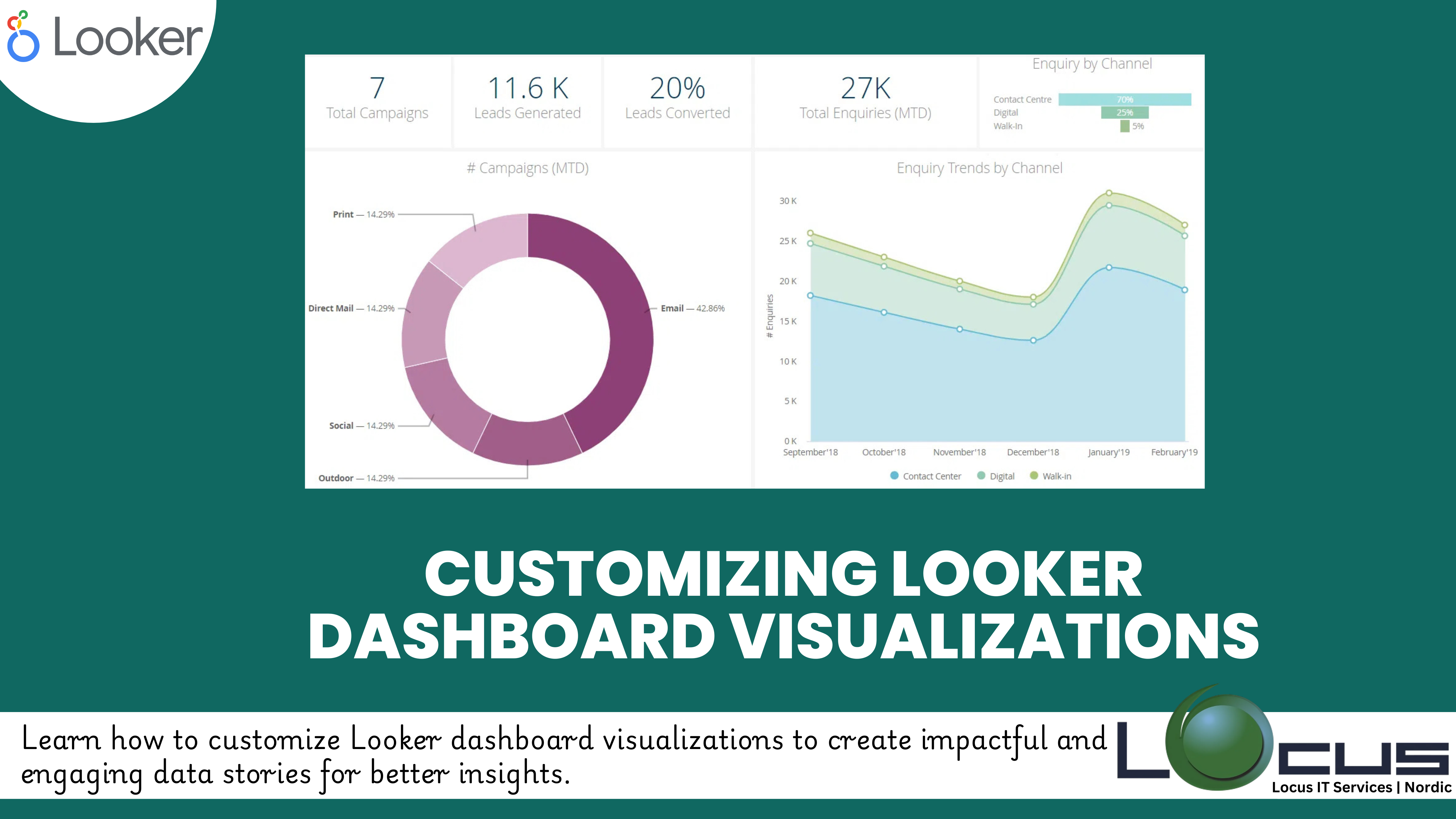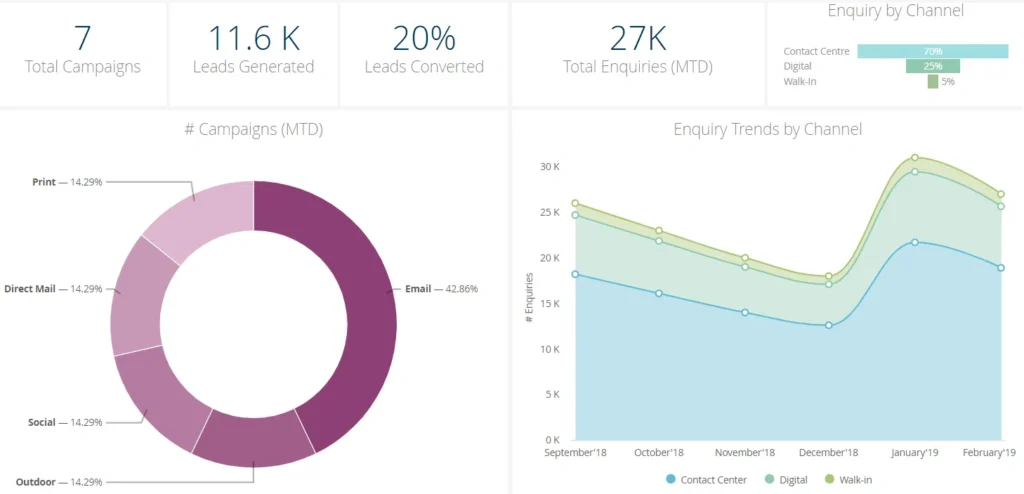
For Every Business, Visualizations are the heart of any dashboard, transforming raw data into actionable insights. In Looker, customizing dashboard visualizations can make a significant difference in how your audience interacts with and interprets data. With a range of tools and settings, Looker empowers you to tailor your Looker Dashboard Visualizations to suit your specific business needs.
In this blog post, we’ll explore key techniques for customizing dashboard visualizations in Looker and best practices to create impactful visual narratives.
Why Customize Visualizations?
Default visualizations often provide basic insights, but customization allows you to:
- Highlight key metrics for better focus.
- Align visual design with your organization’s branding.
- Improve data comprehension through intuitive layouts.
- Enhance interactivity and engagement with your dashboards. (Ref: Connecting Looker to Financial Data Sources)
Key Techniques for Customizing Looker Visualizations
1. Selecting the Right Visualization Type
Each type of visualization in Looker is designed to present specific types of data effectively:
- Bar and Column Charts: Great for comparing categories or tracking trends over time.
- Pie Charts: Useful for showing proportions or distributions.
- Line Charts: Ideal for visualizing trends or changes over a continuous time scale.
- Heatmaps and Tables: Best for displaying dense, detailed data.
Tip: Consider the end user’s needs and the story you want to tell when selecting a visualization type.
2. Using Custom Themes and Colors
Colors play a crucial role in data visualization. In Looker Dashboard Visualizations, you can customize themes to:
- Represent brand colors in dashboards.
- Highlight important metrics with contrasting shades.
- Use gradients or color scales to show intensity or trends.
Example: Use green for positive growth metrics and red for declines to provide immediate visual cues.
3. Adding Conditional Formatting
Conditional formatting helps draw attention to specific data points based on predefined rules.
- Highlight cells or bars when values exceed a target threshold.
- Use color coding for performance categories (e.g., green for “above target,” yellow for “close to target,” red for “below target”).
How to Apply: Conditional formatting options are available in the visualization settings, making it easy to define rules and choose colors.
4. Adjusting Axes and Scales

Ensure your axes and scales are clear and intuitive:
- Use logarithmic scales for wide-ranging data.
- Customize axis labels and titles to add clarity.
- Set static axis ranges to ensure consistency across comparisons.
Tip: Avoid overcrowding the axis with too many ticks or labels.
5. Adding Interactivity
Looker Dashboard Visualizations can be made interactive to enhance user experience:
- Enable drill-throughs to let users explore detailed data behind visualizations.
- Add filters to allow users to customize views based on parameters like date ranges or regions.
- Use dynamic sorting options for real-time data exploration.
6. Customizing Layout and Tile Appearance
- Arrange tiles in a logical sequence to guide the user’s eye.
- Resize and align tiles for a clean and professional look.
- Add text tiles to include annotations, explanations, or headers for better context.
Best Practice: Group related Looker Dashboard Visualizations together and use white space to avoid a cluttered design.
Best Practices for Customizing Dashboard Visualizations
- Focus on Clarity: Avoid overly complex designs that may confuse users. Simplicity is key to effective storytelling.
- Test with End Users: Share prototypes with your audience to gather feedback and refine visualizations accordingly.
- Ensure Data Accuracy: Looker Dashboard Visualizations should enhance, not distort, the data being presented.
- Stay Consistent: Use consistent fonts, colors, and styles across dashboards for a cohesive look.
Final Thoughts
Customizing Looker Dashboard Visualizations in Looker is a powerful way to turn raw data into engaging, actionable insights. By choosing the right visualization types, applying thoughtful customizations, and following best practices, you can create dashboards that not only inform but also inspire action.
Start exploring Looker Dashboard Visualizations customization features today, and transform your dashboards into a compelling narrative that drives results!


