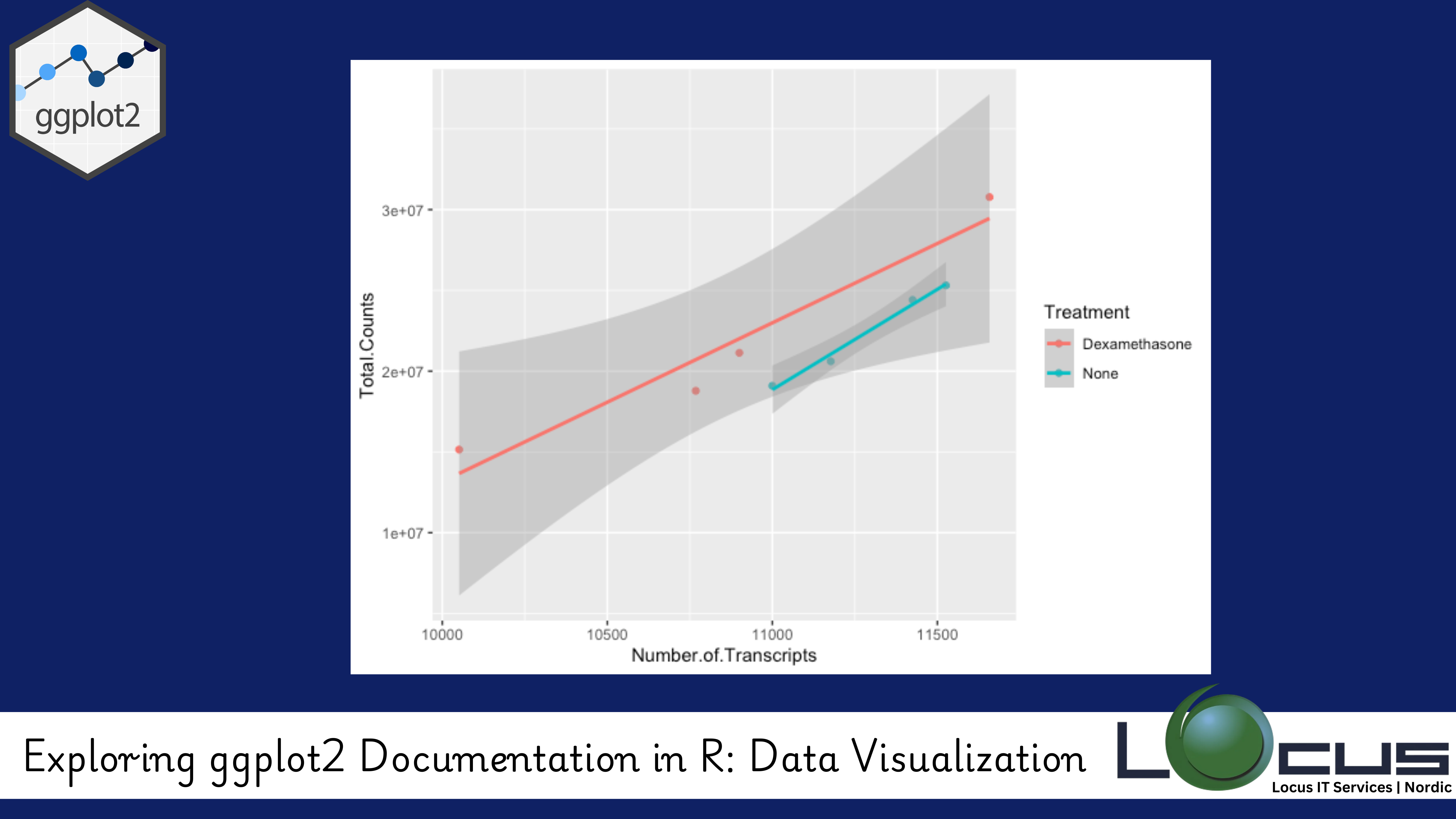
In the world of data visualization, ggplot2 is one of the most widely used and powerful libraries in R. It allows you to create beautiful, customizable, and high-quality visualizations from your data with just a few lines of code. However, as with any complex tool, the key to mastering ggplot2 lies in understanding its documentation and learning how to make the most of its extensive features.
In this blog post, we’ll explore how to navigate the ggplot2 documentation, understand its core concepts, and utilize its resources to create compelling data visualizations in R. (Ref: Parallel Computing in R for Data-Intensive Tasks)
What is ggplot2?
ggplot2 is an R package for creating graphics based on the grammar of graphics, a systematic approach to building visualizations. Unlike base R plotting functions, ggplot2 provides a more structured and flexible framework for creating visualizations. It allows you to layer components like data, aesthetics, geoms (visual marks), and statistics to build your plot step by step.
Whether you are creating scatter plots, bar charts, line graphs, or complex multi-layered visualizations, ggplot2 has you covered.
Why Should You Explore the ggplot2 Documentation?
The ggplot2 documentation is a treasure trove of information that can help you unlock its full potential. Here are some reasons why you should dive into the documentation:
- Comprehensive Examples: The documentation provides detailed examples of how to use each function, making it easy for you to understand how to apply ggplot2 to your own data.
- Customization: It explains how to tweak the appearance of your plots, such as adjusting colors, themes, labels, and scales, giving you control over the aesthetics of your visualizations.
- Advanced Features: It covers advanced topics like faceting, statistical transformations, and custom themes, enabling you to create more sophisticated and informative visualizations.
- Reference for Functions: You can find a complete list of functions, their arguments, and how they can be used effectively.
Key Sections of the ggplot2 Documentation
The ggplot2 documentation is divided into several key sections that help you learn the basics as well as dive into more advanced topics. Here are the most important ones:

1. Getting Started with ggplot2
The “Getting Started” section of the documentation is a great place to begin if you’re new to ggplot2. It introduces the core concepts behind the package and walks you through the basic structure of a ggplot2 plot:
- Data: Your dataset.
- Aesthetics (aes): Aesthetic mappings like x, y, color, size, etc., that define how data are mapped to visual properties.
- Geoms: The geometric objects (points, lines, bars) that represent your data.
- Facets: Subset the data into smaller plots based on a factor.
- Statistical Transformations: Apply statistical transformations to the data before plotting.
- Coordinate Systems: Customize the axes or even use polar coordinates for circular plots.
2. The Grammar of Graphics
At the heart of ggplot2 is the grammar of graphics, a theory developed by Hadley Wickham, the creator of ggplot2, which forms the foundation for building plots. This section of the documentation explains the grammar of graphics and how to think about visualizing data in layers.
Every plot in ggplot2 can be thought of as a combination of several components, such as:
- Data: The dataset being visualized.
- Aesthetics: The mapping between data and visual properties.
- Geometries: The shapes used to represent data points.
- Statistics: Data transformations or statistical summaries.
- Coordinates: The system used to position data points (e.g., Cartesian, polar).
- Faceting: Dividing the plot into subplots based on a factor variable.
By understanding the grammar of graphics, you can approach your visualizations methodically and create plots that clearly communicate your data’s story.
3. Layers and Geoms
ggplot2 plots are built using layers, with each layer corresponding to a different aspect of the plot. This allows you to easily add multiple components to a plot, such as points, lines, and text, each on a separate layer. Geoms are the visual elements used in ggplot2 plots, such as:
- geom_point(): Creates scatter plots.
- geom_line(): Adds line graphs.
- geom_bar(): Creates bar charts.
- geom_histogram(): Displays histograms.
- geom_boxplot(): Shows boxplots.
The documentation for each geom is detailed and provides parameters for customizing the appearance of each layer (e.g., color, size, transparency).
4. Customizing Plots
One of the standout features of ggplot2 is its ability to customize every aspect of the plot. The documentation includes sections on:
- Themes: You can change the overall appearance of your plots using ggplot2 themes. There are pre-built themes like
theme_minimal()andtheme_bw(), or you can create custom themes. - Labels and Titles: Easily add titles, axis labels, legends, and captions using
labs(),xlab(), andylab(). - Color Scales: You can control the color scheme of your plot using functions like
scale_color_manual()orscale_fill_gradient(). - Coordinate Systems: Adjust the coordinate system to suit your data. For example, use
coord_flip()to swap the x and y axes orcoord_polar()to create circular plots.
5. Advanced Features
Once you’re comfortable with the basics, the documentation goes on to cover more advanced topics:
- Faceting: Split your data into multiple subplots with facet_wrap() or facet_grid() based on the values of one or more categorical variables.
- Statistical Transformations: Apply transformations like smoothing or binning to your data before plotting (e.g.,
geom_smooth()). - Annotations: Add text, arrows, and other annotations to highlight important aspects of your plot.
- Interactive Plots: Integrate ggplot2 plots with interactive libraries like plotly to make your visualizations more engaging.
6. ggplot2 Cheatsheet
For those who prefer quick reference guides, the ggplot2 cheatsheet is an invaluable resource. It condenses all the key functions, geoms, and customization options into a compact, easy-to-read format, making it perfect for quick look-ups.
How to Access ggplot2 Documentation
You can access the ggplot2 documentation in several ways:
- Online Documentation: The official ggplot2 documentation is always up to date and provides comprehensive coverage of the package.
- R Console: If you prefer to stay within the R environment, you can use the
?function_namecommand (e.g.,?ggplot) to access documentation for any function. - Cheatsheets: Downloadable cheatsheets are available from the tidyverse website, which is perfect for quick reference.
Final Thoughts
The ggplot2 documentation is a comprehensive and invaluable resource for anyone looking to improve their data visualization skills in R. By exploring the documentation and experimenting with the various features it offers, you can take your visualizations to the next level.
Whether you are just starting with ggplot2 documentation or looking to explore advanced customization options, the documentation has something for everyone. By mastering ggplot2 documentation, you’ll be able to create powerful, insightful, and visually appealing plots that communicate your data in meaningful ways. (Ref: Locus IT Services)


