For Every Business data-driven decision-making, businesses across industries are turning to geospatial data to unlock valuable insights. Qlik GeoAnalytics offers a powerful suite of tools for combining location-based data with analytics to help you visualize trends, improve operations, and drive smarter decisions.
In this blog post, we’ll take you through a hands-on project where we’ll build a GeoDashboard that integrates data from multiple sources and displays geographic trends. By the end of this guide, you’ll have the knowledge to create a dynamic, interactive dashboard that can help solve real-world business challenges.
Project Overview: What We’ll Build
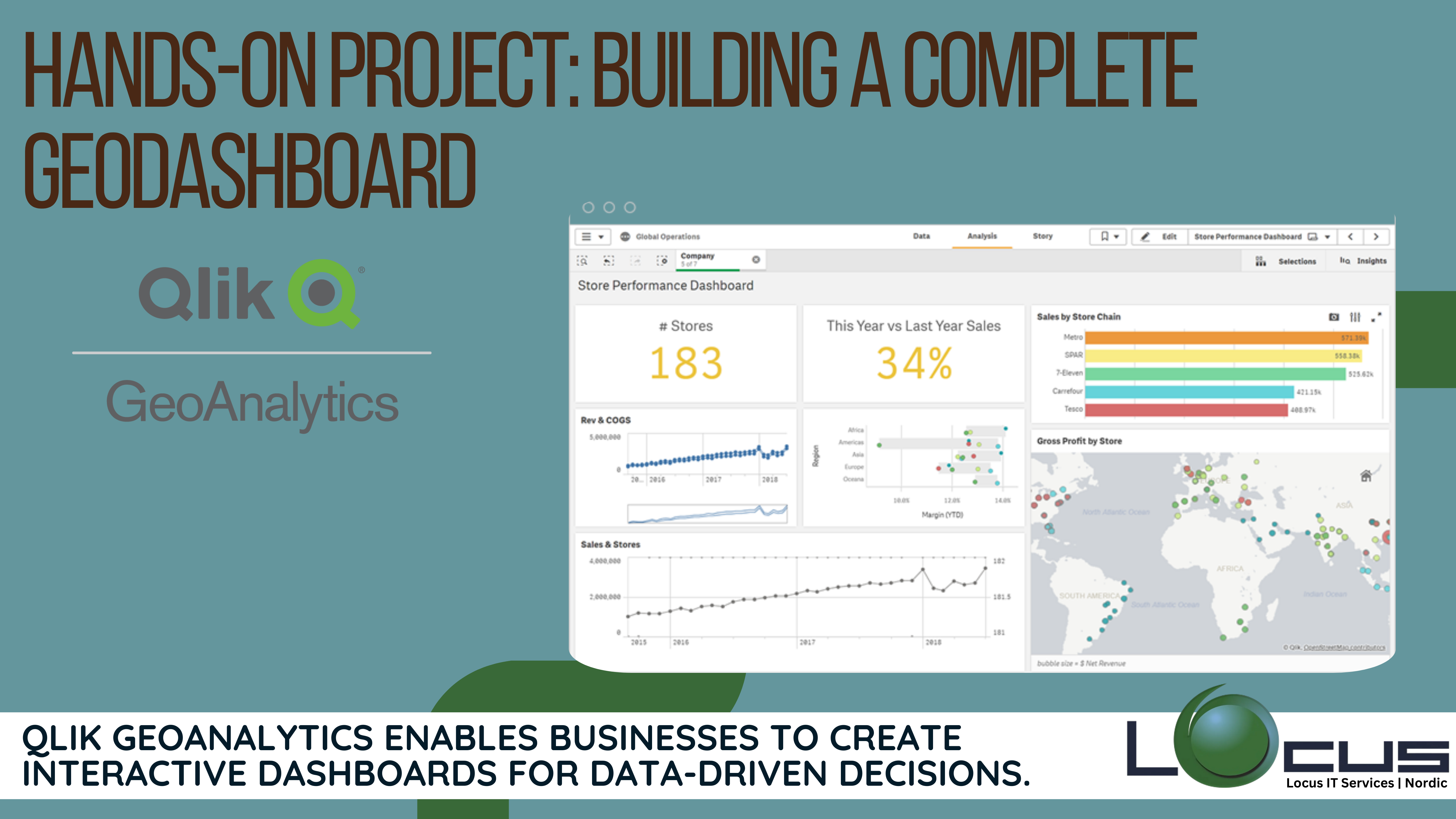
The Project Overview section outlines the main goals and components of a GeoDashboard that we’ll build in the project. The purpose of this dashboard is to help a retail chain optimize its store locations and analyze sales trends across different regions. Here’s a deeper breakdown of what we’ll be creating: (Ref: Case Study: Logistics Optimization with Location Intelligence)
Map-based Visualizations: Displaying Store Locations and Sales Performance
- What it is: This component of the dashboard will use maps to show the locations of all retail stores in the chain. Each store’s location will be marked on the map using latitude and longitude coordinates.
- How it helps: By visualizing the store locations on a map, users can immediately see where the stores are located geographically, which can be crucial for making decisions about where to expand or focus marketing efforts.
- Sales Performance: The map will also highlight store performance, using color codes, size variations, or labels to represent how well each store is performing in terms of sales. For example, red might indicate low sales, while green could represent high sales.
Sales Trend Analysis: Interactive Charts Showing Sales Data Across Geographic Regions
- What it is: This component will include charts that provide insights into sales trends over time across different regions. Users will be able to interact with these charts to examine how sales are performing in different geographic areas (e.g., by city, state, or region).
- How it helps: By analyzing these sales trends, businesses can identify regions where sales are growing or declining. GeoDashboard This could guide decisions on inventory, promotions, or even new store openings in areas with high sales potential.
Heatmaps: Identifying High-Performing Areas Based on Sales and Customer Activity
- What it is: A heatmap is a graphical representation of data where values are depicted by color. In this case, the heatmap will visualize sales performance and customer activity across different regions.
- How it helps: Heatmaps allow you to quickly spot geographic areas where business activity is concentrated. For example, areas with high sales and customer activity will appear as “hot” zones on the map (with colors like red or orange), while low-performing areas will be cooler (with colors like blue or green). GeoDashboard This can help the retail chain focus its efforts on high-performing areas or identify where improvement is needed.
Filters and Interactivity: Allowing Users to Interact with Data
- What it is: The dashboard will allow users to filter data based on certain criteria, such as time, location, or store type. Filters allow the user to dynamically adjust the data displayed in the dashboard.
- How it helps: These interactive features allow users to drill down into specific time periods (e.g., sales trends in the last quarter or year), geographic regions (e.g., comparing performance across different states), or types of stores (e.g., flagship stores vs. smaller outlets). This enhances the dashboard’s flexibility, making it more valuable to different users with specific needs.
Overall, this GeoDashboard will provide the retail chain with an interactive, data-driven tool to make smarter, location-based business decisions, optimizing operations and improving performance across regions.
Step 1: Preparing the Data
To begin building our GeoDashboard, we first need to prepare the data. Here’s the data we’ll be working with:
- Store Data: Information about each store, including its name, location (latitude, longitude), and type of products sold.
- Sales Data: Monthly sales performance for each store.
- Geospatial Data: Boundaries for different geographic regions, such as city, state, and zip codes.
We’ll upload these datasets into Qlik Sense, ensuring they are properly formatted and cleaned for use in the dashboard.
Step 2: Creating GeoAnalytics Maps
With Qlik GeoAnalytics, we can create interactive maps that display store locations and their respective sales performance. Here’s how to do it:

- Load the Location Data: Using the store data, load the latitude and longitude fields into Qlik Sense.
- Plot the Stores on a Map: Create a Map object and set the location fields as the map’s coordinates.
- Sales Visualization: Customize each map point by adding size, color, or labels to represent sales performance. Larger or redder points could indicate high-performing stores, while smaller or greener points could represent lower sales.
Pro Tip: Use Qlik’s clustering features to group stores that are located close together, making it easier to interpret dense areas on the map.
Step 3: Analyzing Sales Trends
With the stores plotted on the map, we now want to explore sales trends across GeoDashboard geographic regions. For this, we will:
- Create Sales KPIs: Calculate key metrics like total sales, average sales per store, and sales growth percentage.
- Region-based Aggregation: Use Qlik’s geospatial aggregation features to display sales data based on regions (e.g., states or zip codes).
- Bar and Line Charts: Add interactive bar charts or line charts that show how sales are performing in different regions over time.
For example, a line chart could display sales growth month-over-month for each region, allowing decision-makers to quickly identify high-performing areas.
Step 4: Adding Heatmaps for Visual Insights
A heatmap is an excellent way to visualize the density or intensity of certain metrics, such as sales or customer foot traffic. Here’s how you can create one:
- Overlay the Heatmap: On the map visualization, add a heatmap layer that shows areas of high sales or activity. This will allow users to quickly identify the areas where the business is performing best or where it may need attention.
- Customizing the Heatmap: Adjust the color scheme to represent different sales performance levels, such as red for high sales and blue for low sales.
This will help stakeholders identify hotspots and make informed decisions about resource allocation, marketing efforts, or store expansion.
Step 5: Enhancing Interactivity with Filters
Now, let’s make the dashboard more interactive. We can allow users to filter data by:
- Time Period: Filter by specific months, quarters, or years.
- Store Type: Filter by store type (e.g., flagship, regional, outlet).
- Region: Drill down into specific regions, such as city or state.
Qlik Sense’s interactive filters let users explore the data from multiple angles, providing more customized insights.
Step 6: Finalizing and Publishing the GeoDashboard
Once the dashboard is built, we can focus on final touches like:
- Design and Layout: Make sure the GeoDashboard is user-friendly and visually appealing. Organize the map, charts, and filters logically for intuitive navigation.
- Add Labels and Tooltips: Provide context by adding labels to key map points or tooltips that display additional information GeoDashboard when users hover over data points.
- Publishing: Once the GeoDashboard is complete, publish it to your Qlik Sense hub and share it with stakeholders for use in decision-making.
Final Thoughts
Building a GeoDashboard with Qlik GeoAnalytics enables organizations to gain location-based insights, optimize operations, and improve decision-making. Through this hands-on project, we have shown how to integrate geospatial data, build interactive visualizations, and enhance user experience. Whether you’re a retail chain, logistics company, or healthcare provider, a GeoDashboard can unlock new ways to visualize and analyze geographic data to drive business success.
By applying the techniques discussed in this blog post, you can take full advantage of Qlik GeoAnalytics to gain insights that were once hidden within your location-based data.

