Tableau bar and line graphs is a powerful and intuitive data visualization tool used to transform raw data into interactive and insightful visualizations. Its drag-and-drop interface, combined with robust analytical features, makes it an ideal platform for anyone looking to analyze and present data in a visual format. Whether you are working with small datasets or big data, Tableau can handle it with ease.
Before we dive into the specifics of creating Tableau bar and line graphs, let’s first understand how Tableau works in general. Tableau connects to various data sources such as Excel spreadsheets, SQL databases, Google Sheets, cloud services, and many others. Once the data is imported, Tableau automatically detects the fields and suggests suitable visualization types.

Bar Charts in Tableau
Bar charts are used to compare data across different categories, making them ideal for representing categorical data. They consist of rectangular bars where the length or height of the bar represents a quantitative value.
Creating a Simple Bar Chart
Creating a basic bar chart in Tableau is relatively straightforward:
- Connect to Data: Open Tableau and connect to your data source. This could be an Excel file, database, or any other supported format.
- Drag Dimensions and Measures: In the “Data” pane on the left, you will see the dimensions (categorical data) and measures (quantitative data). To create a bar chart, drag a dimension (e.g., “Product Category”) to the Columns shelf and a measure (e.g., “Sales”) to the Rows shelf.
- Automatic Visualization: Tableau will automatically generate a bar chart. If it doesn’t, click on the “Show Me” panel and select the bar chart icon.
- Refining the Chart: You can refine your chart by adjusting the size, adding color, or sorting the data.
Customizing the Bar Chart
Tableau allows for extensive customization options to enhance your bar chart:
- Sorting: You can sort bars in ascending or descending order based on the values or categories. Right-click on the axis or field and choose “Sort.”
- Coloring: Adding color to the bars can improve clarity and make the chart more visually engaging. Drag a dimension (such as “Region”) to the “Color” shelf in the Marks card to assign different colors to the bars.
- Labels: To add labels, drag the “Sales” field to the “Label” shelf. This will display the sales number on each bar in Tableau bar and line graphs.
- Axis Formatting: You can format the axis to adjust the scale or modify the tick marks and labels for readability.
Advanced Bar Chart Types
Tableau offers several advanced bar chart options to enhance your analysis:
- Stacked Bar Chart: To visualize how sub-categories contribute to the total, you can create a stacked bar chart. Drag a second dimension to the “Color” shelf, and Tableau will automatically stack the bars based on that dimension.
- Grouped Bar Chart: If you want to compare multiple categories side by side, use a grouped bar chart. Drag another dimension to the “Columns” shelf alongside the first one.
- Side-by-Side Bar Chart: This is a variation of the grouped bar chart where bars representing different categories appear next to each other for better comparison.(Ref: Tableau Workbooks: A Key to Advanced Data Analysis)
Line Graphs in Tableau

Line graphs, also known as line charts, are used to represent trends over time. They are particularly useful for displaying continuous data, such as sales performance, stock prices, or website traffic.
Creating a Basic Line Graph
Follow these steps to create a basic line graph in Tableau:
- Connect to Data: Open Tableau and connect to your data source in Tableau bar and line graphs.
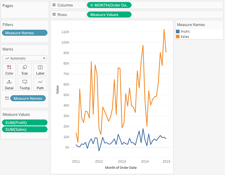
- Drag Dimensions and Measures: To create a line graph, drag a date-related field (e.g., “Order Date”) to the Columns shelf and a measure (e.g., “Sales”) to the Rows shelf.
- Select Line Graph: Tableau will automatically generate a line chart when it detects time-series data on the Columns shelf. If not, you can click the “Show Me” panel and select the line graph.
Customizing the Line Graph
Just like bar charts, line graphs in Tableau are highly customizable:
- Multiple Lines: If you want to display multiple lines on the same graph (e.g., sales for different regions), drag a dimension (e.g., “Region”) to the “Color” shelf. Each region will have a different colored lines in Tableau bar and line graphs.
- Line Style: You can change the appearance of the lines by modifying the “Size” and “Line” options in the Marks card. You can make lines thicker or thinner based on your preference.
- Trend Lines: Tableau allows you to add trend lines to your line graph, helping to visualize underlying trends in the data. Right-click on the graph, select “Trend Lines,” and choose the type of trend line you want to display (linear, exponential, etc.).
- Annotations: Adding annotations to your graph can provide context to certain data points. Right-click on a point in the line graph and select “Annotate” to add text to that specific data point.
Using Dual-Axis Line Graphs
A dual-axis line graph allows you to display two different measures on the same graph, using two different Y-axes.
- Creating Dual-Axis: Drag a second measure (e.g., “Profit”) to the Rows shelf. Tableau will automatically create a second Y-axis.
- Synchronizing Axes: Right-click on one of the Y-axes and select “Synchronize Axis” to ensure both axes have the same scale.
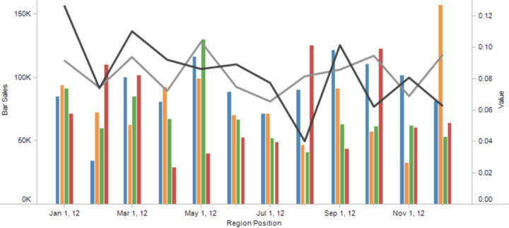
- Combining Axes: You can also adjust the type of graph on one of the axes (e.g., bar on one axis, line on the other) to compare the two measures more effectively in Tableau bar and line graphs.
Best Practices for Tableau Bar and Line Graphs
While creating Tableau bar and line graphs is relatively easy, the key to effective data visualization lies in following best practices. Here are some tips to ensure your charts are both clear and impactful:
Bar Charts Best Practices
- Limit Categories: Don’t overwhelm your audience with too many categories. If you have too many categories, the bars will become too small to read. Consider using filters to display only the top N categories in Tableau bar and line graphs.
- Order Bars Properly: Ensure that the bars are ordered in a way that makes sense to your audience. This could be alphabetically, by value, or any other meaningful way.
- Keep it Simple: Avoid clutter by minimizing the use of colors and extra labels. Use color only when it adds meaning to the chart, such as distinguishing different categories.
Line Graphs Best Practices
- Use Line Graphs for Trends: Line graphs are most effective for showing trends over time. Avoid using them for categorical data, as bar charts are better suited for such comparisons.
- Label Your Axes: Always label both the X and Y axes to avoid confusion. This is particularly important for time-series data, where time intervals need to be clearly defined in Tableau bar and line graphs.
- Limit the Number of Lines: Too many lines on a single graph can make it hard to interpret. Stick to a manageable number of lines (3-5) for clarity.
- Show Data Points: If necessary, display data points on the line graph to show the exact values for each time period for Tableau bar and line graphs.
Final Thoughts
Tableau bar and line graphs are two of the most widely used visualizations in data analysis, and Tableau makes it easy to create both. Bar charts are ideal for comparing categorical data, while line graphs excel at showing trends over time. By mastering these visualizations, you can communicate your data-driven insights clearly and effectively.
In this blog, we’ve covered how to create basic and advanced Tableau bar and line graphs, as well as how to customize them for your specific needs. Additionally, we’ve discussed best practices that can help you create visualizations that are not only informative but also aesthetically pleasing and easy to understand.


