For Every Business, Looker offers a robust suite of visualization tools designed to transform raw data into insightful, actionable graphics. By using these visualization options effectively, businesses can present data in a way that’s not only visually appealing but also easy to interpret. In this blog post, we’ll explore key tips and strategies for maximizing Looker visualization capabilities.
Why Visualization Matters in Looker
Data visualization is more than just creating charts; it’s about telling a story with data. Looker’s visualization options enable users to: (Ref: Utilizing Looker Table Calculations in Dashboards)
- Highlight key metrics.
- Simplify complex data relationships.
- Engage stakeholders with interactive dashboards.
Getting Started with Looker Visualizations
Looker provides various visualization types, including bar charts, line graphs, pie charts, and scatter plots. Selecting the right visualization for your data is the first step in effective storytelling.
Key Considerations for Choosing a Visualization
- Nature of Data: Use bar charts for comparisons, line charts for trends, and scatter plots for relationships.
- Audience: Ensure the visualization is intuitive for its intended viewers.
- Purpose: Clearly define whether you’re summarizing, comparing, or exploring data.
Tips for Using Looker Visualization Options Effectively
1. Customize Visualization Settings
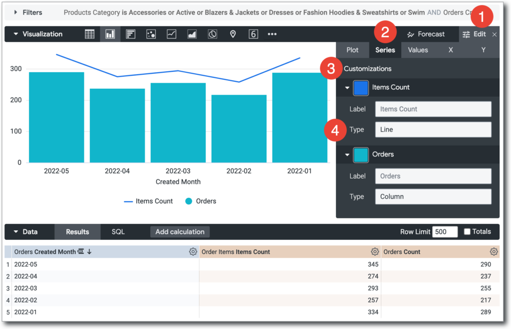
Every visualization in Looker has customization options to tailor the appearance and functionality:
- Colors: Use consistent and meaningful color schemes to highlight patterns.
- Axis Configuration: Set meaningful labels and scales to avoid misinterpretation.
- Legends and Titles: Add clear labels and descriptions to make charts self-explanatory.
2. Use Interactive Features
Looker’s interactive capabilities allow users to explore data within visualizations:
- Drill-Through: Let viewers click on data points to see underlying details.
- Filters: Enable dynamic filtering to adjust data views on the fly.
- Linked Dashboards: Connect visualizations across dashboards for deeper insights.
3. Leverage Advanced Visualizations
Go beyond basic visualizations with Looker’s advanced options:
- Heatmaps: Ideal for showing intensity or density across categories.
- Funnels: Analyze conversion rates or sequential data processes.
- Custom Charts: Incorporate unique visualizations using Looker’s custom visualization API.
4. Focus on Performance
Visualization performance is critical for user experience.
- Optimize data queries to reduce load times.
- Avoid overloading dashboards with too many visualizations.
Common Visualization Mistakes to Avoid
Creating impactful data visualizations requires careful planning and execution. Missteps in design and presentation can obscure the data’s meaning, leading to confusion or misinterpretation. Below is an explanation of three common mistakes and why avoiding them is crucial.

1. Overcomplicating the Design
What it Means:
Adding too many elements—such as excessive labels, complex graphics, or overly intricate data representations—can make a visualization difficult to interpret.
Why It’s a Problem:
- Viewers may struggle to identify the key message or insight.
- Overly busy visuals can be overwhelming, reducing their effectiveness in conveying information.
Solution:
Keep the design simple and focused. Use minimal, relevant elements that directly contribute to understanding the data. Let the insights stand out without distraction.
2. Ignoring Data Context
What it Means:
Presenting data without providing adequate background or context, such as timeframes, units of measurement, or comparisons, can lead to misleading interpretations.
Why It’s a Problem:
- Data out of context might be interpreted incorrectly, leading to poor decisions.
- Stakeholders may question the reliability or relevance of the visualization.
Solution:
Always accompany Looker Visualization with essential details. For example:
- Include labels and legends to clarify data points.
- Use titles or annotations to explain trends or anomalies.
- Compare data against benchmarks to highlight significance.
3. Inconsistent Visual Elements
What it Means:
Using varied styles, colors, or formatting across multiple Looker Visualization can disrupt the cohesiveness of your presentation.
Why It’s a Problem:
- Inconsistency can confuse the audience and make the overall presentation seem unprofessional.
- Viewers may spend extra time deciphering visuals instead of focusing on insights.
Solution:
- Stick to a consistent color palette and font style throughout your Looker Visualization.
- Ensure similar types of data are represented using the same chart types for uniformity.
- Follow established design standards to create a cohesive and polished presentation.
Final Thoughts
Effective Looker Visualization is at the heart of data-driven decision-making, and Looker provides all the tools you need to achieve it. By carefully selecting the right visualizations, customizing settings, and leveraging interactivity, you can transform data into impactful stories that drive business insights.
Whether you’re building dashboards for executives or creating analytics for operational teams, mastering Looker visualization options will empower you to deliver results that truly make a difference.


