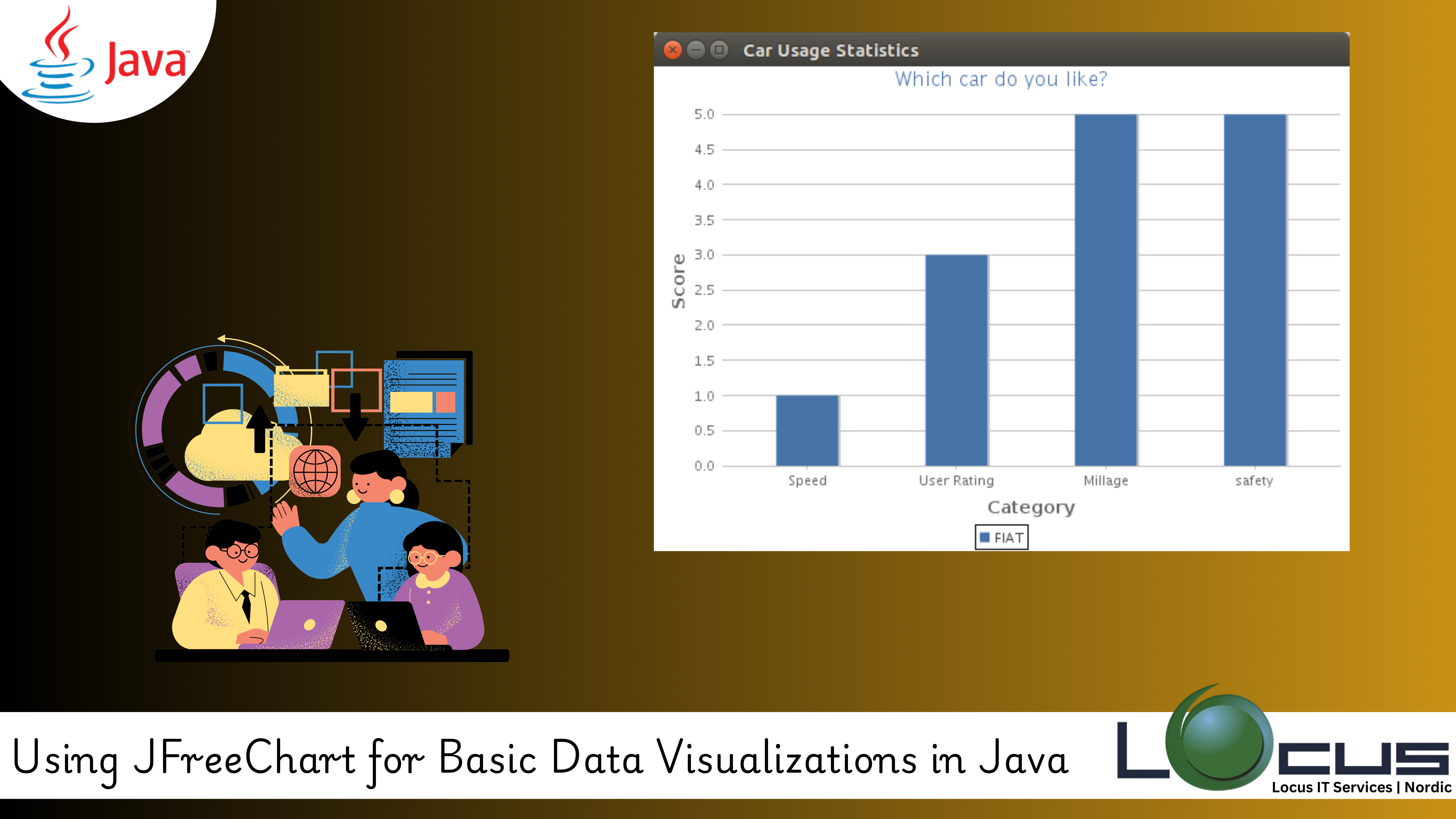
For Every Business, data science and software development, data visualization is crucial for understanding patterns, trends, and insights from large datasets. While there are many tools and libraries available for creating visualizations, Java developers often turn to JFreeChart for its ease of use and flexibility when working with data. JFreeChart is a powerful library for creating various types of charts and graphs in Java applications.
In this blog post, we will explore JFreeChart, how to use it for creating basic data visualizations, and the key features that make it a go-to library for Java developers.
What is JFreeChart?
JFreeChart is an open-source Java library that provides a wide range of charting options for visualizing data. It offers support for various types of charts, including line charts, bar charts, pie charts, scatter plots, and more. JFreeChart allows you to embed these charts in your Java Swing or JavaFX applications. (Ref: Using ORM Libraries: Hibernate and JPA in Java)
The library is known for its simplicity and powerful customization options, making it easy for developers to generate interactive and attractive visualizations from raw data.
Why Use JFreeChart?
- Wide Range of Chart Types: JFreeChart supports several chart types, including bar charts, pie charts, line charts, scatter plots, area charts, and more.
- Easy Integration: It integrates seamlessly with Swing or JavaFX applications, allowing you to create dynamic charts in desktop apps.
- Customizable: You can easily customize the appearance of your charts (colors, labels, titles, legends, etc.), making JFreeChart flexible enough to match your design requirements.
- Free and Open-Source: It is free to use and open-source, making it a cost-effective choice for developers working on data-driven applications.
Getting Started with JFreeChart
Before we dive into creating charts, you first need to include JFreeChart in your project. Here’s how you can get started:
1. Installing JFreeChart:
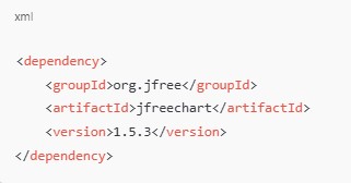
- If you’re using Maven, simply add the following dependency to your
pom.xml:

- Alternatively, you can download the JFreeChart library from JFreeChart’s official site and manually add it to your project’s classpath.
2. Basic Setup:
Once you’ve added JFreeChart to your project, you can start creating visualizations. For example, to display a simple line chart, follow these steps:
Creating a Simple Line Chart with JFreeChart
Let’s build a basic line chart that represents a dataset over time.
import org.jfree.chart.ChartFactory;
import org.jfree.chart.ChartPanel;
import org.jfree.chart.JFreeChart;
import org.jfree.data.category.DefaultCategoryDataset;
import javax.swing.*;

public class LineChartExample {

    public static void main(String[] args) {
        // Create dataset
        DefaultCategoryDataset dataset = createDataset();

        // Create chart
        JFreeChart chart = createChart(dataset);

        // Display chart
        ChartPanel chartPanel = new ChartPanel(chart);
        chartPanel.setPreferredSize(new java.awt.Dimension(800, 600));
        JFrame frame = new JFrame("Line Chart Example");
        frame.setDefaultCloseOperation(JFrame.EXIT_ON_CLOSE);
        frame.getContentPane().add(chartPanel);
        frame.pack();
        frame.setVisible(true);
    }

    private static DefaultCategoryDataset createDataset() {
        DefaultCategoryDataset dataset = new DefaultCategoryDataset();

        // Add data (Category, Series, Value)
        dataset.addValue(1.0, "Series1", "Jan");
        dataset.addValue(4.0, "Series1", "Feb");
        dataset.addValue(3.0, "Series1", "Mar");
        dataset.addValue(5.0, "Series1", "Apr");
        dataset.addValue(4.0, "Series1", "May");

        return dataset;
    }

    private static JFreeChart createChart(DefaultCategoryDataset dataset) {
        return ChartFactory.createLineChart(
            "Monthly Data",  // Title
            "Month",         // X-axis Label
            "Value",         // Y-axis Label
            dataset          // Dataset
        );
    }
}
Explanation:
- Dataset: We use
DefaultCategoryDatasetto store the data we want to display in the chart. This dataset is then passed to thecreateChart()method. - Chart Creation:
ChartFactory.createLineChart()generates a line chart based on the dataset, with the specified title, axis labels, and dataset. - Displaying the Chart: The
ChartPanelis used to display the chart inside a JFrame window.
Types of Charts You Can Create with JFreeChart
- Line Charts: Ideal for displaying trends over time, as seen in our example above.
- Example: Stock market trends, temperature data, sales growth.
- Bar Charts: Useful for comparing quantities across different categories.
- Example: Revenue comparison across different regions or products.
- Pie Charts: Great for showing proportions or percentages of a whole.
- Example: Market share distribution, budget allocation.
- Scatter Plots: Excellent for visualizing the relationship between two continuous variables.
- Example: Correlation between height and weight, temperature and electricity consumption.
- Area Charts: Similar to line charts but with the area beneath the line filled, useful for showing cumulative data.
- Example: Total website visitors over time.
Customizing Your Charts
It provides a rich set of customization options that allow you to modify various aspects of your chart, such as colors, fonts, labels, and titles.
1. Changing Chart Colors:
You can change the color of the plot elements, such as the lines in a line chart or the bars in a bar chart, by using setSeriesPaint().
Example:

2. Adding Titles and Labels:
It allows you to add custom titles and labels to make your chart more informative. You can set the title of the chart and axis labels as shown earlier, or use setDomainPannable(true) and setRangePannable(true) to allow users to pan the chart interactively.
3. Legend Customization:
Legends are helpful to show what each series represents. You can modify the font, position, and visibility of the legend.

Integrating JFreeChart with Swing or JavaFX
It can be seamlessly integrated with Swing or JavaFX applications for building rich desktop applications.
- Swing: As shown in our example above, you can use
ChartPanelto embed the chart inside a Swing container, likeJFrame. - JavaFX: You can embed JFreeChart into JavaFX applications using
FXChart.
Final Thoughts
JFreeChart is an essential tool for Java developers when it comes to creating professional-looking, interactive data visualizations. Whether you are building simple line charts, complex bar graphs, or pie charts, It offers a wide array of features that are highly customizable and easy to integrate into Java applications.
In this post, we covered the basics of using it for creating basic charts, but this is just the beginning. With , you can explore more advanced features like 3D charts, interactive visualizations, and exporting charts to various formats (PNG, JPEG, PDF).
By mastering, you can enhance your data-driven applications and provide your users with compelling insights through attractive and interactive visual representations of their data. (Ref: Locus IT Services)


