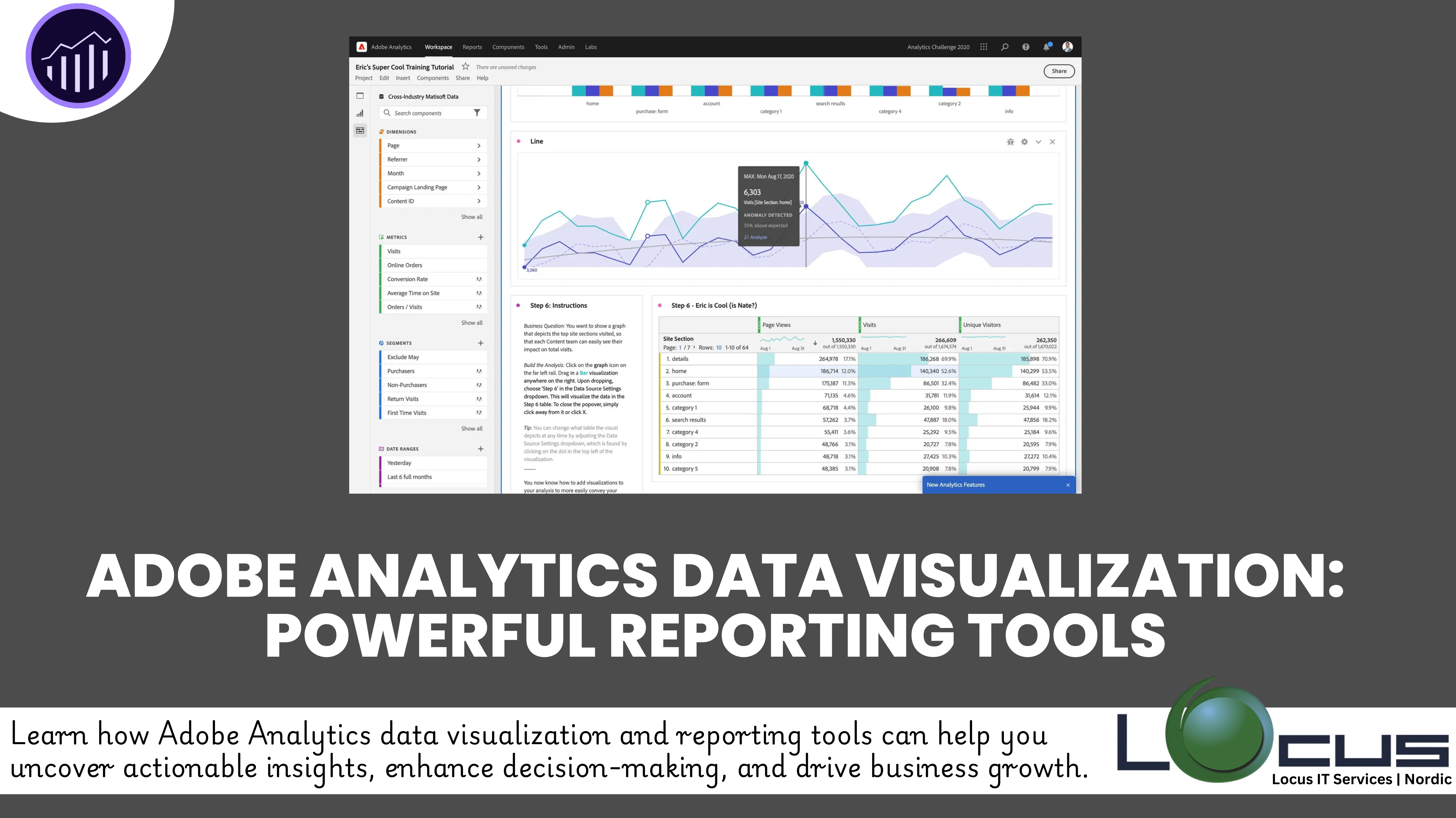
Every businesses must go beyond collecting data—they need to visualize it effectively to uncover actionable insights. Adobe Analytics Data Visualization, a premier analytics platform, provides robust data visualization and reporting tools that help organizations turn raw numbers into compelling stories.
This blog explores how Adobe Analytics empowers users with data visualization capabilities, enabling smarter decision-making and enhancing business performance. (Ref: Case Study: Advanced Predictive Analytics in Action)
Why Data Visualization Matters in Analytics
Data visualization simplifies complex datasets by transforming them into visual formats like charts, graphs, and dashboards. This approach:
- Makes data easier to understand and analyze.
- Highlights patterns and trends that might go unnoticed in raw data.
- Drives better communication of insights across teams.
In Adobe Analytics, visualization takes center stage, ensuring that businesses can interpret data quickly and effectively.
Key Visualization Features in Adobe Analytics
1. Analysis Workspace
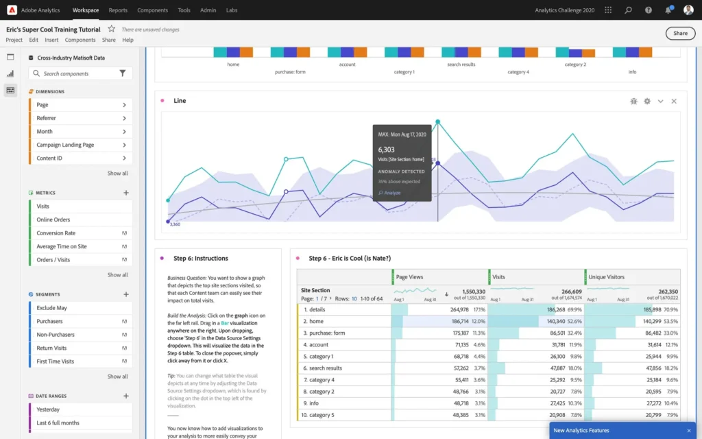
The Analysis Workspace is Adobe Analytics’ flagship tool for creating interactive, customizable dashboards. With its drag-and-drop interface, users can:
- Combine metrics, dimensions, and segments for tailored analyses.
- Create dynamic visualizations, such as line graphs, bar charts, and scatter plots.
- Use breakdowns and filters to dive deeper into specific data points.
2. Real-Time Reporting
Real-time visualizations are essential for monitoring ongoing campaigns and operations. Adobe Analytics provides real-time dashboards that allow businesses to:
- Track live website traffic and customer interactions.
- Respond quickly to emerging trends or issues.
3. Customizable Visualizations
Adobe Analytics supports a wide variety of visualization types, including:
- Heatmaps for identifying user behavior hotspots.
- Pathing diagrams to visualize customer journeys.
- Cohort analysis charts to track user retention over time.
4. Segmentation and Comparison Tools
Segmentation enables businesses to compare different customer groups visually. For example:
- Visualizing how new users behave compared to returning users.
- Comparing performance across different marketing channels.
5. Data Export and Integration
Adobe Analytics seamlessly integrates with Adobe Experience Cloud and other external tools. This allows businesses to export visualized data for further analysis or presentation, ensuring that insights are accessible to all stakeholders.
Benefits of Adobe Analytics Data Visualization

1. Improved Decision-Making
Data visualization enables businesses to identify key trends and make informed decisions, whether optimizing marketing campaigns or improving customer retention.
2. Enhanced Team Collaboration
Visual dashboards simplify communication, ensuring that teams across departments understand the insights and align their strategies effectively.
3. Time Efficiency
With intuitive visualization tools, Adobe Analytics eliminates the need for manual data analysis, allowing users to focus on interpreting and acting on insights.
4. Actionable Insights
Dynamic and interactive dashboards provide actionable insights in real time, enabling businesses to adapt strategies and improve outcomes.
Use Case: Visualizing Campaign Performance
Imagine a digital marketing team running multiple campaigns across various platforms. With Adobe Analytics Data Visualization:
- They can use Analysis Workspace to visualize the performance of each campaign in real-time.
- Custom charts highlight which platforms are driving the most traffic and conversions.
- Segmentation tools reveal how different customer demographics respond to each campaign.
This insight enables the team to reallocate resources toward high-performing strategies, maximizing ROI.
Best Practices for Data Visualization with Adobe Analytics
1. Define Clear Objectives
Before creating a Adobe Analytics Data Visualization, it’s essential to understand the purpose of the analysis. Ask yourself:
- What business question are you trying to answer?
- Who is the audience for this visualization?
- What decisions will this data inform?
For example, if your objective is to assess the performance of a marketing campaign, your visualization should focus on key metrics like click-through rates, conversions, and ROI. Defining clear objectives ensures that the visualization aligns with your business goals and provides actionable insights.
2. Choose the Right Visualization
The type of visualization you use can significantly impact how effectively your data is communicated. Adobe Analytics Data Visualization offers a variety of options, and each serves a specific purpose:
- Bar Graphs: Ideal for comparing values across categories, such as sales by region or performance across marketing channels.
- Line Charts: Perfect for showing trends over time, such as daily website traffic or monthly revenue growth.
- Heatmaps: Useful for identifying behavioral patterns, such as clicks on different parts of a webpage or customer activity during specific times of the day.
By selecting the appropriate visualization type, you ensure that your audience can interpret the data quickly and accurately.
3. Focus on Simplicity
Effective Adobe Analytics Data Visualization is about clarity. Overloading charts with too much information, excessive colors, or unnecessary elements can confuse the audience. To maintain simplicity:
- Limit the number of metrics displayed in a single chart.
- Use consistent color schemes to avoid visual distractions.
- Highlight key data points with annotations or callouts.
In Adobe Analytics Data Visualization, features like customizable charts and filtering options help you create clean, focused visualizations that emphasize the most critical insights.
4. Leverage Real-Time Dashboards
Real-time dashboards are a powerful feature in Adobe Analytics, Adobe Analytics Data Visualization enabling businesses to monitor operations and campaigns as they happen. These dashboards allow for:
- Dynamic Monitoring: Track live metrics, such as active users, ongoing sales, or campaign performance.
- Immediate Action: Respond quickly to issues, such as a sudden drop in website traffic or a spike in cart abandonment.
For instance, an e-commerce company can use real-time dashboards to monitor Black Friday sales, adjusting promotional strategies in real time based on customer behavior.
Final Thoughts
Adobe Analytics Data Visualization and reporting tools offer businesses a powerful way to interpret their data and act on it with confidence. Whether you’re tracking customer journeys, analyzing marketing campaigns, or monitoring real-time website performance, Adobe Analytics equips you with the insights needed to succeed in a competitive landscape.
Embrace Adobe Analytics Data Visualization and take your reporting capabilities to the next level. Uncover trends, communicate insights, and drive smarter business decisions—one chart at a time.


