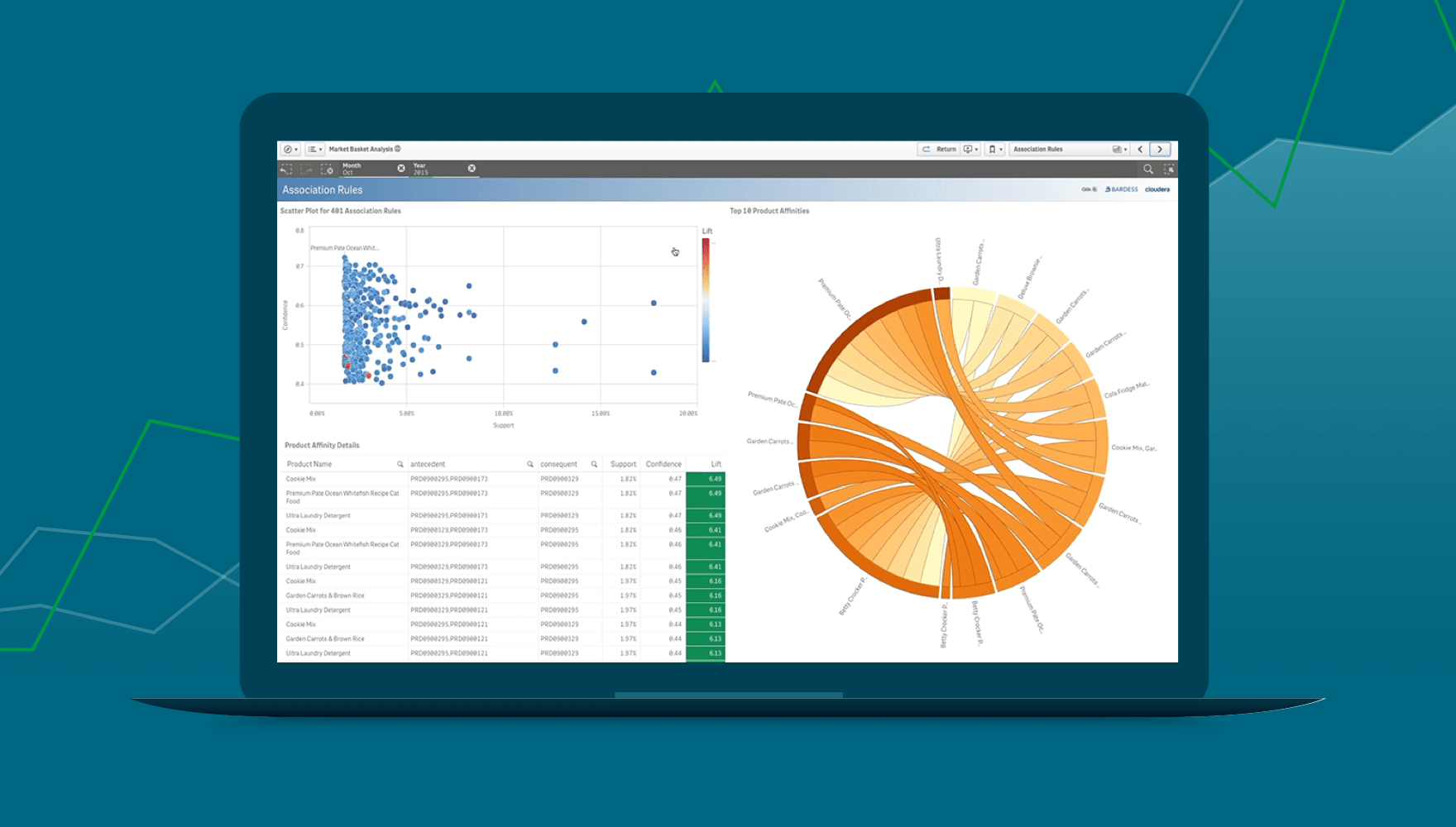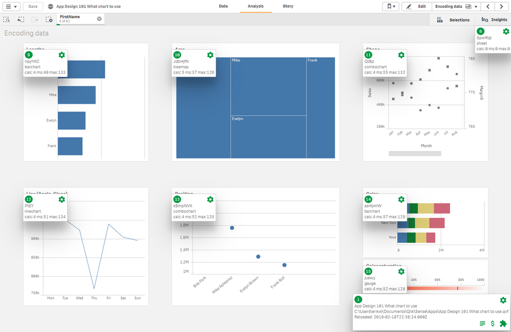
Data visualization is more than just presenting charts and graphs — it’s about telling a story that allows stakeholders to make informed, data-driven decisions. In Qlik Sense, advanced visualization and analytics capabilities enable organizations to transform raw data into actionable insights. Whether you’re analyzing sales performance, customer behavior, or operational efficiency, Qlik Sense provides the tools to create intuitive, interactive, and impactful visualizations.
In this blog post, we will explore some of the advanced visualization and analytics techniques available in Qlik Sense, how to use them effectively, and best practices for designing powerful and insightful dashboards.
Why Advanced Visualization and Analytics Matter
In the age of big data, organizations are inundated with vast amounts of information. The challenge lies in extracting meaningful insights from this data and presenting it in ways that facilitate quick understanding and decision-making. (Ref: Debugging and Troubleshooting Data Models in Qlik Sense)
Advanced visualization and analytics in Qlik Sense allow users to:
- Uncover hidden patterns in data that might be overlooked in simple charts.
- Interact dynamically with data, enabling deeper exploration and insights.
- Transform complex data into intuitive visual representations, making it accessible to users with various expertise levels.
With Qlik Sense’s powerful tools, you can go beyond basic charts and use advanced visualizations to unlock the true value of your data.
1. Mastering Complex Data Visualizations in Qlik Sense
Qlik Sense offers a wide range of advanced visualizations that can help users interpret complex datasets with ease. Some of the most powerful options include:

a. KPI Visualizations
Key Performance Indicators (KPIs) allow businesses to quickly assess performance against targets. Advanced KPI charts can include multiple metrics and calculations, such as growth percentages, year-over-year comparisons, or forecasted vs. actual results.
Best Practice: Use KPI visualizations to track critical metrics in real-time, providing quick insights into business health.
b. Heatmaps
Heatmaps are excellent for visualizing data density, intensity, or frequency. This visualization type is particularly useful for identifying patterns in geographic data or understanding customer behavior across different segments.
Best Practice: Use heatmaps to visualize sales or web traffic data by region or time, helping to identify high and low-performing areas.
c. Scatter Plots and Bubble Charts
These visualizations are ideal for representing relationships between two or more variables. Scatter plots show correlation between variables, while bubble charts allow you to visualize data with an additional dimension, such as size, to represent volume or impact.
Best Practice: Use scatter plots to identify trends, correlations, or outliers in your data, and employ bubble charts for deeper analysis with an extra layer of information.
d. Waterfall Charts
Waterfall charts help visualize cumulative changes in data, such as how a value progresses over time or how various factors contribute to a total.
Best Practice: Use waterfall charts to track financial data, such as revenue growth, where each bar shows the positive or negative contribution of each factor to the overall result.
2. Advanced Analytics with Qlik Sense Functions
Qlik Sense not only offers powerful visualizations but also provides advanced analytics capabilities to enable deeper insights. Here are some of the key functions and features for advanced analytics:
a. Set Analysis
Set Analysis allows you to perform comparative analysis between different groups of data. This feature is powerful for comparing values, calculating specific subsets, or filtering data dynamically.
Example:
plaintextCopy codeSum({$<Year={2023}>} Sales)

This expression calculates the total sales for the year 2023, regardless of the selected year in the filter pane.
Best Practice: Use Set Analysis to create complex filters, such as calculating year-to-date sales, while excluding certain categories.
b. Advanced Aggregations
Advanced aggregation functions, like Aggr(), allow you to aggregate data at different levels, enhancing your ability to calculate complex metrics within your visualizations.
Example:
plaintextCopy codeAggr(Sum(Sales), ProductCategory)

This formula sums up sales by product category, which can then be used for advanced visualizations.
Best Practice: Use advanced aggregations for multi-dimensional analysis, such as calculating average sales per region and per product category simultaneously.
c. Statistical Functions
Qlik Sense provides powerful statistical functions that can be used for regression analysis, forecasting, trend analysis, and outlier detection. Functions such as Avg(), Stdev(), Trend(), and Forecast() can reveal deeper insights into patterns and trends within your data.
Best Practice: Use statistical functions to identify key trends, forecast future outcomes, and measure data variability.
3. Interactive Dashboards for In-Depth Exploration
One of the key advantages of Qlik Sense is its ability to create highly interactive dashboards that enable users to explore data in real time. By leveraging interactive features, users can gain dynamic insights and uncover new perspectives on their data.
a. Dynamic Filtering and Selections
Qlik Sense’s selection capabilities allow users to filter data dynamically by clicking on any element within a visualization. This makes it easy to drill down into specific data points or trends and explore different views on the data.
Best Practice: Use interactive filtering to allow users to customize their data exploration, focusing on specific regions, time periods, or product categories.
b. Drill-Through and Drill-Down
With drill-through and drill-down features, users can easily explore data at different levels of granularity. Drill-down allows you to view data from a higher-level perspective (e.g., country) down to a more detailed view (e.g., city or store), while drill-through enables users to jump to another sheet for deeper analysis.
Best Practice: Implement drill-through and drill-down capabilities to allow users to access detailed data from summary views, providing them with the ability to investigate underlying trends.
c. Storytelling with Data
Qlik Sense offers a storytelling feature that allows you to combine data visualizations into a narrative. This is ideal for presenting insights in a sequential, logical manner, guiding users through key findings.
Best Practice: Use storytelling to present complex data findings in a clear, compelling way, especially during executive presentations or strategy meetings.
4. Best Practices for Designing Advanced Visualizations
a. Keep It Simple and Clear
While advanced visualizations can display a wealth of information, it’s important not to overwhelm users. Keep visualizations simple, intuitive, and focused on key insights.
b. Use Consistent Color Schemes
Colors play a crucial role in data visualization. Use a consistent color palette to represent different categories or metrics across multiple visualizations. This helps users quickly interpret the data.
c. Optimize for Performance
Complex visualizations and large datasets can slow down performance. Optimize your Advanced Visualization by limiting the number of dimensions or measures, using pre-aggregated data, and leveraging QVD files for faster data loading.
Final Thoughts
Qlik Sense provides a powerful suite of advanced visualization and analytics capabilities that can turn raw data into actionable insights. By mastering features like advanced charts, Set Analysis, statistical functions, and interactive dashboards, you can create compelling, insightful visualizations that drive informed decision-making across your organization.
Whether you’re a seasoned Qlik developer or a business user looking to explore your data more effectively, the power of advanced visualization and analytics in Qlik Sense is at your fingertips. By adopting these techniques and best practices, you’ll be able to unlock the full potential of your data and empower your team with the insights they need to succeed.

