For Every Business data-driven, businesses often need to compare different sets of data to make well-informed decisions. Whether it’s comparing sales performance across regions, analyzing customer behavior before and after a product launch, or understanding the impact of different marketing campaigns, the ability to perform side-by-side comparisons is crucial.
Qlik Sense provides an incredibly powerful feature for this purpose — Alternate States. This feature allows users to create multiple selections in the same dashboard without overriding each other, facilitating complex comparative analysis. In this blog post, we’ll explore how to use Alternate States in Qlik Sense for advanced visualization and analytics, helping you gain deeper insights and drive better decision-making.
What Are Alternate States in Qlik Sense?
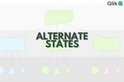
In Qlik Sense, an Alternate State is essentially a parallel set of selections that are independent of the default selections. This means that you can apply different filter conditions (selections) to different visualizations on the same sheet without those selections affecting each other. By doing so, you can easily compare different data subsets or scenarios side by side. (Ref: Discover Advanced Visualization & Analytics in Qlik Sense)
For instance, you can compare the sales of two different years or see the effect of a marketing campaign by applying one state to one visualization and another state to a different one, all in the same sheet. This provides a dynamic and interactive way to perform comparative analysis within your dashboards.
How to Set Up Alternate States in Qlik Sense
To start using Alternate States in Qlik Sense, follow these steps:
1. Enable Alternate States
In Qlik Sense, Alternate States are turned off by default. To enable them:
- Go to App Overview.
- Under App Options, select Alternate States.
- Check the box to enable Alternate States and name your alternate states (e.g., “State A”, “State B”).
2. Assign Alternate States to Visualizations
Once Alternate States are enabled, you can assign different states to specific visualizations on your sheet.
- In the properties panel of the visualization, find the Alternate State dropdown menu.
- Select the desired state (either the default state or a custom alternate state you created).
- Repeat this process for each visualization that needs to be in a different state.
3. Apply Selections to Each State
Now, each visualization in your dashboard can be controlled independently by applying selections (filters) to them. When you select data points in one visualization, it won’t affect other visualizations that are in a different alternate state.
Practical Use Cases for Alternate States
1. Comparing Time Periods
A classic use case for Alternate States is comparing data from different time periods, such as year-over-year (YoY) analysis or before-and-after comparisons for a specific event.

Example:
You can create two alternate states: one for the current year and one for the previous year. Then, you can apply these states to two separate visualizations (e.g., bar charts or line graphs) and compare sales performance across the two years side by side.
Best Practice: Use line charts or bar charts to track trends over time, such as comparing monthly revenue or customer acquisition data for the two states.
2. A/B Testing Analysis
Alternate States are also extremely useful for A/B testing, where you compare the performance of two different versions of a product, campaign, or user experience.
Example:
You can assign one state to represent Version A (e.g., control group data) and another state to represent Version B (e.g., test group data). By applying each state to its respective visualization, you can easily compare metrics like conversion rates, user engagement, or sales between the two versions.
Best Practice: Use scatter plots or heatmaps to visualize the differences in performance across both versions of the experiment.
3. Segment Analysis
If you want to compare the performance of different customer segments or sales regions, Alternate States allow you to quickly isolate and analyze distinct subsets of your data.
Example:
You can assign one state to Region A and another state to Region B. By applying these states to separate visualizations, you can compare the performance of these regions on the same dashboard, helping you identify regional trends, sales disparities, or customer behavior variations.
Best Practice: Use pie charts or stacked bar charts to show the distribution of sales or market share across different regions or customer groups.
4. Product Comparison
For businesses with multiple products or services, comparing the performance of different products or categories is often necessary. Alternate States make this process straightforward.
Example:
You can set up alternate states for Product A and Product B and apply them to different visualizations. This way, you can see how the sales performance, customer ratings, or profitability of each product compares over time or across different metrics.
Best Practice: Utilize bar charts or waterfall charts to track product performance by revenue or profit margin, making it easier to visualize the impact of each product on overall business performance.
Advanced Tips for Using Alternate States in Qlik Sense
1. Use the “Show All” Option
In some cases, you may want to compare the total dataset with your alternate states. Qlik Sense offers a Show All option for visualizations, which allows you to see the full dataset while still applying alternate states for comparison.
2. Apply Set Analysis Within Alternate States
You can also use Set Analysis within Alternate States for more complex filtering. For example, you can calculate the sum of sales for State A for the year 2023 and compare it against the sales for State B using different conditions.
3. Combine Alternate States with Other Qlik Sense Features
Alternate States can be combined with other advanced features in Qlik Sense, such as Bookmarks and Dynamic Charts, to create even more powerful comparative analyses. For instance, you can bookmark a particular selection in an alternate state and return to it later for deeper analysis.
Best Practices for Using Alternate States
- Keep it Simple: While Alternate State are powerful, using too many of them in a single dashboard can be overwhelming. Stick to the most relevant comparisons to avoid confusion.
- Clearly Label States: Clearly label your alternate states (e.g., “Region A”, “Year 2023”) so users understand the context of each comparison.
- Optimize for Performance: Alternate States can increase the complexity of your app, so ensure that your visualizations are optimized for performance, especially if you are working with large datasets.
Final Thoughts
Alternate State in Qlik Sense are a game-changer when it comes to conducting advanced comparative analysis. By allowing you to independently apply selections to different visualizations, this feature makes it easy to compare multiple subsets of data side by side. Whether you’re analyzing time periods, A/B test results, customer segments, or product performance, Alternate State provide a dynamic and interactive way to unlock deeper insights from your data.
With these capabilities, you can create rich, interactive dashboards that empower decision-makers to draw meaningful comparisons and make informed, data-driven decisions. By following the best practices and tips outlined in this post, you’ll be able to fully leverage Alternate State in your Qlik Sense applications and take your data analysis to the next level.

