For Every Business data-driven world, businesses rely on analytics platforms like Qlik Sense to visualize complex datasets and extract actionable insights. While Qlik Sense offers a rich library of built-in charts and visualization tools, there are situations where standard options might not fully meet unique business requirements. This is where Qlik custom charts and widgets come into play.
Custom visualizations provide greater flexibility, allowing users to tailor their dashboards to specific needs, enhance user experience, and improve data interpretation. In this blog post, we’ll explore the key aspects of designing Qlik custom charts and widgets in Qlik, focusing on how they can elevate your data visualization strategy.
Why Create Custom Visualizations in Qlik?
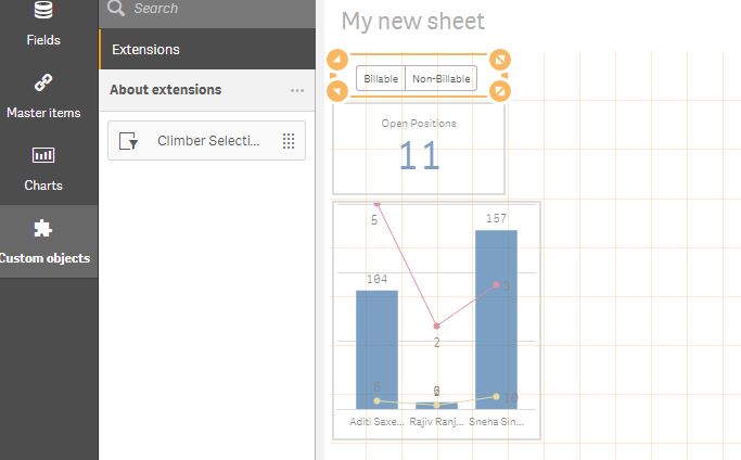
Custom visualizations in Qlik Sense empower users to go beyond default chart types and design tailored solutions for specific business challenges. Here are some compelling reasons to consider building custom visualizations: (Ref: Fundamentals of Qlik Sense Extensions)
1. Address Unique Business Requirements
Off-the-shelf visualizations may not always align with the complexity or specificity of your data. Custom visualizations allow you to design charts that match your organization’s unique needs, whether it’s a specialized industry metric, financial KPI, or operational dashboard.
2. Enhance User Experience
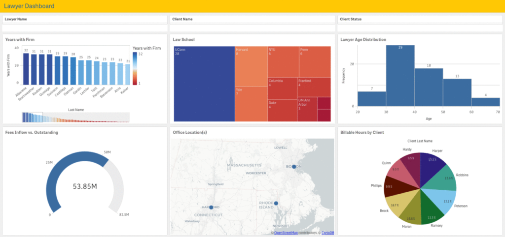
Custom widgets and charts can improve the user experience by offering more intuitive and interactive ways to explore data. Whether it’s a dynamic heat map, an advanced scatter plot, or a custom gauge, these visualizations can make data exploration more engaging.
3. Maintain Consistent Branding
Custom visualizations provide the flexibility to align with your organization’s branding and design guidelines. You can modify colors, fonts, and layouts to ensure your Qlik applications are consistent with your company’s visual identity.
4. Unlock New Insights
Innovative custom visualizations can reveal patterns, trends, and relationships in your data that might be overlooked with traditional charts. This can lead to better decision-making and a deeper understanding of your business operations.
Key Components of Building Custom Visualizations
Creating custom visualizations in Qlik Sense involves several key components, including design, interactivity, and data integration. Let’s explore each of these in more detail.
Designing the Visualization

The first step in building a Qlik custom chart or widget is to design its layout and appearance. This typically involves:
- HTML: For structuring the visualization.
- CSS: For styling and making the visualization visually appealing.
- JavaScript: For adding interactivity and controlling how the visualization behaves.
A well-designed custom visualization should be clean, easy to understand, and responsive across different devices.
Leveraging Qlik APIs
Qlik Sense provides a range of APIs, such as the Visualization API and Capability API, that allow developers to interact with data and build custom visualizations. These APIs enable you to:
- Retrieve data from Qlik’s associative engine.
- Bind data to your custom visualization.
- Add dynamic behavior, such as filtering, sorting, or drill-down interactions.
By leveraging these APIs, you can ensure that your Qlik custom charts visualizations are fully integrated with the rest of your Qlik Sense application.
Ensuring Interactivity
Interactivity is a critical aspect of any visualization. Qlik Custom charts and widgets should allow users to interact with the data in meaningful ways, such as:
- Drill-downs: Enable users to explore data hierarchies by clicking on specific elements.
- Dynamic Filters: Allow users to filter data directly within the visualization.
- Tooltips: Provide additional context or information when users hover over elements.
The goal is to make the visualization not just a static display of data but an interactive tool that facilitates deeper exploration.
Testing and Optimization
Once the custom charts visualization is built, it’s essential to test it thoroughly to ensure it performs well across different scenarios. Key considerations include:
- Performance: Large datasets can impact the performance of Qlik custom charts visualizations. Optimize your code to handle data efficiently and reduce rendering times.
- Compatibility: Test the visualization across different devices and browsers to ensure it is responsive and works seamlessly.
- User Feedback: Gather feedback from end-users to identify areas for improvement and ensure the visualization meets their needs.
Examples of Custom Visualizations in Qlik
Here are some examples of Qlik custom charts visualizations that can be built in Qlik Sense to address specific business needs:
1. Dynamic Heat Maps

Heat maps are excellent for visualizing large datasets and identifying patterns or anomalies. A Qlik custom charts heat map can be designed to dynamically adjust colors, scales, and thresholds based on user interactions.
2. Advanced Scatter Plots
Standard scatter plots are useful for visualizing relationships between two variables, but a custom scatter plot can incorporate additional dimensions, such as color and size, to represent more complex data relationships.
3. Interactive Gauges and KPIs
Custom gauges and KPIs can display real-time performance metrics in a visually engaging way. You can design them to change colors, animate transitions, or trigger alerts based on predefined thresholds.
4. Network Graphs
For organizations that need to visualize complex relationships between entities (e.g., social networks, supply chains), a custom network graph can provide a clearer picture of connections and dependencies.
Best Practices for Building Custom Visualizations in Qlik
When designing Qlik custom charts and widgets, it’s essential to follow best practices to ensure they are effective and user-friendly:
- Focus on Usability: Keep the user experience in mind and ensure that your visualizations are intuitive and easy to navigate.
- Prioritize Performance: Optimize your code to handle large datasets efficiently and minimize loading times.
- Maintain Consistency: Ensure that Qlik custom visualizations align with your organization’s branding and design standards.
- Document Your Code: Proper documentation makes it easier for other developers to understand, maintain, and enhance your Qlik custom visualizations.
- Engage Users: Involve end-users in the design process to gather feedback and ensure the final product meets their needs.
Final Thoughts
Qlik Custom charts visualizations in Qlik Sense offer a powerful way to tailor your analytics environment to meet unique business needs. By designing Qlik custom charts and widgets, you can enhance data exploration, improve user experience, and unlock new insights that drive better decision-making.
Whether you’re building a simple Qlik custom chart or a complex interactive dashboard, the flexibility and power of Qlik Sense extensions make it possible to Qlik create custom charts that truly stand out. Start exploring the possibilities of Qlik custom charts visualizations today and take your data analytics to the next level!

