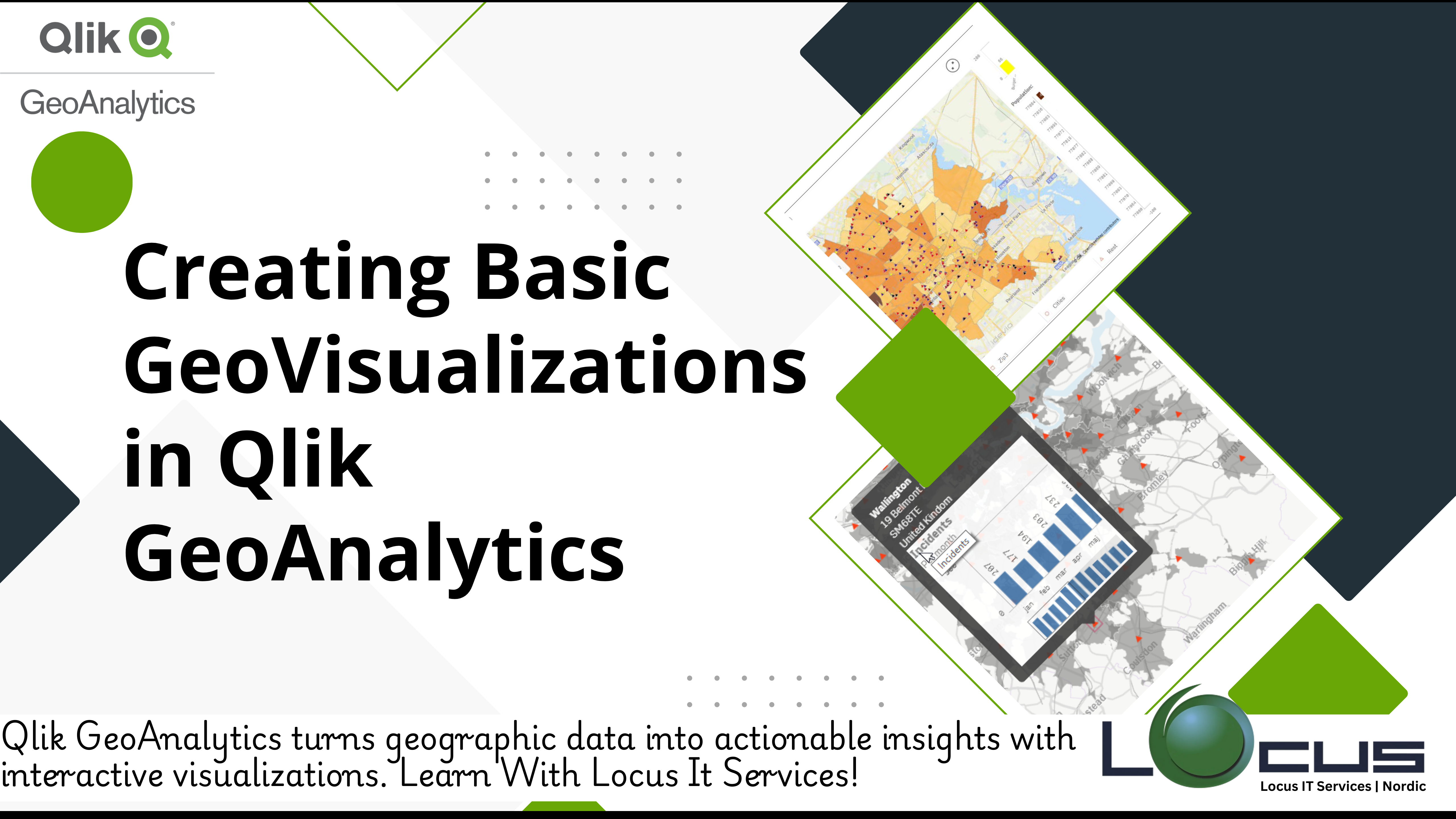
For Every Business data-driven world, businesses are increasingly looking to leverage location-based insights to gain a competitive edge. Whether it’s optimizing supply chains, enhancing customer experiences, or identifying new market opportunities, geographic data plays a critical role in decision-making. Qlik GeoAnalytics, with its powerful mapping and visualization capabilities, enables users to easily transform spatial data into interactive and insightful geo-visualizations.
In this blog post, we’ll take you through the process of creating basic GeoVisualizations in Qlik, from understanding the fundamentals of geographic data to building maps, adding layers, and customizing visual elements.
What Are GeoVisualizations?
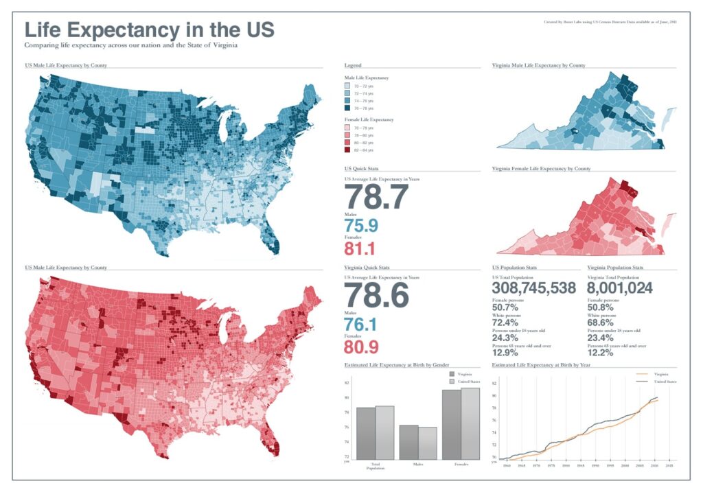
GeoVisualizations use geographic data and mapping tools to display location-based insights. These types of visualizations typically utilize maps, charts, and layers to show the relationship between geographic locations and other data attributes, such as sales, traffic, population density, and more. (Ref: Qlik and IoT Integration)
With Qlik GeoAnalytics, you can build a range of geo-visuals, from simple maps displaying locations to complex interactive dashboards with heatmaps, choropleth maps, and more.
Step 1: Preparing Your Geographic Data
Before you can create GeoVisualizations, it’s essential to have accurate geographic data. In Qlik, geographic data can come in many forms, including:
- Coordinates (Latitude and Longitude): The most common form of geographic data for pinpointing locations on a map.
- Geocoded Addresses: Street addresses can be converted into geographic coordinates.
- Region-Based Data: Information about countries, states, cities, or postal codes that can be mapped to predefined boundaries.
The first step is to ensure your data is in a format that Qlik GeoAnalytics can use. If you’re working with addresses, you can use Qlik’s geocoding capabilities to convert these into latitude and longitude values for mapping. If you’re dealing with regional data, make sure you have the appropriate geospatial identifiers (such as country codes, postal codes, or region names) to ensure accurate mapping.
Step 2: Adding Your Geographic Data to Qlik
Once your geographic data is ready, it’s time to load it into Qlik. You can load geographic data through Qlik’s Data Load Editor or directly via the Qlik Sense interface.
- Load Your Data: In the Data Load Editor, connect your data source (e.g., CSV file, Excel sheet, database, etc.) and ensure the geographic fields (latitude, longitude, or regional identifiers) are mapped correctly.
- Create a GeoAnalytics Connection: Qlik GeoAnalytics allows you to connect to a wide variety of external data sources, including online geospatial databases, which can enrich your data with boundaries, road networks, or demographic information.
- Load and Associate the Data: Once the data is loaded, associate it with any other datasets you’re working with, such as sales data, inventory, or customer information.
Step 3: Creating a Basic GeoMap
Once your data is loaded, it’s time to create a basic geo-map to visualize your locations. Follow these steps:

- Create a New Sheet: In Qlik Sense, open a new sheet or dashboard where you want to display the map.
- Add a Map Object: Click on the “Add Object” button and select the “Map” GeoVisualizations option. This will create a blank map on your sheet.
- Define the Geographic Data: In the map’s properties panel, you will need to define the geographic data. If you are working with coordinates (latitude and longitude), map these fields to the appropriate layers. If you are working with region-based data (e.g., cities or postal codes), map those to the corresponding geographic layers.
- Customize Your Map: You can add multiple layers to your map, such as:
- Point Layer: To display individual locations (e.g., store locations, delivery points).
- Polygon Layer: To show boundaries of regions, states, or countries.
- Heatmap Layer: To represent the intensity of data points, such as sales volume or customer traffic, with color gradients.
- Configure the Map Settings: Customize your map’s appearance by adjusting the zoom level, map style (street, satellite, terrain), and other map settings such as color schemes or the size of the markers.
Step 4: Adding Interactive Features
Qlik allows you to make your GeoVisualizations interactive, which enhances user engagement and insight exploration. Here are some ways to make your map more interactive:
- Filters: Add filters for different dimensions, such as product categories, time periods, or regions. This allows users to drill down into specific segments of the data and see the map update in real-time.
- Hover and Click Actions: Set up hover actions to display more information when users hover over a data point (such as store name, sales figures, or customer details). You can also set up click actions to drill down into more detailed data.
- Layer Visibility: Allow users to toggle map layers on or off, such as showing sales data versus customer locations or switching between different types of GeoVisualizations (heatmaps, point maps, etc.).
Step 5: Customize the Map’s Aesthetics
To make your geovisualizations both functional and visually appealing, consider the following customization options:
- Marker Styles: Change the appearance of the markers on the map. You can choose between different shapes (e.g., circles, squares) and sizes depending on the importance of the data points.
- Map Themes: Qlik GeoAnalytics provides several map themes, including light, dark, or custom options, to fit your organization’s branding and presentation preferences.
- Color Schemes: Use color gradients to represent values, such as varying shades of blue or red for different ranges of sales performance or customer activity.
Step 6: Save and Share Your GeoDashboard
Once your map is ready, save the sheet and share it with your team or organization. Qlik Sense allows you to publish and share dashboards, granting access to interactive maps through the Qlik Hub. GeoVisualizations Depending on the user’s permissions, they can filter, drill down, or interact with the map to explore insights relevant to their role.
Key Takeaways
Creating basic GeoVisualizations in Qlik is straightforward and highly customizable. By following the steps outlined above, businesses can begin to unlock the power of geographic data to gain insights and make data-driven decisions. Here are some key benefits of geo-visualization in Qlik:
- Enhanced Insight: Understand geographic patterns and relationships in your data that aren’t always visible through traditional visualizations.
- Improved Decision-Making: Use maps to make strategic decisions related to store locations, customer segmentation, and logistics optimization.
- User Engagement: Provide interactive and customizable dashboards that allow users to explore the data and uncover insights on their own.
By incorporating basic GeoVisualizations into your Qlik Sense environment, you can gain a deeper understanding of your data, optimize your operations, and drive better business outcomes.

