

For Every Business, Data visualization plays a crucial role in data science, helping to communicate complex patterns and trends clearly and effectively. Among the many tools available for ggplot2 Visualizations in R stands out as one of the most powerful and flexible libraries. It is built on the Grammar of Graphics, which allows users to create complex, customized plots by layering components.
In this blog post, we will dive into some advanced techniques for creating sophisticated ggplot2 Visualizations. By the end, you will be equipped to tackle more complex data visualizations and communicate deeper insights with ease.

1. Creating Multi-Layered Visualizations
One of the greatest strengths of ggplot2 Visualizations is its ability to layer different elements on top of each other to build complex plots. Let’s explore how you can create multi-layered visualizations to tell a more detailed story with your data.
Example: Scatter Plot with Multiple Layers
Imagine you are visualizing car data, and you want to show the relationship between horsepower (hp) and miles per gallon (mpg) but also include a regression line and color the points based on the number of cylinders (cyl).
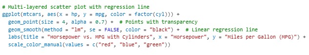
In this example:
geom_point()creates the scatter plot, whilegeom_smooth()adds a regression line.color = factor(cyl)changes the color of the points based on the number of cylinders, helping highlight trends across different groups.
This approach helps convey the main trend while also providing an additional layer of information through color coding. (Ref: Model Performance in Java: Metrics and Techniques)
2. Faceting for Grouped Visualizations
Faceting is an incredibly useful feature in ggplot2 Visualizations for creating small multiples or subplots, where the data is split into subsets based on a factor, and a separate plot is generated for each subset. Faceting can be especially helpful when you want to explore how different groups within your dataset behave differently.
Example: Faceting by Categories
Let’s create a plot that shows the distribution of mpg (miles per gallon) across different categories of cars (i.e., cyl for number of cylinders) using faceting.
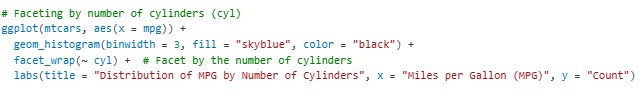
facet_wrap(~ cyl)generates separate histograms for each value ofcyl(number of cylinders), allowing you to compare distributions across categories.- Faceting can be used with many different types of plots, including scatter plots, bar plots, and more.
3. Customizing Themes for Professional Visuals
Themes in ggplot2 Visualizations allow you to customize the overall look of your plots, from fonts to background colors. This is particularly useful when you are creating visualizations for presentations or publications, where aesthetic consistency is key.
Example: Applying Custom Themes
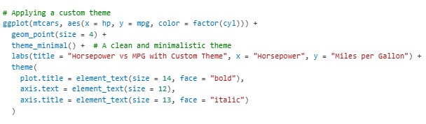
In this example:
theme_minimal()provides a clean background that makes the data stand out.theme()allows further customization, such as adjusting text size and font style for the title and axis labels.
By adjusting the theme elements, ggplot2 Visualizations you can create visually appealing and polished plots that align with your presentation or publication needs.
4. Creating Interactive Plots with ggplot2 and Plotly
Although ggplot2 is great for static visualizations, you can easily make your plots interactive by integrating ggplot2 with plotly. ggplot2 Visualizations This is helpful for web applications, dashboards, or any scenario where you want users to explore the data interactively.
Example: Converting ggplot2 to Plotly
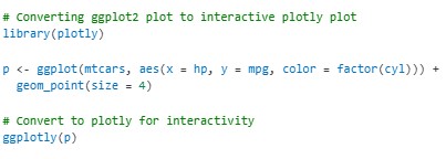
Once you convert your ggplot2 plot to plotly, the resulting plot will allow users to hover, zoom, and pan, providing a more interactive experience.
5. Heatmaps for Visualizing Correlation
Heatmaps are a great way to visualize the correlation between variables, especially when dealing with large datasets. ggplot2 Visualizations allows you to create heatmaps that clearly show relationships in the form of color-coded grids.
Example: Heatmap of Correlation Matrix
Let’s visualize the correlation matrix of the mtcars dataset using a heatmap.
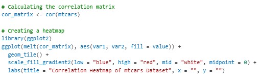
Here:
geom_tile()is used to create the tiles of the heatmap.scale_fill_gradient2()customizes the color scale, with blue representing negative correlations, red representing positive correlations, and white representing no correlation.
Heatmaps provide a visually effective way to understand the relationships between multiple variables at once.
6. Creating 3D Plots
For more complex datasets, 3D plots can offer a unique perspective, especially when visualizing relationships between three continuous variables. While ggplot2 doesn’t natively support 3D plots, you can use the plotly library to create interactive 3D plots based on ggplot2 data.
Example: 3D Scatter Plot
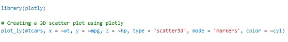
Here, scatter3d creates a 3D scatter plot with points colored by the number of cylinders. Users can rotate and zoom into the plot for a better understanding of the data.
Final Thoughts
Advanced ggplot2 visualizations can take your data analysis to the next level, allowing you to create compelling, informative, and interactive plots that convey insights effectively. By mastering concepts like layering, faceting, custom themes, and integrating with other libraries like plotly, you can create visualizations that tell a powerful data story.
Whether you’re analyzing car performance, visualizing complex relationships, or presenting findings in a polished manner, ggplot2 offers the flexibility and depth you need to visualize your data in creative and impactful ways. (Ref: Locus IT Services)