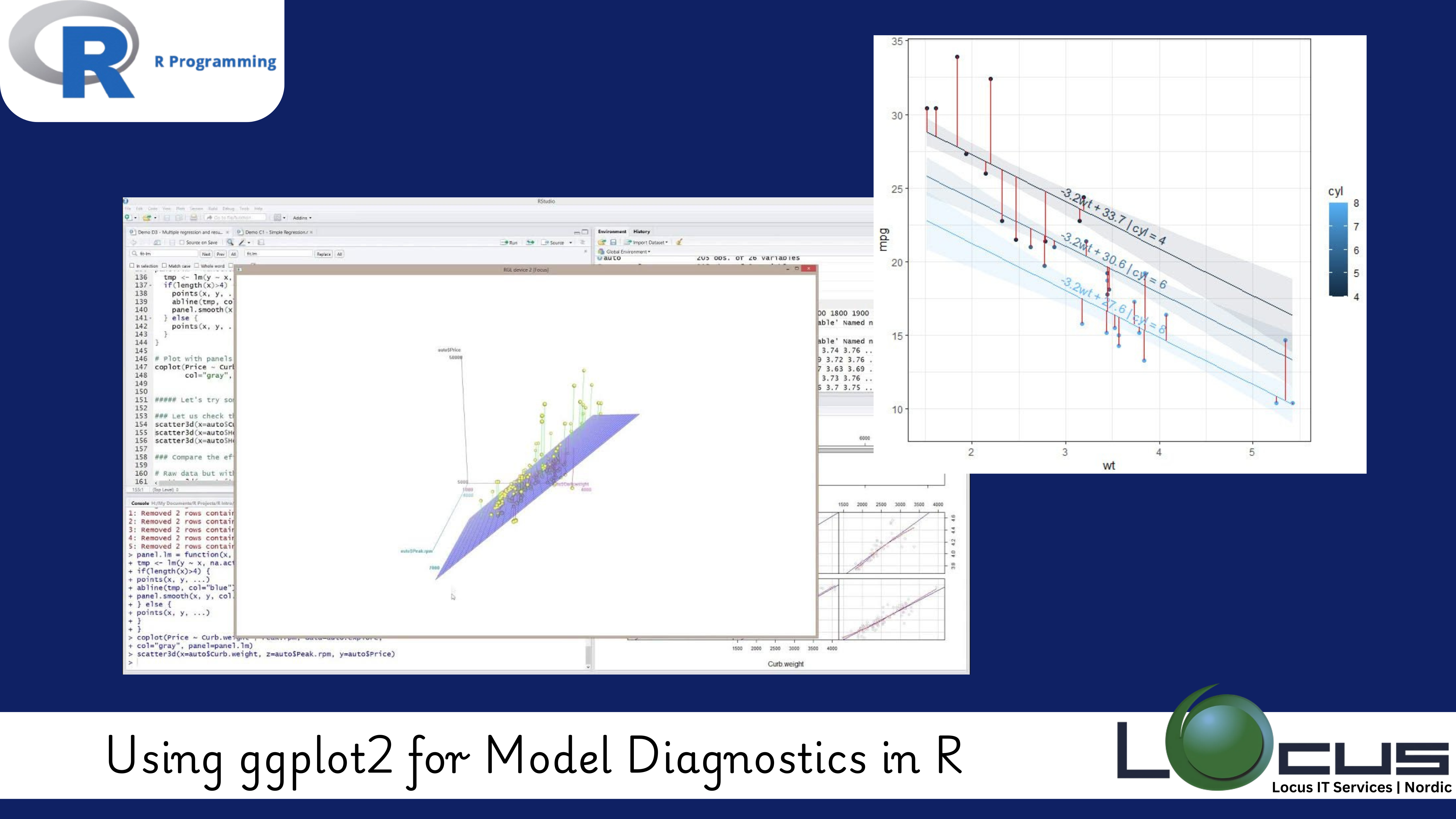
For Every Business, When building predictive models, ensuring that the model is well-calibrated and reliable is just as important as the model’s ability to make accurate predictions. Model Diagnostics in R help in evaluating the assumptions made during model development, identifying any potential issues, and fine-tuning the model for optimal performance. One of the most powerful tools in R for visualizing model diagnostics is ggplot2—a versatile and highly customizable plotting system.
In this blog post, we will explore how to use ggplot2 for model diagnostics in R. From residual analysis to visualizing model assumptions, ggplot2 offers a rich set of features to help you interpret your model’s performance. (Ref: Integrating R with Big Data Tools: Large-Scale Analytics)
What is Model Diagnostics?
Model Diagnostics in R are techniques used to evaluate how well a statistical model fits the data. They help in:
- Identifying patterns or trends that the model failed to capture.
- Checking if the model assumptions (e.g., homoscedasticity, normality) hold.
- Diagnosing problems such as outliers, multicollinearity, or autocorrelation.
- Providing insights into potential improvements for the model.
Common types of diagnostics include:
- Residual analysis: Examining the residuals (errors) of the model to check if they behave as expected.
- Check for normality: Verifying if the residuals follow a normal distribution.
- Assessing heteroscedasticity: Ensuring that the residuals have constant variance.
- Leverage and influence: Identifying data points that have a disproportionate impact on the model.
Using ggplot2 for Residual Diagnostics
Residual plots are essential for diagnosing whether the assumptions of the model hold. ggplot2 provides a straightforward way to create these plots, allowing you to quickly assess whether the residuals exhibit any patterns.
1. Residuals vs Fitted Plot
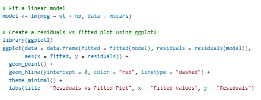
One of the most common diagnostic plots is the Residuals vs Fitted Plot. It helps check if the residuals exhibit homoscedasticity (constant variance) and whether they follow a random pattern. Ideally, the residuals should be randomly scattered around zero without any discernible trend.

In the plot:
- The horizontal red line represents zero residuals.
- A random scatter of points around the red line indicates that the model’s assumptions hold.
- Patterns, such as funnel shapes or trends, could suggest heteroscedasticity or other issues.
2. Q-Q Plot for Normality
A Q-Q (Quantile-Quantile) Plot helps check if the residuals are normally distributed. In a Q-Q plot, if the residuals follow a straight line, it suggests that the residuals are approximately normally distributed, which is an assumption for many statistical models.

- The plot compares the quantiles of the residuals to the theoretical quantiles of a normal distribution.
- A straight line indicates that the residuals are approximately normal.
- Significant deviations from the line can suggest non-normality, such as skewness or kurtosis.
3. Scale-Location Plot (Spread-Location Plot)
The Scale-Location Plot is another diagnostic plot that helps assess homoscedasticity. It shows if residuals have constant variance across fitted values. Ideally, the residuals should be evenly spread across the range of fitted values.

- A random spread of points indicates homoscedasticity (constant variance).
- Patterns or trends in this plot can indicate heteroscedasticity, where the variance of residuals changes with fitted values.
Advanced ggplot2 Diagnostics: Identifying Outliers and Leverage
Beyond residual diagnostics, ggplot2 can also help identify outliers and influential points that might disproportionately affect your model. Model Diagnostics in R These are data points that are far from the center of the data distribution and have a high leverage in determining the model’s parameters.
1. Cook’s Distance Plot
Cook’s Distance is a measure of the influence of each data point on the regression model. Points with high Cook’s Distance may be outliers or influential observations that disproportionately affect the model’s fit.

- Points with large Cook’s Distance indicate potentially influential data points.
- These points should be examined more closely to see if they are genuine or if they are outliers that need to be handled differently.
2. Leverage vs Standardized Residuals Plot
Another way to detect influential points is by plotting leverage against standardized residuals. High leverage points are those with extreme predictor values, Model Diagnostics in R while large residuals indicate poor model fit for certain observations.

- High leverage points are those far to the right on the x-axis, and large residuals are far from zero on the y-axis.
- Points in the upper right quadrant of this plot may require further attention as they can heavily influence the model’s results.
Final Thoughts
ggplot2 is an incredibly powerful tool for visualizing model diagnostics in R. By leveraging ggplot2’s plotting capabilities, you can gain valuable insights into how well your model fits the data, check for violations of assumptions, and identify any outliers or influential points. These diagnostics help you refine and optimize your model, ensuring that it performs well and provides reliable predictions.
Whether you’re building a linear regression model, a more complex machine learning model, or anything in between, incorporating ggplot2 Model Diagnostics in R into your workflow is an essential step for creating robust, accurate models. (Ref: Locus IT Services)


