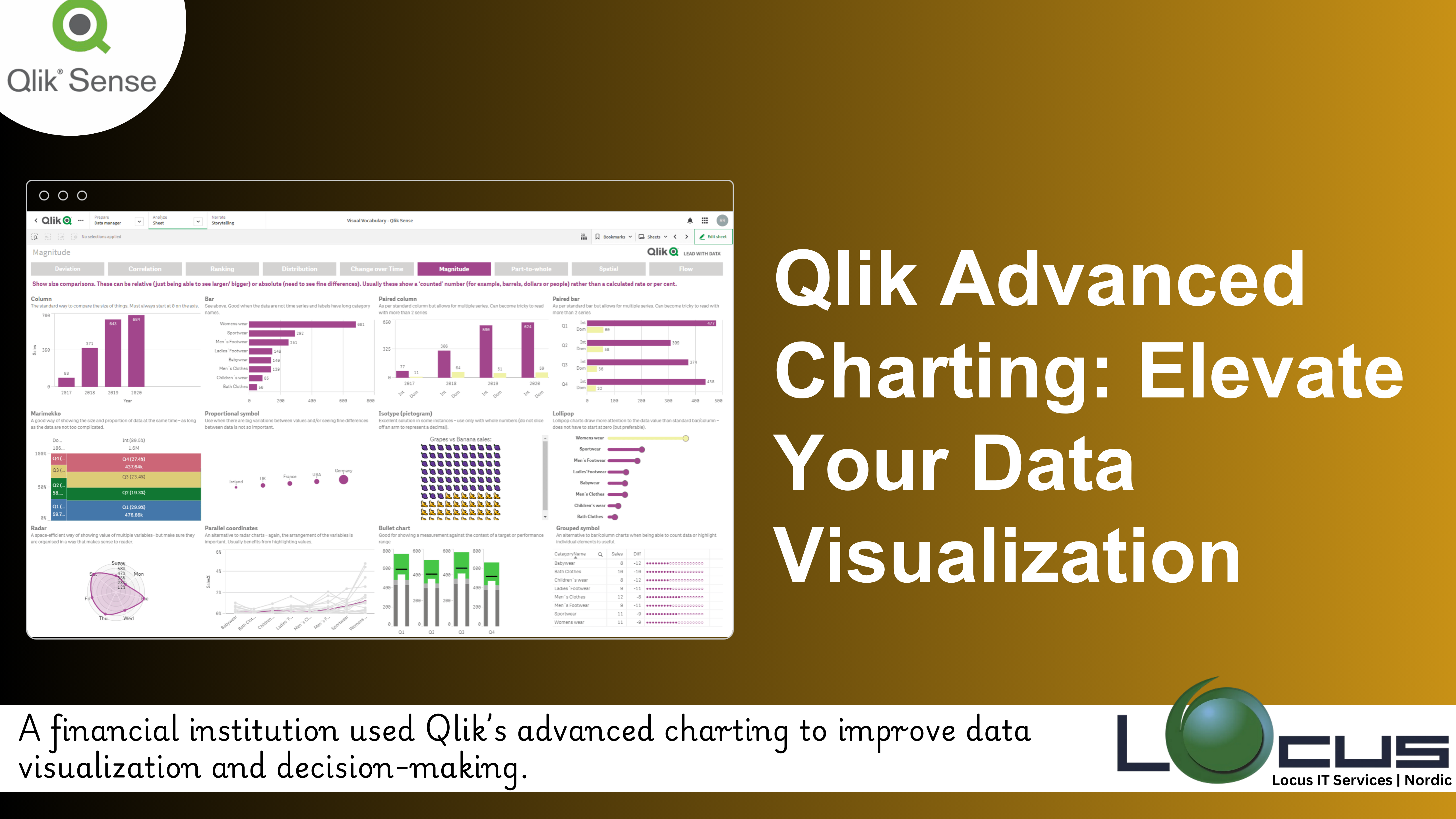
Qlik Sense is renowned for its ability to transform raw data into actionable insights through dynamic and interactive visualizations. While its standard charting capabilities are robust, Qlik Advanced Charting techniques can elevate your data storytelling, providing deeper insights and more engaging dashboards.
Why Qlik Advanced Charting Matters in Data Analysis:
1. Visualize Complex Data
Qlik Advanced Charting techniques allow businesses to represent multifaceted, high-dimensional data in a way that is easy to understand and interpret. Complex relationships, such as correlations between multiple variables, trends over time, or geospatial patterns, may not be obvious when displayed in basic charts. Advanced charts, like heat maps, scatter plots, radar charts, or tree maps, can make these intricate data points clearer. By leveraging such charts, businesses can uncover hidden insights that would otherwise remain obscured in traditional visualizations. Qlik Advanced Charting These insights can lead to new opportunities for growth, optimization, or risk management. (Ref: Exploring Qlik Sense Advanced Visualization Technique)
2. Tailor Dashboards to Specific Needs
Different stakeholders in a business have different needs. What an executive needs from a dashboard is likely different from what a marketing manager or data analyst would require. Qlik Advanced Charting techniques enable the creation of dashboards that are customized to meet the unique needs of these various audiences. For example, executives might prefer high-level visualizations that summarize key performance indicators (KPIs), while analysts might need detailed scatter plots to explore data at a granular level. By tailoring the visualizations to the needs of specific groups, businesses ensure that users are presented with the right data in a format that is most relevant to their role and decision-making process.
3. Drive Better Decisions
Advanced charts provide a more nuanced and sophisticated way of representing data, enabling businesses to make more informed decisions. By offering a detailed view of trends, correlations, and anomalies, advanced visualizations help decision-makers understand the underlying patterns in the data. This enhanced understanding leads to better strategic decisions, whether it’s predicting future sales trends, optimizing supply chain operations, or analyzing customer behavior. Qlik Advanced Charting provides a deeper level of insight that helps businesses stay competitive and make decisions based on data-driven evidence rather than assumptions or limited views.
Exploring Qlik Advanced Charting Techniques
1. Combo Charts

What It Is: Combo charts combine multiple chart types, such as bars and lines, into a single visualization.
Use Case: Compare two related metrics, like revenue (bars) versus profit margins (lines), to identify correlations or disparities.
Benefits:
- Overlay complementary data for better context.
- Highlight trends alongside detailed breakdowns.
2. Treemaps
What It Is: Treemaps use nested rectangles to represent hierarchical data, with size and color reflecting different metrics.
Use Case: Analyze product category sales performance across multiple regions.
Benefits:
- Reveal proportional relationships within hierarchies.
- Provide a compact and visually engaging overview of data.
3. Scatter Plots with Advanced Layering
What It Is: Scatter plots visualize relationships between two or more variables, with additional layers like trendlines or bubble sizes.
Use Case: Explore the relationship between marketing spend, customer acquisition, and revenue.
Benefits:
- Spot clusters, outliers, and correlations easily.
- Add depth with third-dimensional data points like bubble size or color coding.
4. Sankey Diagrams
What It Is: Sankey diagrams represent flows between entities, showing proportions and connections.
Use Case: Map customer journeys or analyze energy usage patterns.
Benefits:
- Highlight flow bottlenecks or inefficiencies.
- Make complex processes intuitive and visual.
5. GeoAnalytics Visualizations
What It Is: Location-based analytics using maps to combine geographical and business data.
Use Case: Visualize store performance or track deliveries across regions.
Benefits:
- Pinpoint trends and opportunities geographically.
- Incorporate advanced mapping layers for deeper spatial analysis.
Best Practices for Qlik Advanced Charting in Qlik Sense:
1. Start with the Story: Define the Insights Before Choosing a Chart Type
Before selecting a chart, Qlik Advanced Charting it’s important to understand the message or insights you want to convey. Ask yourself:
- What are the key trends or relationships you want to highlight?
- What questions are you trying to answer with the data?
- Who will be using the visualization, and what do they need to see?
By clarifying the story or insight you want to present, you can choose the most appropriate chart type. For instance, if you’re comparing multiple data points over time, a line or combo chart might be best. If you’re displaying the relationship between different variables, a scatter plot might be more effective. Understanding the “story” ensures the chart communicates the intended insight clearly.
2. Simplify Interactivity: Make It Easy for Non-Technical Users
Advanced charts can sometimes become overwhelming if they’re too complex. To maximize usability:
- Keep interactivity simple and intuitive.
- Provide clear labels, tooltips, and legends to explain what the user is viewing.
- Avoid overcomplicating the design with too many interactive elements that can confuse users.
While advanced visualizations provide rich insights, the goal is to ensure that all users—whether technical or not—can easily engage with and interpret the data. Features like drill-downs, hover actions, and interactive filters should be intuitive and not overwhelm the user.
3. Maintain Consistency: Use Consistent Color Schemes, Fonts, and Layouts
Consistency in design plays a crucial role in making the data easy to understand and visually appealing.
- Color schemes: Use a consistent color palette throughout your dashboard to avoid confusion. For example, stick to specific colors for positive and negative trends (e.g., green for growth, red for decline).
- Fonts: Use clear, readable fonts and ensure consistency in text size, especially for titles, axis labels, and legends.
- Layouts: Ensure that charts and visual elements follow a logical layout, with similar types of visualizations grouped together.
Maintaining consistency across visualizations not only improves readability but also creates a cohesive experience for the user. When users see similar elements styled uniformly, it helps them make quicker connections and better understand the data.
4. Leverage Extensions: Access Custom Visualizations for More Flexibility
While Qlik Advanced Charting offers a wide variety of built-in chart types, extensions available on Qlik Branch and other repositories can provide additional flexibility and customization.
- Custom visualizations: Extensions allow you to use more specialized charts, such as advanced heat maps, hierarchical treemaps, or geospatial charts.
- Tailored functionality: If your organization needs a specific chart type or interaction that’s not available natively in Qlik Advanced Charting, using extensions can help fill that gap.
- Community-driven innovations: Extensions from Qlik Branch are often community-driven, providing unique solutions that might not yet be part of Qlik Sense’s core offering.
By leveraging extensions, you can enhance the capabilities of your visualizations, providing more tailored and dynamic charts that meet the specific needs of your business.
Driving Decisions with Advanced Visualizations
Qlik Advanced Charting empowers users to uncover patterns, trends, and opportunities that might be missed with basic charts. By applying techniques such as combo charts, Sankey diagrams, and GeoAnalytics, organizations can turn complex datasets into visually compelling stories that guide data-driven strategies.
Final Thoughts
As businesses navigate increasingly data-driven environments, leveraging Qlik Advanced Charting techniques in Qlik Sense can be a game-changer. These visualizations not only enhance the clarity of insights but also engage users across the organization, fostering better collaboration and decision-making. Start exploring these techniques today and unlock the full potential of your data.


