For Every Business, In the world of data science, one of the most effective ways to communicate insights is through visualization. Whether it’s understanding trends, making predictions, or explaining complex concepts, R for Data Visualization allows you to present data in a more intuitive and engaging way. Among the many tools available for data visualization, R stands out as one of the most powerful and widely used programming languages for data analysis and visualization.
R has a robust ecosystem of libraries and tools designed specifically for visualizing data. Its flexibility, extensive package support, and integration with powerful libraries like ggplot2 make it a popular choice for analysts, scientists, and researchers.
In this blog post, we’ll introduce R as a tool for data visualization, explore its key features, and highlight why it’s an excellent choice for anyone looking to make the most out of their data. (Ref: Case Studies: Optimizing R Scripts for Better Performance)
Why Choose R for Data Visualization?
R is a language built for statistics and data analysis, and its extensive library ecosystem makes it highly suitable for visualizing complex datasets. Here are a few reasons why R is ideal for creating effective R for Data Visualization:
- Comprehensive Libraries: R comes with a variety of libraries for different visualization needs. From basic charts to complex interactive visualizations, packages like ggplot2, plotly, and lattice offer a wide array of options.
- Statistical Capabilities: R’s foundation in statistics makes it easier to create visualizations that are not only visually appealing but also statistically robust. You can quickly generate plots that convey deeper insights from data.
- Flexibility: R for Data Visualization allows you to customize every aspect of a plot. From adjusting colors and themes to modifying axis labels, R provides full control over the look and feel of your visualizations.
- Interactivity: With the integration of libraries like plotly and shiny, R also allows for interactive visualizations that are great for dashboards and web applications.
- Reproducibility: R scripts are highly reproducible, meaning that you can easily re-run analysis with different datasets and share your R for Data Visualization markdown reports or Shiny apps.
Getting Started with Data Visualization in R
Let’s begin by exploring some of the basics of using R for data visualization. First, you’ll need to install R and some key packages. The two primary packages we will focus on are:
- ggplot2: The most popular package for creating high-quality visualizations in R, based on the Grammar of Graphics.
- plotly: A package for creating interactive plots.
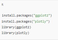
You can install and load these packages into R as follows:

Once you have the necessary packages installed, it’s time to dive into creating some visualizations!
Basic Plotting in R: ggplot2
The ggplot2 package is part of the tidyverse family and is one of the most widely used tools for data visualization in R. The power of ggplot2 comes from its ability to build plots based on layers, making it both flexible and intuitive.
Creating a Simple Plot
Let’s start by creating a simple scatter plot using the built-in mtcars dataset. This dataset contains information about various car models, such as miles per gallon (mpg), number of cylinders, horsepower, and more.

Here, we specify:
aes(x = wt, y = mpg): The aesthetic mapping of the x and y variables.geom_point(): The type of plot (a scatter plot).labs(): Customizing the title and axis labels.
This will produce a basic scatter plot, showing the relationship between car weight and miles per gallon.
Adding Layers and Customizations
ggplot2 is built on the concept of layering, where different plot elements (like points, lines, or text) can be added to the plot to enhance its meaning. For example, let’s add a regression line to the scatter plot:

In this example:
geom_smooth(method = "lm", se = FALSE, color = "blue")adds a linear regression line to the plot, without the shaded confidence interval.
Interactive Data Visualizations with Plotly
While ggplot2 creates static plots, plotly allows you to add interactivity to your plots. R for Data Visualization This is particularly useful when you want to explore data in an interactive environment, such as a dashboard or web application.
To create an interactive version of the scatter plot using plotly, you can convert the ggplot2 object to a plotly object as follows:

With plotly, the resulting plot will be interactive, allowing you to zoom, pan, and hover over data points to see their values.
Final Thoughts
R for Data Visualization, and with packages like ggplot2 and plotly, it becomes even more robust and flexible. Whether you are looking to create simple charts or interactive dashboards, R for Data Visualization provides a rich ecosystem for all your visualization needs.
By mastering these visualization techniques, you can not only present data in an easily digestible format but also uncover insights that may otherwise remain hidden. R for Data Visualization is an essential skill for any data scientist or analyst, and R gives you the tools to excel in this area.
Start experimenting with ggplot2 and plotly, and unlock the potential of your data through meaningful visualizations! (Ref: Locus IT Services)


