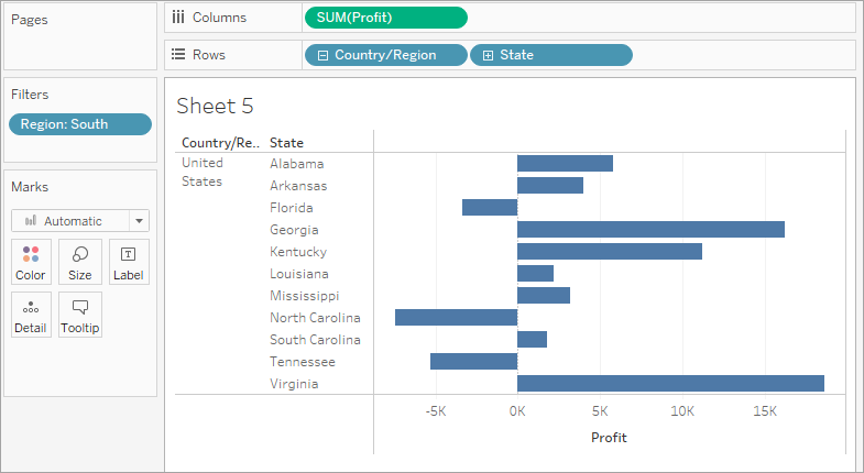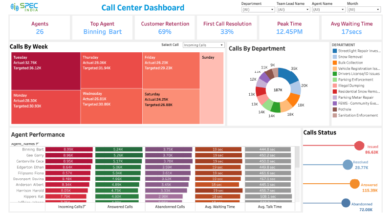
Tableau is one of the most powerful data visualization tools, allowing users to create insightful and interactive dashboards for data analysis. One of the most popular features that makes Tableau stand out is the ability to create Tableau drill-down dashboards. Drill-downs enable users to explore data at various levels of detail, from high-level summaries to more granular information, providing an interactive experience that enhances data exploration and decision-making.
In this blog, we will dive into the concept of Tableau drill-down dashboards, explore their benefits, and walk you through the process of creating them, complete with best practices and tips to ensure you are maximizing Tableau’s capabilities.
What is a Tableau Drill-Down Dashboards?

A drill-down dashboard allows users to click on a specific data point (such as a bar, line, or any other visualization) to explore more detailed data related to that point. For example, imagine you have a dashboard that shows sales by region. By clicking on a region, you could drill down into sales by country, then further drill down into sales by city or individual salespersons. This hierarchy of data allows for an interactive exploration of your dataset.
In Tableau, drill-down functionality can be applied to a variety of visualizations, including bar charts, maps, and scatter plots. The core principle is to organize data hierarchically and provide users with the ability to explore the data at different levels of granularity. (Ref: Tableau Server Techniques for Customizing Views and Optimizing Permissions)
Benefits of Using Tableau Drill-Down Dashboards
1. Enhanced Data Exploration
Drill-downs allow users to dig deeper into data without overwhelming them with too much information upfront. By starting with high-level summaries and enabling deeper exploration as needed, tableau drill-down dashboards help users understand the data from different perspectives.
2. Interactive User Experience
One of Tableau’s key strengths is interactivity. Tableau Drill-down dashboards provide a dynamic user experience by letting users click on a data point to reveal more details. This interactivity makes the dashboards engaging and ensures that the audience can discover trends, patterns, and insights on their own.
3. Better Decision Making
By providing a more granular view of the data, Tableau drill-down dashboards enable better decision-making. For example, business leaders can identify which regions or product categories are underperforming and investigate further to take corrective actions.
4. Improved Data Presentation
Tableau Drill-down dashboards reduce clutter by starting with high-level summaries, showing only the most relevant data. As users drill deeper, more detailed information becomes available, keeping the dashboard clean and focused.
How to Create Tableau Drill-Down Dashboards

Step 1: Connect to Your Data
Before creating any dashboards, you need to connect Tableau to your data source. Tableau supports a wide range of data sources, including Excel, SQL, cloud databases, and many others.
- Open Tableau and select “Connect to Data.”
- Choose your data source type and load the data into Tableau.
- Make sure your dataset has hierarchical fields. For instance, you might have a field for “Region,” “Country,” and “City,” which will serve as your drill-down hierarchy.
Step 2: Create Hierarchies
To enable drill-down functionality, you need to organize your data into hierarchical levels. Tableau allows you to create hierarchies by dragging and dropping fields onto each other in the Data Pane.
- Go to the Data Pane on the left side.
- Select the fields that represent different levels of detail, such as “Region,” “Country,” and “City.”
- Right-click on one of the fields and choose Create Hierarchy. Name the hierarchy (e.g., “Geography”).
- Drag other related fields into the hierarchy, making sure they are arranged in the correct order, from high-level to low-level (Region > Country > City).
Step 3: Build the Initial View
Once you’ve set up your hierarchy, you can start building your initial view.
- Drag a field like “Sales” or “Revenue” to the Rows shelf.
- Drag the first level of your hierarchy (e.g., “Region”) to the Columns shelf.
- Tableau will automatically generate a bar chart or another visualization that displays the data at this high level.
- You can customize the chart type based on your preference. For example, you could use bar charts, pie charts, or maps to display the data effectively.
Step 4: Enable Drill-Downs Using the Hierarchy
To enable drill-downs, you need to allow users to click on a data point to reveal more detailed information.
- Drag the next level of the hierarchy (e.g., “Country”) onto the Columns or Rows shelf.
- Tableau will automatically generate a view where clicking on a region (from the “Region” field) will drill down to show sales by country within that region.
- You can repeat this process by adding further levels of your hierarchy (e.g., “City”) until you have as many levels as necessary for your analysis.
Step 5: Create an Interactive Dashboard
Now that you have your drill-down views set up, you can place them into a dashboard for an interactive experience.
- Go to the Dashboard menu and select New Dashboard.
- Drag your sheet (or sheets) into the dashboard workspace.
- Arrange your visualizations and add filters to allow users to interact with the data further.
- You can also add interactivity by using actions. For example:
- Filter Actions: When you click on one part of a chart, you can filter the rest of the dashboard based on that selection.
- Highlight Actions: Clicking on a data point can highlight related data across all visualizations in the dashboard.
- URL Actions: Clicking on a data point can open a web page or another dashboard.
To set up actions:
- In the Dashboard menu, select Actions.
- Add a Filter Action that links your visualizations together.
- Choose the source and target sheets, and specify how users will interact with the data.
Step 6: Test and Refine
Once your dashboard is set up, make sure to test the drill-down functionality. Try clicking on various data points to see how the dashboard reacts. If something feels off, you can adjust the hierarchy or filters to ensure a smooth user experience.
Refining your design: Consider the following for an optimal user experience:
- Tooltips: Add tooltips to provide additional information when hovering over data points.
- Color: Use color strategically to differentiate between different levels of data or to highlight important information.
- Legibility: Ensure your text and labels are legible and appropriately sized, especially when the user drills down to more detailed data.
Best Practices for Tableau Drill-Down Dashboards
Creating effective Tableau drill-down dashboards requires careful planning. Here are some best practices to ensure your dashboards are user-friendly and insightful:
1. Organize Data Hierarchically
Before you even start designing your dashboard, make sure your data is organized in a logical hierarchy. This helps users drill down to the most granular level without feeling lost or overwhelmed.
2. Limit the Number of Drill Levels
While Tableau allows you to create many levels of Tableau drill-down dashboards, too many levels can lead to confusion. Limit your hierarchy to 3-4 levels at most to keep the dashboard intuitive.
3. Use Clear Labels and Tooltips
Ensure that each data point is clearly labeled, and use tooltips to provide extra details when users hover over or click on a data point. This will enhance the user’s understanding of what they are exploring.
4. Provide Context with High-Level Summaries
When creating Tableau drill-down dashboards, it’s important to offer users a clear summary of the data at the highest level. This allows users to get an overview before diving into more specific data.
5. Avoid Overloading the User
While drill-downs offer depth, presenting too much detail all at once can overwhelm the user. Use filters, actions, and controlled Tableau drill-down options to ensure the data stays digestible.
6. Enable Simple Navigation
Make sure that users can easily navigate back to higher levels of the data. Providing an option to return to the previous level or summary view is essential for a smooth experience.
Final Thoughts
Tableau Drill-down dashboards empower users to interact with data in a way that provides meaningful insights. Whether you are analyzing sales, customer behavior, or financial performance, drill-downs help users gain a deeper understanding of the data. By following the steps outlined in this guide, and adhering to best practices, you can create powerful and user-friendly dashboards that enhance data exploration, improve decision-making, and provide an engaging experience for your audience.


