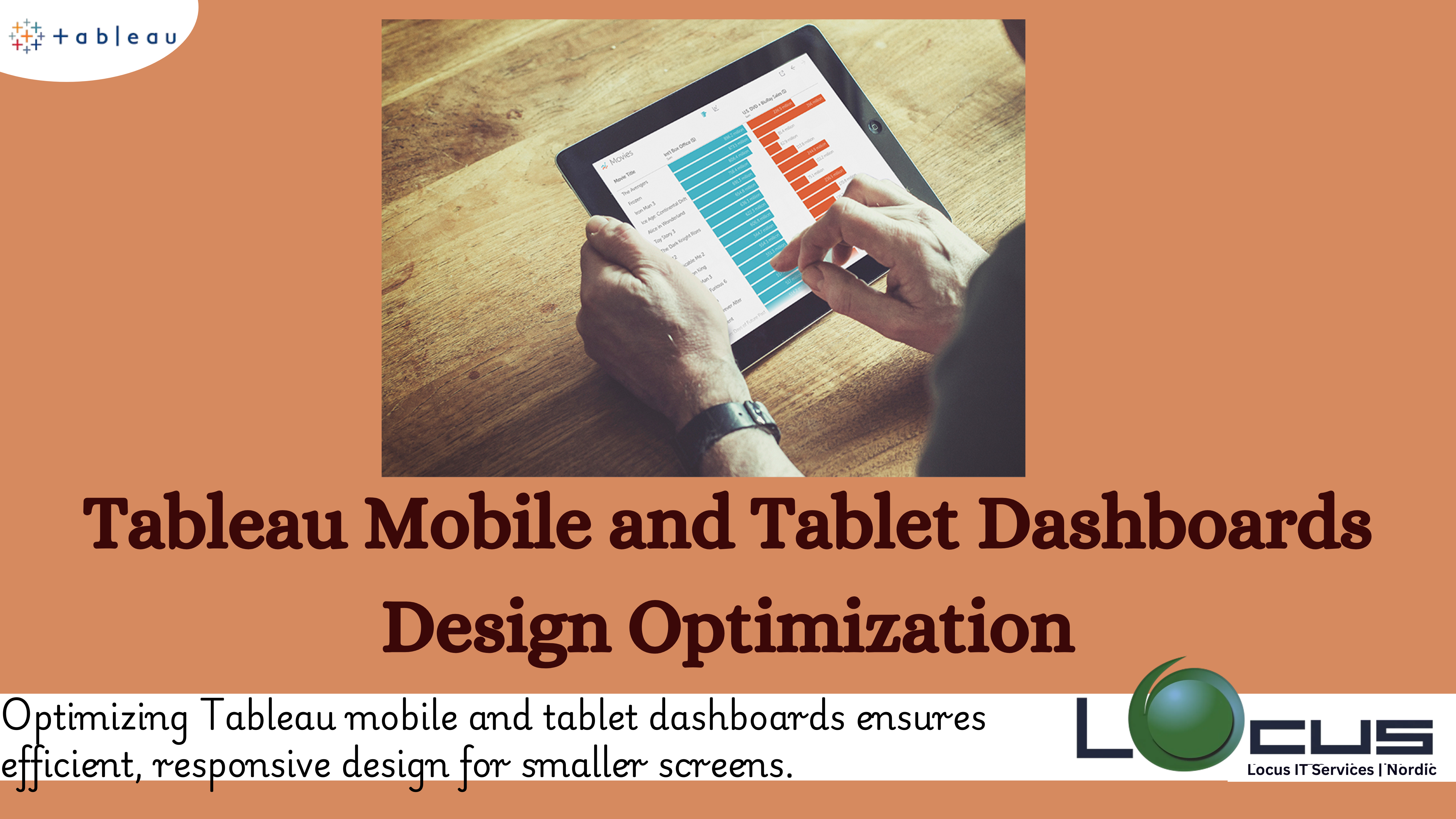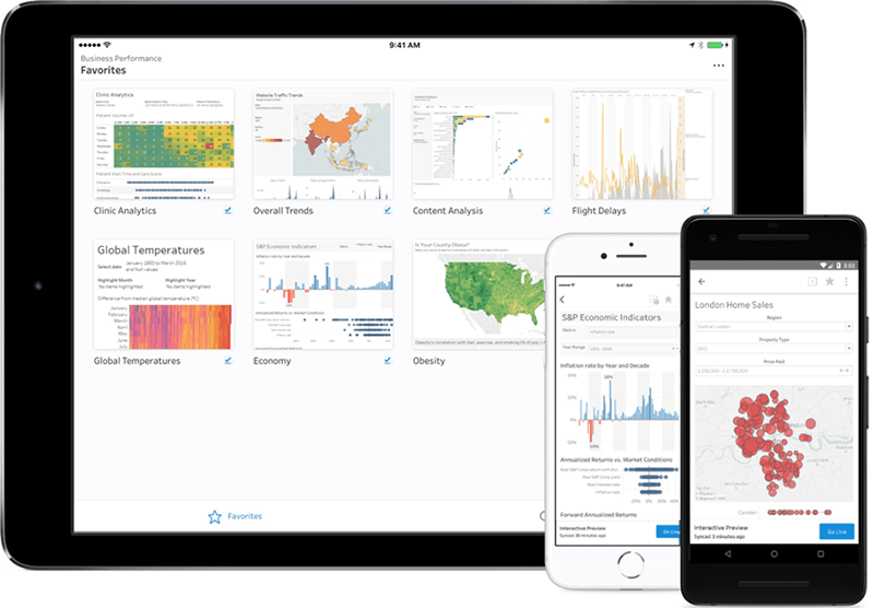
In many situations, mobile and tablet use has eclipsed traditional PC use in the current digital era. To guarantee accessibility, usability, and efficiency, dashboards—which are essential tools for data visualisation and decision-making—must be tailored for these devices. A well-designed Tableau mobile and tablet dashboards design optimization is more than just a smaller version of its desktop counterpart; it takes user behaviour, screen size, and device capabilities into account. The concepts and methods for creating dashboards that are optimised for tablet and smartphone users are examined here.

Recognising Context and User Needs
Knowing the end user is the first step in creating a dashboard for a smartphone or tablet. What choices will they make using the dashboard’s data, and who will use it? Users of smartphones and tablets, in contrast to PC users, are frequently on the go and access dashboards in a variety of settings, including meetings, fieldwork, and travel.
Establish User Goals: High-priority information must usually be easily accessible to mobile users. Instead than delving deeply into data, concentrate on displaying important metrics or alerts.
Determine Use Cases: Recognise the situations in which the dashboard will be used. Is it for rapid analysis, reporting, or real-time monitoring? Prioritising features is aided by designing with context in mind.
Take the Environment into Account: Users of mobile devices may be in surroundings that are noisy or distracting. Information is guaranteed to be easy to understand in these circumstances with a clear, succinct design.(Ref: Tableau Animations in Dashboards: Enhancing User Experience and Insights)
Fundamental Design Guidelines for Tableau Mobile and Tablet Dashboards
- The Key Is Simplicity
Limited real estate is available on tablets and mobile devices. Because of this limitation, design simplicity must be given top priority.
Content Prioritisation: Show only the most important details. When more information is required, use progressive disclosure strategies.
Reduce Cognitive Load: Reduce the quantity of visual components to prevent clutter. Pay attention to images that convey ideas clearly and succinctly.
- Design that is responsive
Make sure the dashboard adjusts to various screen sizes and orientations without any issues.
Scalable Layouts: Make use of flexible layouts and fluid grids that adapt to different screen sizes.
Device-Specific Features: For a simple user experience, make use of built-in features like haptic feedback and touch gestures.
- Navigation Focused on the User
Tableau mobile and tablet dashboards should have easy-to-use navigation.
Thumb-Friendly Design: For convenience of use, position interactive items within the thumb’s reach.
Consistent Menus: To conserve room while preserving access to crucial functionality, use tabs and menus that can be folded up.
Search Functionality: Give consumers a wide range of search options so they can locate specific info fast.
- Hierarchy of Visuals
Information can be prioritised and understood by consumers more rapidly when there is a strong visual hierarchy.
Emphasis on Key measurements: Use bold colours, larger fonts, or prominent positioning to draw attention to the main measurements.
Use Visual Cues: To differentiate between sections, use borders, shading, and spacing.
Progressive Disclosure: Offer drill-down options to provide more detailed data when needed without overwhelming the main view.
- Performance Optimization
Mobile devices often have less processing power compared to desktops. A dashboard must be optimized for fast load times and smooth interactions.
Data Simplification: Pre-aggregate or filter data to minimize the amount of information loaded.
Efficient Visuals: Avoid overly complex charts or animations that could slow performance.
Offline Access: Enable offline capabilities for users in areas with limited connectivity.
Designing for Touch Interactions in Tableau Mobile and Tablet Dashboards

Mobile and tablet dashboards rely heavily on touch interactions, which differ significantly from mouse-based navigation.
- Touch Targets
Ensure interactive elements are large enough to be tapped easily.
Size Guidelines: Buttons and icons should have a minimum size of 44×44 pixels for accuracy.
Spacing: Provide adequate spacing between touch targets to prevent accidental taps.
- Gestures
Integrate intuitive gestures to enhance user experience.
Swiping: Allow swiping to navigate between dashboard sections or drill into data.
Pinch-to-Zoom: Enable pinch-to-zoom functionality for detailed views of charts or maps.
Drag-and-Drop: Facilitate rearrangement of widgets or elements for customization.
Choosing the Right Data Visualizations
The type of data visualization used can significantly impact the effectiveness of a mobile dashboard.
- Simplified Charts
Complex visualizations are challenging to interpret on smaller screens. Opt for simplified versions.
Bar and Line Charts: These are ideal for showing trends and comparisons in Tableau mobile and tablet dashboards.
Pie Charts and Gauges: Use sparingly to display proportions or single metrics.
- Interactive Features
Interactive elements can enhance understanding without cluttering the screen.
Tooltips: Allow users to tap on data points to reveal additional information for Tableau mobile and tablet dashboards.
Dynamic Filters: Enable users to apply filters for customized views.
Drill-Downs: Offer the ability to explore deeper levels of data with a tap.
Accessibility Considerations
Inclusive design ensures that dashboards are usable by people with diverse abilities.
- Color and Contrast
High Contrast: Ensure sufficient contrast between text, background, and visual elements for readability.
Color Blindness: Avoid relying solely on color to convey information. Use labels, patterns, or icons as alternatives.
- Text and Typography
Legible Fonts: Use clean, sans-serif fonts that are easy to read on small screens.
Scalable Text: Allow users to adjust text size based on their preferences for Tableau mobile and tablet dashboards.
- Screen Readers and Keyboard Navigation
ARIA Labels: Include ARIA (Accessible Rich Internet Applications) labels to describe visual elements for screen readers.
Keyboard-Friendly Design: Ensure compatibility with external keyboards or assistive devices.
Testing and Iteration
The success of a mobile or tablet dashboard depends on continuous testing and refinement.
- User Testing
Conduct usability testing with real users to gather insights and identify pain points.
Field Tests: Observe users interacting with the dashboard in their typical environment for Tableau mobile and tablet dashboards.
Feedback Loops: Provide mechanisms for users to share feedback directly within the app.
- Performance Monitoring
Track metrics like load time, error rates, and user engagement to identify areas for improvement.
Analytics Integration: Use analytics for Tableau mobile and tablet dashboards as tools to gather data on user behavior.
Iterative Design: Regularly update the dashboard based on user feedback and performance data.
- Cross-Device Testing
Ensure the dashboard performs well on a variety of devices and operating systems.
Device Labs: Test on popular devices, including different screen sizes and resolutions in Tableau mobile and tablet dashboards.
Browser Compatibility: Verify functionality across major browsers and mobile OS versions.
Future Trends in Mobile Dashboard Design
As technology evolves, so do user expectations. Here are some emerging trends to consider:
- AI and Personalization
Smart Insights: Use AI to surface relevant insights or anomalies automatically.
Custom Dashboards: Allow users to personalize their dashboard layout and metrics for Tableau mobile and tablet dashboards.
- Voice and Gesture Controls
Voice Commands: Enable users to interact with dashboards using voice assistants.
Gesture Recognition: Explore advanced gesture controls for hands-free navigation.
- Augmented Reality (AR)
AR Overlays: Combine dashboard data with real-world visuals for enhanced context in Tableau mobile and tablet dashboards.
Immersive Analytics: Use AR to visualize complex datasets in a three-dimensional space.
Final Thoughts
Tableau mobile and tablet dashboards design optimization is a complex but rewarding challenge. By focusing on user needs, adhering to core design principles, and embracing the unique capabilities of mobile devices, you can create dashboards that deliver valuable insights on the go. Remember, the key to success lies in simplicity, responsiveness, and continuous improvement. With careful planning and execution, your dashboard can empower users to make informed decisions anytime, anywhere.


