Tableau is a powerful data visualization tool that allows users to create visually appealing charts and graphs to analyze and present data. Among the various types of charts Tableau pie and donut charts are two widely used options for showcasing proportional data.
In this blog, we’ll explore how to create Tableau pie and donut charts, including step-by-step instructions, use cases, and best practices.

What Are Tableau pie and Donut Charts?
Pie Charts
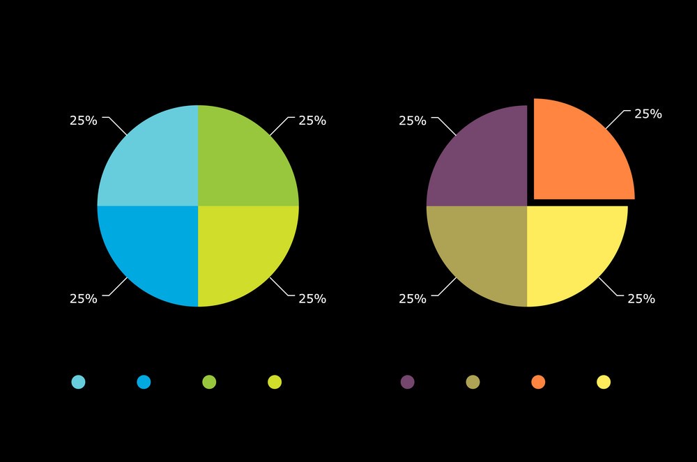
A pie chart represents data in a circular format, where each segment of the pie corresponds to a category. The size of the segment is proportional to the value it represents, making pie charts a popular choice for displaying percentage distributions.
Donut Charts
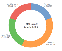
A donut chart is a variation of the pie chart with a blank center. The empty space in the middle is often used to display additional information, such as totals or key values. Donut charts can be more visually appealing and provide extra room for annotations. (Ref: Tableau Filters for Enhancing Visualizations)
When to Use Tableau Pie and Donut Charts?
Use Cases
- Distribution Analysis: Showing the composition of data categories, e.g., market share of companies.
- Simple Comparisons: Comparing a small number of categories with distinct differences.
- Single Variable Visualization: Displaying proportions of a single variable.
When to Avoid
- Avoid Tableau pie and donut charts if:
- There are too many categories, making the chart cluttered.
- Precise comparison is required; bar charts or tables are better suited for such cases.
Creating a Pie Chart in Tableau
Step-by-Step Instructions
- Connect to Your Data Source
- Open Tableau and connect to your data source (e.g., Excel, SQL, or a Tableau Extract).
- Load the Dataset
- Load a dataset with categorical and numerical fields. For example, a sales dataset with fields like
RegionandSales.
- Load a dataset with categorical and numerical fields. For example, a sales dataset with fields like
- Drag Fields to the Columns and Rows Shelves
- Drag the categorical field (e.g.,
Region) to the Columns shelf. - Drag the numerical field (e.g.,
Sales) to the Rows shelf.
- Drag the categorical field (e.g.,
- Change the Mark Type to Pie
- In the Marks card, select the dropdown and choose Pie as the mark type.
- Add Dimensions and Measures to Marks
- Drag the categorical field (e.g.,
Region) to the Color section of the Marks card. This will color-code the pie segments. - Drag the numerical field (e.g.,
Sales) to the Angle section. This determines the size of the pie slices.
- Drag the categorical field (e.g.,
- Adjust Labels
- Drag the categorical field (e.g.,
Region) to the Label section to add labels to each slice. - Drag the numerical field (e.g.,
Sales) to Label to display the value or percentage.
- Drag the categorical field (e.g.,
- Customize the Chart
- Adjust the chart size by clicking on the Size button in the Marks card.
- Customize colors, fonts, and labels as needed.
- Format and Add Titles
- Add a title to your chart and format it to enhance readability.
- Add to Dashboard (Optional)
- Drag the pie chart into a dashboard to combine it with other visualizations.
Creating a Donut Chart in Tableau
While Tableau doesn’t offer a direct option for creating donut charts, you can create one by layering pie charts. Follow these steps:
Step-by-Step Instructions
- Create a Pie Chart
- Follow the same steps as outlined above to create a basic pie chart.
- Create a Blank Circle
- Drag a new field to the Rows shelf (e.g., a dummy calculated field with a value of 0).
- Change the mark type to Circle in the Marks card.
- Adjust the size of the circle to make it smaller.
- Combine Pie Chart and Blank Circle
- Add the pie chart and blank circle to a dual-axis chart.
- Right-click on the second axis and select Synchronize Axis.
- Format the Donut Chart
- Customize the colors of the pie chart.
- Adjust the size of the blank circle to create the donut effect.
- Add Labels
- Place any relevant information (e.g., totals or key metrics) in the center of the donut by dragging fields to the Label section of the Marks card for the blank circle.
- Finalize and Save
- Review the chart, make any necessary formatting adjustments, and save your work.
Best Practices for Tableau Pie and Donut Charts

1. Limit the Number of Slices
- Use Tableau pie and donut charts for 5-7 categories at most. Too many slices can make the chart difficult to read.
2. Use Contrasting Colors
- Apply distinct and contrasting colors to differentiate the segments clearly.
3. Sort Segments
- Arrange slices in descending order of value for better visual clarity.
4. Add Annotations
- Use labels and tooltips to provide additional context.
5. Combine with Other Charts
- Pair pie or donut charts with bar charts or line graphs to provide a comprehensive view of the data.
Benefits and Challenges of Tableau Pie and Donut Charts
Benefits
- Easy to understand at a glance.
- Visually appealing for showcasing proportional data.
- Useful for emphasizing a key category.
Challenges
- Not ideal for precise comparisons.
- Limited scalability with large datasets.
- Can be misleading if not formatted correctly.
Creating a Pie Chart
- Load the dataset into Tableau.
- Drag
Regionto Color and Label, andSalesto Angle. - Adjust the chart to show the percentage of sales by region.
Creating a Donut Chart
- Create a pie chart as above.
- Add a blank circle using a dummy field.
- Layer the blank circle over the pie chart to form a donut chart.
- Display total sales in the center.
Final Thoughts
Pie charts and donut charts are indispensable tools for visually representing proportional data in a way that is both engaging and easy to interpret. While they are simple to create in Tableau pie and donut charts, their impact depends heavily on thoughtful design and adherence to best practices. By limiting the number of slices, using the contrasting colors, and integrating additional contextual data, you can transform these basic charts into compelling visual narratives.
Tableau’s flexibility allows you to customize these charts to meet your specific needs, whether you’re presenting sales distributions, demographic breakdowns, or market shares. However, remember to use them judiciously—reserve Tableau pie and donut charts for the datasets with clear, distinct categories, and avoid them for detailed comparisons.
With this guide, you’re equipped to create polished and professional Tableau pie and donut charts, elevating your skills.


