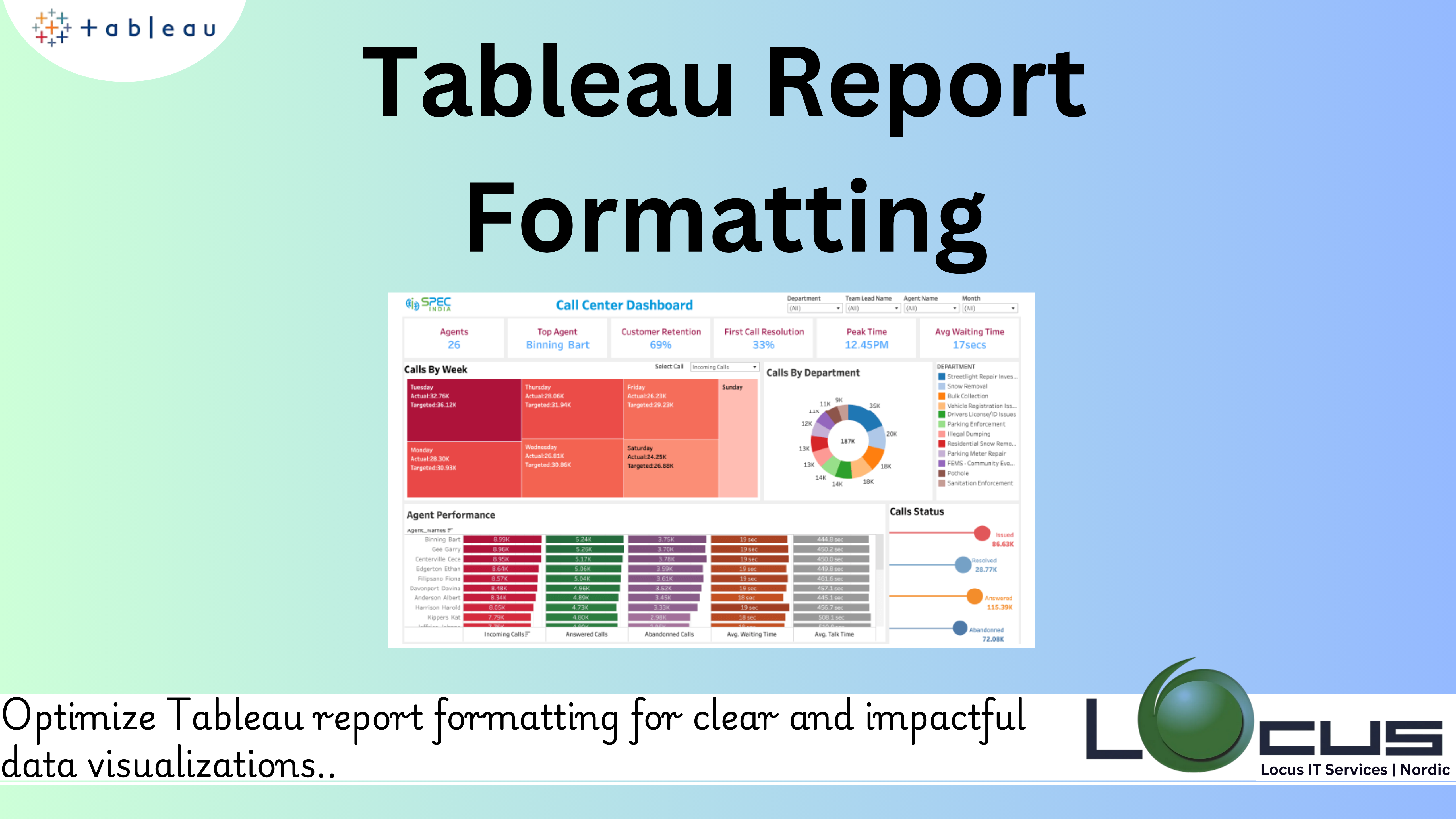
Tableau is an effective data visualisation application that enables users to display intricate datasets in eye-catching ways. However, striking a balance between use and beauty is where Tableau reports truly excel. Proper formatting enhances readability, directs attention to critical insights, and elevates the overall user experience. This guide delves into the art of Tableau report formatting, covering every aspect from layout to design principles, ensuring that your reports not only look professional but also communicate data effectively.

The Value of Formatting Reports
Tableau formatting has two functions: it ensures visual appeal and improves use. By directing the viewer’s attention, creating order, and upholding consistency, proper formatting turns raw data into insights that can be put to use. Tableau report formatting that are properly prepared reduce cognitive strain so that readers may concentrate on what really matters—understanding the narrative your data conveys.
Basics of Tableau Formatting
1. Design Consistency: It’s critical to keep Tableau report formatting consistent. Maintaining uniformity in fonts, colours, borders, and spacing helps to create a cohesive look and prevent visual distractions. Maintaining consistency across multiple worksheets or dashboards may be facilitated by developing a style guide or template.
2. Positioning and Distance: A report’s flow may be broken by misaligned or unevenly spaced parts. To place items proportionately, use Tableau’s alignment tools. Keep your padding and margins constant to produce a well-balanced layout that looks tidy and expert.
3. Selection of Colours: In data visualisation, colour is a potent tool. Misuse of it, meanwhile, may result in misunderstandings or confusion. Select a colour scheme that complements the audience and goal of the report. Respect accessibility guidelines by making sure there is enough contrast and avoiding depending solely on colour to communicate important information for Tableau report formatting.
4. Fonts: Fonts have a small but important impact on a report’s readability. To prevent clutter, choose a small number of font styles. Titles, subtitles, and body text should all have distinct font sizes and weights to maintain a clear hierarchy.
5. Focus and Hierarchy: Several data items are frequently included in reports, although not all of them are equally significant. Use size, colour, and placement to establish in the Tableau report formatting a visual hierarchy that directs visitors to important metrics or trends. Don’t overload viewers with too many elements in one view.(Ref: Advanced Extract Tableau API Operations)
Formatting Tools in Tableau
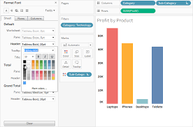
- Text Formatting: Tableau provides extensive options for customizing text elements, including fonts, sizes, colors, and alignment. Use these options to ensure that titles, labels, and annotations are clear and visually distinct in Tableau report formatting fields.
- Borders and Shading: Borders and shading can highlight specific areas of a report or distinguish between sections. Subtle borders and light shading are preferable to avoid overpowering the data itself.
- Gridlines and Dividers: Gridlines and dividers can enhance readability but should be used sparingly. Overuse can create visual clutter, detracting from the data’s impact. Aim for minimal, light-colored gridlines to maintain a clean aesthetic.
- Sizing and Layout: Size and layout adjustments ensure that reports are easily viewable across devices and screen sizes. Tableau’s automatic resizing options can help optimize dashboards for different resolutions.
- Legends and Filters: Legends and filters are crucial for interactivity and context. Position them logically and format them to blend seamlessly with the overall design. Ensure legends are concise and filters are intuitive for users.
Advanced Formatting Techniques
- Using Blank Spaces
Strategic use of blank spaces can improve readability and emphasize key elements. White space acts as a natural divider, reducing visual strain and drawing focus to critical data points. - Dynamic Titles and Labels
Dynamic titles and labels update based on filters or parameters, providing users with contextual information without the need for additional explanations. This feature enhances interactivity and personalization. - Customisation of Tooltips
Without overcrowding the primary visualisation, tooltips provide extra context. Customise tooltips to succinctly convey pertinent information. Steer clear of extraneous details that could overwhelm the audience. - Conditional Formatting
Conditional formatting helps highlight specific data points based on predefined criteria. This technique is effective for drawing attention to outliers, trends, or thresholds. - Floating vs. Tiled Elements
The choice between floating and tiled elements affects the flexibility and alignment of objects within a dashboard. Floating elements provide greater control over placement, while tiled elements ensure uniform alignment and scalability for Tableau report formatting.
Common Pitfalls to Avoid
- Overloading with Visuals
Including too many charts or graphics in a single report can dilute its effectiveness. Focus on the most impactful visuals and split content across multiple dashboards if necessary. - Neglecting Accessibility
Reports should be accessible to a diverse audience. Incorporate features such as screen-reader-friendly text, high-contrast color palettes, and alternative ways to convey information beyond visual cues. - Inconsistent Design Choices
Inconsistent use of colors, fonts, or chart types can confuse viewers and diminish the report’s professionalism. Stick to a predefined style guide to maintain uniformity. - Ignoring Mobile Optimization
With increasing mobile usage, reports must be optimized for smaller screens. Test dashboards on various devices to ensure functionality and readability across all platforms like Tableau report formatting fields. - Cluttered Layouts
Clutter undermines the clarity of a report. Use grouping, filtering, and layering techniques to declutter dashboards while ensuring all essential information is easily accessible.
Best Practices for Effective Formatting
- Start with a Plan
Before diving into Tableau, outline the report’s objectives, audience, and key messages. A clear plan will guide design choices and prevent unnecessary revisions. - Keep the User in Mind
Always consider the end user’s perspective. What questions will they have? What data do they need? Tailor formatting to meet their expectations and simplify navigation. - Leverage Templates
Templates streamline the formatting process and ensure consistency across projects. Tableau allows you to save workbooks as templates, making it easy to replicate styles in Tableau report formatting. - Iterate and Test
Formatting is an iterative process. Seek feedback from stakeholders and test the report with real users to identify areas for improvement. The user experience can be greatly improved with minimal modifications. - Focus on Clarity
Above all, clarity is the ultimate goal of any report.Avoid excessive embellishments and prioritize simplicity to ensure that the data’s message is unmistakable by using Tableau report formatting.
Importance in Data Communication
Although communicating data is the main purpose of Tableau reports, aesthetics are an essential auxiliary function. A visually appealing design encourages people to explore the facts more deeply by fostering engagement and trust. Finding the ideal balance between design and functionality guarantees that reports engage their audience in addition to providing information.
Upcoming Developments in Tableau Report Structure
The requirements for data visualisation are always changing along with technology. The future of Tableau report formatting will be shaped by emerging trends like immersive visualisations, augmented analytics, and personalised dashboards. In a constantly shifting environment, staying ahead of these trends guarantees that your reports will continue to be impactful and relevant to Tableau report formatting field.
Final Thoughts
Mastering Tableau report formatting is a journey that combines technical expertise with creative finesse. By adhering to principles of consistency, clarity, and user-centric design, you can transform ordinary data into extraordinary insights. Whether you’re crafting dashboards for executives, analysts, or general audiences, the key lies in understanding your audience’s needs and delivering a report that is both informative and visually stunning. With practice and attention to detail, your Tableau reports can become not just tools of communication, but works of art that inspire action.


