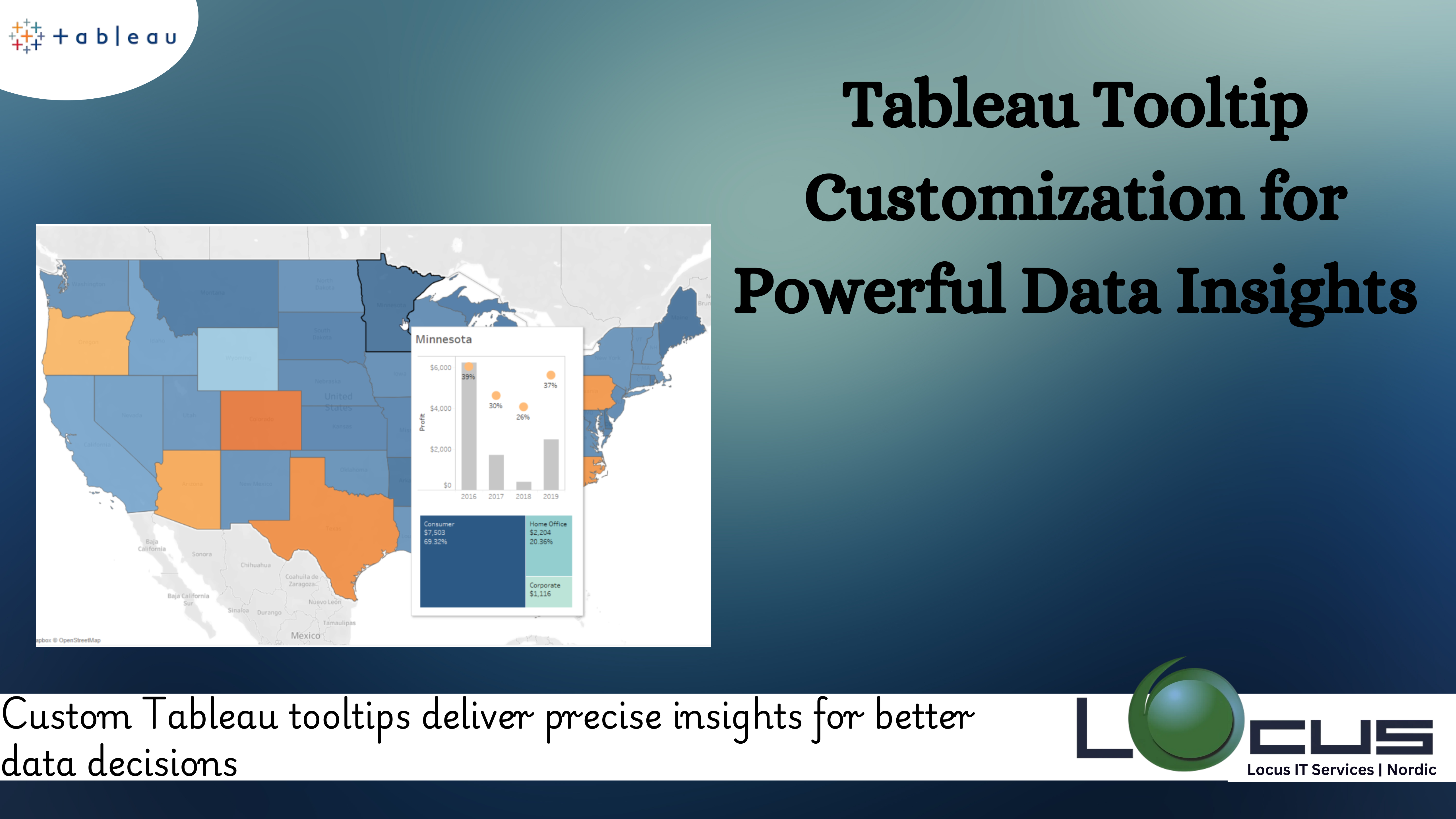
For every business, Tableau tooltips are a powerful feature that allows you to provide additional context and insights directly within your visualizations. By customizing tooltips, you can transform simple data points into interactive narratives that engage users and drive understanding. Whether you’re highlighting key metrics, including advanced calculations, or integrating visual elements like charts and images, Tableau tooltips offer endless possibilities for enhancing user experience.
In this guide, we’ll explore how to leverage Tableau tooltip customization to deliver impactful data insights and create more meaningful, interactive dashboards.
Why Are Tableau Tooltips Important ?
Tooltips are a subtle yet crucial aspect of data visualization. They:

- Provide Context: Tableau Tooltips can display additional data or calculations that help viewers understand the story behind a visualization.
- Enhance Usability: By offering details on hover, tooltips reduce the need for users to navigate between multiple sheets or dashboards.
- Save Space: Tableau tooltips allow you to include supplementary information without cluttering the primary visualization.
- Engage Users: Well-crafted Tableau tooltips invite users to explore and interact with the data more deeply. (Ref: Connecting Tableau to Google Cloud Platform)
Key Features of Tableau Tooltips
Before diving into customization techniques, let’s outline what makes Tableau’s tooltips versatile:
- Dynamic Content: They can dynamically display data from fields used in the visualization.
- Custom Formatting: It support rich text formatting, including fonts, colors, and alignment.
- Interactivity: They can include visualizations, like mini charts, to provide richer insights.
- Calculated Fields: They can display values based on custom calculations.
- Filters and Parameters: It can adapt to user selections, providing relevant, filtered information.
Steps to Customize Tooltips in Tableau
- Accessing Settings
- In Tableau, select the sheet containing your visualization.
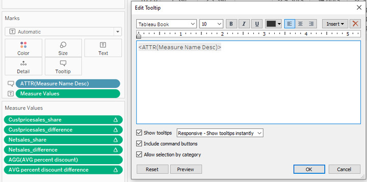
- Click on the “Tooltip” button in the Marks card.
- This opens the Tooltip Editor, where you can customize the text and format.
- Formatting Text
- Use the editor toolbar to apply formatting like bold, italics, or underline.
- Adjust font size and color to ensure readability and alignment with your dashboard theme.
- Adding Dynamic Fields
- Insert fields by clicking the “Insert” button in the Editor. Choose from available dimensions, measures, or calculated fields.
- Example: Instead of static text, show dynamic values like “Sales: $[SUM(Sales)]”.
- Incorporating Calculated Fields
- Create calculated fields for specific insights.
- Example: Showing “Profit Margin: [SUM(Profit)] / [SUM(Sales)]”.
- Using Conditional Formatting
- Add conditional formatting to highlight specific values.
- Example: Use bold text for high-risk areas or color-code profit margins.
- Including Visualizations in Tooltips
- Enable the “Viz in Tooltip” feature to embed visualizations like bar charts or sparklines.
- Navigate to Tooltip Editor > Insert > Sheets > Select the desired sheet.
- Adjust the size and interactivity of the embedded visualization.
- Aligning Tooltips with Dashboard Themes
- Ensure consistent fonts, colors, and styles across the dashboard for a cohesive look.
- Testing Interactivity
- Preview the tooltip by hovering over data points in your visualization.
- Make adjustments to ensure the tooltip behaves as expected across different filters and parameters.
Advanced Tooltip Techniques
- Leveraging HTML and CSS-Like Features
- Tableau supports basic HTML-like syntax for enhanced Tableau tooltips customization
- Example: Use
<b>and<i>for bold and italic text, or<font color="red">for colored text.
- Embedding URLs
- Include clickable URLs for users to explore related reports or external resources.
- Example: “View Details”.
- Parameter-Driven Tooltips
- Use parameters to control what’s displayed in based on user selections.
- Example: A parameter switch toggles between displaying “Year-to-Date Sales” and “Quarterly Growth”.
- Tooltips for Multi-Layered Charts
- For visualizations like scatter plots or stacked bar charts, they can display details for each layer.
- Example: Hovering over a stacked bar segment shows individual and total values.
- Localization and Custom Text
- Use calculated fields or parameters to display in the different languages or formats.
- Example: Translate “Sales” to “Ventas” for Spanish-speaking users.
Best Practices for Tooltip Design
- Keep It Concise
- Avoid overwhelming users with too much information. Display only the most relevant details.
- Example: Instead of listing all product categories, highlight the top three contributors.
- Use Visual Cues
- Include icons or color coding to emphasize key metrics or insights.
- Example: Use a green dot for positive growth and red for decline.
- Test Across Devices
- Ensure they are legible and functional on various devices, including tablets and smartphones.
- Focus on Accessibility
- Use readable fonts and sufficient color contrast to accommodate users with visual impairments.
- Iterate Based on Feedback
- Collect user feedback to refine and ensure they meet your audience’s needs.
Real-World Applications of Customized Tooltips
- Sales Performance Dashboards
- They are highlight trends, such as best-performing regions or products, with supporting metrics like profit margins and growth rates.
- Customer Insights Dashboards
- Include demographic details, customer lifetime value, or churn risk in.
- Financial Reports
- Provide drill-down details like expense breakdowns or YOY comparisons without cluttering the main chart.
- Operational Dashboards
- Show detailed metrics for each step of a process, such as lead time, efficiency rates, or error counts.
Challenges and How to overcome it
- Limited Formatting Options
- Tableau’s native editor offers basic formatting, which can make creating visually appealing and user-friendly challenging.Advanced designs like multi-colored text, icons, or custom layouts may be constrained.
- Use HTML-like markup syntax available in Tableau (e.g.,
<b>,<i>,<u>) to improve visual appeal in Tableau tooltips. - For complex designs, consider overlaying Tableau visuals in Tableau tooltips with transparent custom using external software integrations (e.g., embedding with Tableau Public or Tableau Server).
- Dynamic Content Constraint
- They rely on field values, and dynamically adjusting content based on different user interactions can be limiting.Custom logic for displaying information in may not be directly supported.
- Use calculated fields to dynamically control the content displayed. For instance:tableauCopy code
IF [Metric] = 'Sales' THEN [Sales Value] ELSE [Profit Value] END - Leverage parameter controls to allow users to toggle between different data views that modify content.
- Performance Impact
- Complex or heavily customized (e.g., with multiple visual elements or heavy calculations) can slow down dashboard performance.
- Simplify calculations used in by aggregating data at the source or using pre-processed extracts.
- Test the performance impact on slower systems or lower bandwidth connections.
- Lack of Context
- They can lack the context users need if too much or too little information is presented.Overloaded can overwhelm users, while overly minimal might not provide sufficient insights.
- Define a hierarchy of information where key metrics or insights are highlighted prominently.
- Use action filters to link to other worksheets or dashboards for more detailed insights.
- Add color indicators, icons, or bullet points to improve scannability.
- Device Responsiveness
- It can behave inconsistently on different devices, such as when viewed on a mobile device versus a desktop.
- Design device-specific dashboards in Tableau that include optimized for the intended platform.
- Use Tableau’s Device Designer to preview and adjust for various screen sizes.
- Integrating External Content
- Embedding links, images, or external data into can be challenging, especially when attempting to display external content dynamically.
- Use Tableau’s URL actions to link to external resources or embed interactive content.
- Host external visuals or data on a cloud platform and dynamically reference them through calculated fields
Final Thoughts
Tableau tooltips are a powerful yet often underestimated feature that can significantly enhance the usability, interactivity, and overall impact of your dashboards. By leveraging their dynamic capabilities, such as embedding visualizations, using calculated fields, and incorporating conditional formatting, can provide detailed context without overwhelming the primary visualization.
Despite some challenges, such as formatting limitations, performance concerns, or device responsiveness, these can be addressed with strategic solutions like HTML-like syntax, calculated fields, pre-aggregated data, and device-specific designs. When crafted thoughtfully, not only enrich user experience but also empower users to uncover deeper insights and drive data-driven decisions.
Remember, the key to effective lies in keeping them concise, visually aligned with your dashboard using tableau tooltips, and responsive to user needs. By iterating based on feedback and aligning with best practices, you can transform into a vital tool for storytelling and data exploration in Tableau.


