For Every Business where data-driven decision-making is crucial, organizations need powerful tools that can transform raw data into actionable insights. Qlik Sense, a leading business intelligence platform, stands out for its intuitive and dynamic data visualization capabilities. It not only makes complex data easier to understand but also empowers users to explore trends, patterns, and insights with ease. This blog delves into the core strengths of Qlik Sense data visualization, key features, and best practices to help you get the most from this powerful tool.
Summary of Contents
Why Data Visualization Matters
Data visualization is more than just displaying data in a chart or graph. It’s about making complex data accessible, interactive, and engaging, enabling users to gain insights quickly and make informed decisions. In fast-paced business environments, clear and effective data visualizations can reveal opportunities, identify risks, and provide the foundation for strategic actions. Qlik Sense excels in this domain, offering a wide range of visualization options that cater to users of all skill levels, from beginners to advanced analysts.
Key Features of Qlik Sense Data Visualization
- Associative Model for Dynamic Exploration:
Qlik Sense’s associative model lets users explore data freely, seeing the impact of every selection across the entire dataset. Users can click on any data point in a visualization and instantly see related data, uncovering hidden connections and gaining a broader understanding of the data landscape. - Variety of Visualization Options:
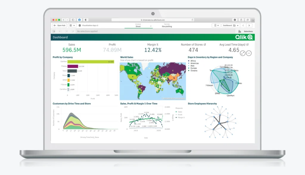
Qlik Sense offers a comprehensive selection of visualizations, including bar charts, line charts, scatter plots, heat maps, and more. This variety allows users to choose the best representation for their data, ensuring clarity and relevance. Each chart type is customizable, allowing users to adjust colors, labels, and scales to fit their specific needs. - Self-Service Analytics:
Qlik Sense promotes self-service analytics, enabling business users to create their own visualizations without relying heavily on IT teams. This self-service approach empowers users to interact with data independently, exploring trends and answering questions on demand. - Responsive Design for Multiple Devices:
Qlik Sense visualizations are automatically optimized for different devices, including desktops, tablets, and smartphones. This flexibility ensures that users can access and interact with insights from anywhere, whether in the office or on the go. - Advanced Analytics Integration:
Qlik Sense supports integration with advanced analytics tools, including R and Python, allowing users to add predictive models and complex calculations directly into their visualizations. This integration elevates Qlik Sense from a basic visualization tool to a comprehensive analytics platform. (Ref: Python) - Embedded and Shared Visualizations:
Qlik Sense makes it easy to share insights across the organization. Users can embed visualizations in websites, applications, or reports, allowing data to flow seamlessly across various platforms. Sharing capabilities also include collaboration tools, enabling teams to discuss and interpret findings together.
Best Practices for Effective Data Visualization in Qlik Sense
- Choose the Right Visualization for the Data:
Different types of data tell different stories. Use bar charts for comparisons, line charts for trends over time, scatter plots for correlations, and maps for geographical data. Choosing the right visualization ensures that the message is clear and effective. - Keep It Simple:
Avoid clutter and keep visualizations simple. Overloading a chart with too many data points, labels, or colors can make it confusing. Prioritize clarity over complexity, focusing on the key insights you want to convey. - Use Color with Purpose:
Colors can enhance visual appeal and draw attention to critical areas, but they should be used strategically. Consistent use of colors across charts improves readability, while highlighting specific data points with contrasting colors can guide the viewer’s focus. - Leverage the Power of Qlik Sense’s Interactive Features:
Qlik Sense enables users to interact directly with the data, making it easy to explore different scenarios. Encourage viewers to use filters, drill-down options, and tooltips to dive deeper into the data. This interactive approach allows for a richer understanding of complex datasets. - Provide Context with Annotations and Labels:
Annotations and labels can help users interpret visualizations by providing additional context, such as definitions, units of measure, or explanations of key trends. This practice can be particularly helpful for viewers unfamiliar with the data, enabling them to understand insights without extensive background knowledge. - Optimize for Performance:
Large datasets can sometimes impact visualization speed and responsiveness. Qlik Sense offers various optimization options, such as limiting the number of data points displayed or using data reduction techniques. Optimizing performance ensures a smooth experience for users, especially in interactive or real-time dashboards.
Real-World Applications of Qlik Sense Data Visualization
Qlik Sense data visualization is used across industries to tackle various business challenges. Here are some examples:

- Retail: Retailers use Qlik Sense to visualize sales data, analyze customer behavior, and manage inventory. By visualizing sales trends across regions, stores, and product lines, businesses can make data-driven decisions on inventory placement and marketing strategies.
- Healthcare: In healthcare, Qlik Sense visualizations enable practitioners to monitor patient outcomes, track resource usage, and analyze treatment effectiveness. Visual dashboards allow healthcare administrators to identify patterns in patient care, leading to improved healthcare delivery.
- Finance: Financial analysts rely on Qlik Sense to visualize revenue, expenses, and key performance indicators (KPIs). With real-time updates, Qlik Sense helps financial institutions track compliance metrics, assess risk, and adjust strategies in response to market changes.
- Supply Chain: Qlik Sense provides visibility into the entire supply chain, allowing organizations to monitor performance, optimize logistics, and mitigate risks. By visualizing supplier metrics and delivery timelines, companies can improve efficiency and reduce operational costs.
Final Thoughts
Qlik Sense’s data visualization capabilities offer a powerful means of translating complex data into actionable insights. Its interactive and customizable visualizations make it possible for users to explore, understand, and communicate data stories effectively. By following best practices and leveraging Qlik Sense’s advanced features, organizations can empower teams with the insights they need to make confident, data-driven decisions. Whether in retail, healthcare, finance, or supply chain, Qlik Sense continues to be a trusted tool for visualizing and unlocking the full potential of data.

