Tableau has long been acknowledged as one of the most potent tools for narrative and data visualisation. Although turning raw data into interactive, understandable insights is still Tableau’s primary goal, the program has undergone substantial development throughout time. Animations are one of its most notable elements that have been added in more recent versions. Tableau Animations can improve the user experience, draw attention to trends, and facilitate more seamless view changes when applied properly. This blog examines sophisticated Tableau animations methods, their applications, and the best ways to optimise their impact.

Understanding Tableau Animations: What Are Tableau Animations?
Tableau animations refer to the smooth transitions between visual states within a dashboard or worksheet. These animations occur when:
-Filters are applied or removed.
-Parameters are adjusted.
-Data refreshes dynamically.
-A user interacts with dashboard elements, such as buttons or dropdowns.
-By animating transitions, Tableau reduces the cognitive load on users, making it easier to understand what changed and why.(Ref: Tableau Radar Charts for Multi-Dimensional Analysis)
Why Use Animations?
1.Improved User Experience
Animations provide visual continuity. Instead of abrupt changes, the transition between data states feels natural and intuitive. Users can track movements, which helps them better grasp trends or shifts in the data.
2.Enhanced Narration
For dashboards designed to present a narrative, animations can act as a storytelling device. They guide users through different stages of the analysis, ensuring clarity and engagement.
3.Highlight Key Insights
Animations can emphasize critical changes, such as rising sales figures, shifting demographics, or regional growth patterns.
4.Simplify Complex Visualizations
Complex visualizations with overlapping elements or multiple data points become more understandable when users can follow transitions step-by-step.
Types of Animations in Tableau

1.Filter Animations
Smoothly transition between filtered and unfiltered views. For example, filtering a dataset by region can animate the movement of data points on a scatter plot.
2.Sorting Animations
When sorting values in ascending or descending order, animations show how items rearrange themselves.
3.Parameter Change Animations
Adjusting parameters (e.g., date ranges, thresholds) can trigger animations, allowing users to observe the effects of their selections.
4.Data Pivot or Transition Animations
Animations shine when switching between views, such as bar charts transitioning into pie charts or maps transforming into scatter plots.
Advanced Animation Techniques
1.Layered Animations for Contextual Clarity
Layered animations involve animating multiple elements sequentially or simultaneously for a cohesive effect.
For example:
-A bar chart might first resize bars to reflect updated data.
-The color gradient then animates to show performance improvements or declines.
-Labels fade in to emphasize the new values.
This approach ensures that each change is easy to follow without overwhelming the viewer.
How to Implement in Tableau:
-Use the “Sequence of Actions” feature by combining parameter controls and calculated fields.
-Leverage dashboard actions like Filter Actions and Highlight Actions for a layered effect.
2.Animating Between Views (Dashboard Navigation)
Dashboards often require navigation between multiple sheets. Instead of abrupt switches, animations allow seamless transitions:
-Zoom effects on maps when navigating from a global view to a country-specific view.
-Morphing visualizations, like a bar chart gradually transforming into a line chart.
How to Implement in Tableau:
-Use navigation buttons linked to worksheets with animations enabled.
-Create custom actions that highlight the transition points.
3.Path and Flow Animations
For time-series data or movement-based visualizations, animations that highlight paths are invaluable. Examples include:
-A line chart animating the progression of stock prices over time.
-A flow chart showing customer journeys through stages of a sales funnel.
How to Implement in Tableau:
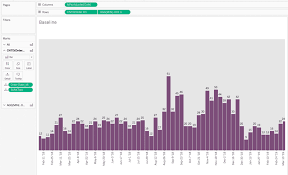
-Utilize Tableau’s built-in Pages Shelf for time-based animations.
-Use calculated fields to plot paths dynamically and enable animations for transitions.
4.Highlighting Changes with Animated Alerts
In dashboards monitoring performance, animated alerts can draw attention to specific metrics. For instance:
-A KPI card flashes or pulses when sales dip below a threshold.
-A region on a map grows in size or changes color when it meets a target.
How to Implement in Tableau:
-Combine parameters and conditional formatting with animations.
-Use tooltips dynamically to highlight additional details alongside animations.
5.Combining Animations with Tooltips
Animated tooltips that appear and fade can enhance the interactivity of dashboards:
-Hovering over a point in a scatter plot can trigger an animated tooltip showing more detailed insights.
-As users move across the dashboard, tooltips transition smoothly to maintain context.
How to Implement in Tableau:
Enable animations for tooltip elements.
Create hover actions that trigger detailed sheets or visualizations.
Best Practices for Using Animations
While animations are powerful, overusing them can detract from the dashboard’s utility. Here are best practices to keep in mind:
- Prioritize Functionality Over Aesthetics
Animations should serve a purpose. If an animation doesn’t add value, it risks becoming a distraction. - Control Animation Speed
The default animation speed in Tableau might not suit every use case. Slower animations work well for storytelling, while faster ones are better for exploratory analysis.
How to Adjust:
Go to Format > Animations and fine-tune the duration to suit the dashboard’s needs.
- Test for Performance
Animations can be resource-intensive, especially with large datasets. Test dashboards for performance and optimize queries where necessary. - Maintain Consistency
Consistent animation styles across dashboards help users build familiarity. Avoid mixing fast, abrupt animations with slow, smooth ones. - Provide Users with Control
Not all users appreciate animations. Include options to toggle animations on or off via parameters or settings.
Use Cases: Real-World Applications of Tableau Animations
- Executive Dashboards
Executives often require high-level overviews with the ability to drill down into specifics. Animations can:
-Gradually reveal trends over time.
-Highlight anomalies or critical changes.
- Marketing Analytics
Marketing dashboards benefit from animations that:
-Showcase campaign performance over time.
-Highlight geographical trends using animated maps.
- Financial Dashboards
In finance, Tableau animations can:
-Emphasize stock movements or revenue shifts.
-Animate balance sheets for quarterly comparisons.
- Supply Chain Dashboards
For logistics, animations help:
-Visualize inventory movement or product flows.
-Track delivery routes with time-lapse Tableau animations.
Limitations of Tableau Animations
Despite their benefits, animations have limitations:
Performance Impact:
Animations can slow down dashboards with large datasets or complex calculations.
Learning Curve:
Creating advanced Tableau animations requires familiarity with Tableau’s features, such as parameters, calculated fields, and actions.
User Preferences:
Some users find animations distracting or unnecessary for quick insights.
Final Thoughts
Tableau animations have transformed static dashboards into dynamic, interactive storytelling tools. By leveraging advanced techniques, you can elevate your dashboards to not only present data but also guide users through it effectively. Whether you’re animating transitions between views, emphasizing key insights, or creating engaging narratives, the possibilities are vast.
Remember, the ultimate goal of any dashboard is to communicate information clearly and effectively. With well-implemented Tableau animations, you can make your dashboards not just visually appealing, but also highly functional and impactful.


