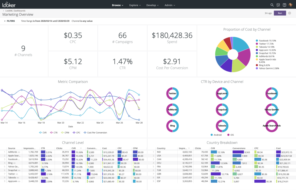
Tableau executive dashboards are now essential tools for businesses looking to effectively track, evaluate, and act on their business insights in the age of data-driven decision-making. A robust feature set provided by Tableau, a top data visualization software, makes it possible to create intricate Tableau executive dashboards. The key procedures, recommended practices, and pointers for creating powerful executive dashboards in Tableau will all be covered.

Tableau Executive Dashboard: What Is It?
A high-level visual depiction of an organization’s metrics and key performance indicators (KPIs) is called an executive dashboard. It is intended for top management and offers real-time insights into a number of business issues, facilitating strategic planning and prompt decision-making. Executive dashboards, as opposed to in-depth analytical reports, emphasise conciseness, clarity, and simplicity in order to display only the most important data.(Ref: Tableau Time Series Analysis Techniques: Real-Time Trends)
Benefits of Executive Dashboards
Enhanced Decision-Making: Dashboards aggregate complex data into intuitive visuals, allowing leaders to make informed decisions quickly.
Real-Time Monitoring: They provide up-to-date insights, helping executives respond to issues proactively.
Centralised Insights: A comprehensive picture of corporate performance is obtained by combining data from many sources.
Enhanced Transparency: By making important metrics easily available and understandable, dashboards promote accountability.
Enhanced Productivity: They cut down on the amount of time spent looking for information by making it easier to obtain crucial data.
Components of an Effective Tableau Executive Dashboard
To create an impactful Tableau executive dashboards, focus on these elements:
KPIs and Metrics: Identify the most relevant metrics aligned with organizational goals.
Data Sources: Integrate reliable and real-time data sources.
Visualizations: Use charts, graphs, and tables that are easy to interpret.
Interactivity: Enable filtering, drill-downs, and hover-over details for deeper analysis.
User-Centric Design: Ensure the dashboard is intuitive and visually appealing.
Essential Elements of a Successful Tableau Executive Dashboard
Pay attention to these components to produce an Tableau executive dashboards that has an impact:
KPIs & Metrics: Determine which metrics are most pertinent to the objectives of the company.
Data Sources: Include trustworthy and up-to-date data sources.
Visualisations: Make use of easily comprehensible tables, graphs, and charts.
Interactivity: For further in-depth analysis, enable drill-downs, filters, and hover-over details.
User-Centric Design: Make sure the dashboard is both aesthetically pleasing and easy to use.
Step-by-Step Process to Create Tableau Executive Dashboards
- Define Objectives and Audience
Begin by understanding the purpose of the dashboard and the audience it serves. Ask:
-What decisions will this dashboard support?
-Who will use this dashboard, and what are their priorities?
Example: For a sales executive, the focus might be on revenue trends, sales pipeline, and regional performance.
- Connect to Data Sources
Tableau supports a variety of data connections, including databases, cloud services, and spreadsheets. Ensure that the data is clean, accurate, and updated regularly.
Steps:
Go to Data > Connect to Data and select your source.
Use Tableau Prep for data cleaning and transformation if needed.
- Design the Layout
A well-structured layout is crucial for clarity. Follow these guidelines:
Top Section: Display KPIs and summary metrics.
Middle Section: Include trend analyses and detailed visualizations.
Bottom Section: Provide contextual details or supporting data.
Use Tableau’s grid layout feature to organize content neatly.
- Create Visualizations
Choose the right visualizations for your data:
Bar Charts: Compare categories.
Line Charts: Show trends over time.
Pie Charts: Display proportions (use sparingly).
Maps: Visualize geographic data.
Tables: Provide precise values (use minimally).
Drag and drop fields onto the Rows and Columns shelves in Tableau to start building visualizations.
- Incorporate Interactivity
Interactive elements enhance usability:
Filters: Allow users to refine data by regions, dates, or categories.
Drill-Downs: Enable exploration of granular details by clicking on a visualization.
Tooltips: Provide additional context on hover.
Actions: Link dashboards or external resources.
Steps:
-Use the Filter shelf to add filters.
-Set up actions via Dashboard > Actions.
- Apply Design Best Practices
Simplicity: Avoid clutter by focusing on essential information.
Consistency: Use uniform colors, fonts, and styles.
Highlighting: Use color to draw attention to critical metrics.
Accessibility: Ensure readability with appropriate font sizes and color contrasts.
- Test and Validate
Before deployment, review the dashboard:
-Verify data accuracy.
-Test functionality, including filters and actions.
-Seek feedback from intended users.
- Publish and Share
Once finalized, publish the dashboard to Tableau Server, Tableau Cloud, or export it for offline use. Adjust permissions to control access.
Steps:
Go to File > Publish to Tableau Server or Export as PDF/Image.
Share the URL or embed the dashboard in other platforms.
Best Practices for Tableau Executive Dashboards
Start with the End in Mind: Define what success looks like for your dashboard before building it.
Focus on KPIs: Prioritize metrics that align with strategic goals.
Minimize Cognitive Load: Use familiar and simple visualizations.
Optimize Performance: Reduce load times by aggregating data and minimizing complex calculations.
Iterate Based on Feedback: Continuously improve the dashboard by incorporating user input.
Common Challenges and Solutions
- Data Quality Issues
Solution: Use Tableau Prep or ETL tools to clean and standardize data.
- Overloading the Dashboard
Solution: Limit the number of visualizations and focus on key insights.
- Performance Bottlenecks
Solution: Optimize extracts, use aggregated data, and limit the use of high-cardinality fields.
- Lack of User Adoption
Solution: Conduct training sessions and ensure the dashboard addresses user needs.
Real-World Examples
- Sales Performance Dashboard
KPIs: Total Revenue, Monthly Growth, Sales Pipeline Value
Visualizations: Line charts for trends, bar charts for regional performance
Interactivity: Filters by product category and sales region
- Financial Overview Dashboard
KPIs: Profit Margin, Expenses, Cash Flow
Visualizations: Waterfall chart for profit breakdown, pie chart for expense allocation
Interactivity: Drill-downs into department-level expenses
- Customer Insights Dashboard
KPIs: Customer Retention Rate, Net Promoter Score (NPS), Churn Rate
Visualizations: Heatmaps for customer satisfaction, line charts for retention trends
Interactivity: Filters by demographic and geography
Final Thoughts
Creating Tableau executive dashboards is an art that combines technical skills with a deep understanding of business needs. By following the steps outlined in this guide and adhering to best practices, you can design dashboards that empower executives to make data-driven decisions with confidence.
Remember, an effective dashboard is not static. Regularly update and refine it to ensure it remains relevant and valuable in an ever-evolving business landscape. With Tableau’s robust capabilities, the possibilities for crafting impactful Tableau executive dashboards are virtually limitless.


