

For Every Business, In the world of data science and analytics, sharing interactive visualizations can make your data insights much more engaging and accessible. Shiny or Plotly in R are informative, but interactive plots allow users to explore data dynamically, zoom in on details, and even customize views according to their preferences. Two of the most popular tools in the R ecosystem for creating and sharing interactive plots are Shiny and Plotly. In this blog post, we’ll explore how you can leverage these powerful tools to share your interactive plots.
What is Shiny?

Shiny is an R package that enables the creation of interactive web applications. These applications can display dynamic content, respond to user inputs, and display real-time data visualizations. Shiny is particularly useful when you want to create custom web-based dashboards or applications that feature interactive plots and allow end-users to engage with the data in meaningful ways.
By using Shiny, you can:
- Build interactive dashboards.
- Embed interactive plots that respond to user inputs like sliders or drop-down menus.
- Share the application as a standalone web app, allowing users to access your visualizations through any browser. (Ref: Optimizing R Code: Techniques to Boost Performance)
What is Plotly?
Plotly is a graphing library that integrates seamlessly with R to create interactive plots. Unlike Shiny, which is primarily used for building entire applications, Plotly is focused on creating interactive plots and charts. Plotly allows you to generate highly customizable visualizations that users can zoom, pan, and hover over to access additional information.
With Plotly, you can:
- Generate interactive plots (scatter plots, line graphs, bar charts, etc.).
- Customize the appearance, colors, and behavior of your charts.
- Export plots as standalone HTML files for sharing.
- Embed interactive plots in websites or presentations.
Integrating Shiny and Plotly for Interactive Visualizations
Shiny and Plotly can be used together to create full-featured interactive applications. By combining the two, you can build powerful dashboards that feature interactive charts, dynamic inputs, and real-time data updates.
Here’s how they work together:
- Create a Shiny app: Define the user interface (UI) and server logic for your application.
- Add Plotly visualizations: Embed Plotly plots inside the UI to display interactive charts.
- Allow dynamic inputs: Use Shiny input widgets (e.g., sliders, drop-down menus) to allow users to modify the data displayed on the Plotly charts.
For instance, you might use a Shiny app to allow users to filter a dataset, and based on their selections, a Plotly scatter plot will update to reflect those choices.
Creating Interactive Plots with Plotly
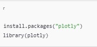
To get started with Plotly in R, you’ll need to install the plotly package:
Once installed, you can create interactive plots with ease. Here’s an example of a simple scatter plot using Plotly:
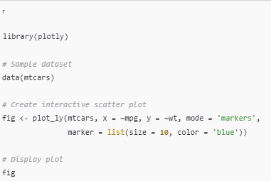
This code creates a basic interactive scatter plot where you can hover over the points to see additional details, zoom into the plot, and pan across.
Plotly provides a wealth of customization options. Shiny or Plotly in R You can modify the appearance of the chart (e.g., change colors or adjust axis labels), add annotations, or even include multiple layers on a single plot.
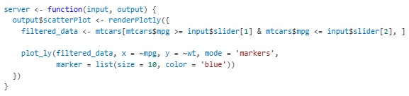
Building an Interactive Dashboard with Shiny and Plotly
To create a more dynamic experience, you can integrate Shiny or Plotly in R. Below is a basic example of how to combine the two for an interactive dashboard:
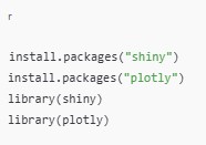
- Install and load the necessary packages:
- Define the user interface (UI):
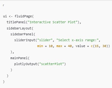
- Define the server logic:
- Run the Shiny app:

In this example, the Shiny app displays a scatter plot using Plotly. A slider allows users to filter the mtcars dataset based on the mpg variable, dynamically updating the plot as the user interacts with the slider.
Sharing Your Interactive Plots
Once you’ve created your interactive visualizations, you may want to share them with others. Both Shiny or Plotly in R offer different ways to share your work:
1. Sharing with Plotly
You can export your Plotly visualizations as HTML files, Shiny or Plotly in R which can be easily shared via email, uploaded to websites, or included in presentations.
To save a plot as an HTML file:

This will create an interactive HTML file that retains all the interactivity of the plot, and Shiny or Plotly in R anyone with access to the file can view and explore the plot.
2. Sharing with Shiny
To share a Shiny app, you can:
- Host the app on your own server or use platforms like ShinyApps.io, which offers free and paid plans to deploy your Shiny applications online.
- Share the app’s URL with others, Shiny or Plotly in R allowing them to access your interactive visualizations from any device with an internet connection.
Final Thoughts
Interactive plots are a great way to make your data visualizations more engaging and accessible. By using Shiny or Plotly in R, you can create rich, dynamic visualizations that allow users to explore and interact with data in real-time.
- Plotly is perfect for creating stand-alone interactive charts that can be shared easily via HTML.
- Shiny allows you to build fully interactive web applications, enabling dynamic user inputs and real-time plot updates.
By mastering both tools, Shiny or Plotly in R you’ll be able to share your data stories in a more interactive and meaningful way, giving your audience the ability to explore and engage with the data on their own terms. (Ref: Locus IT Services)