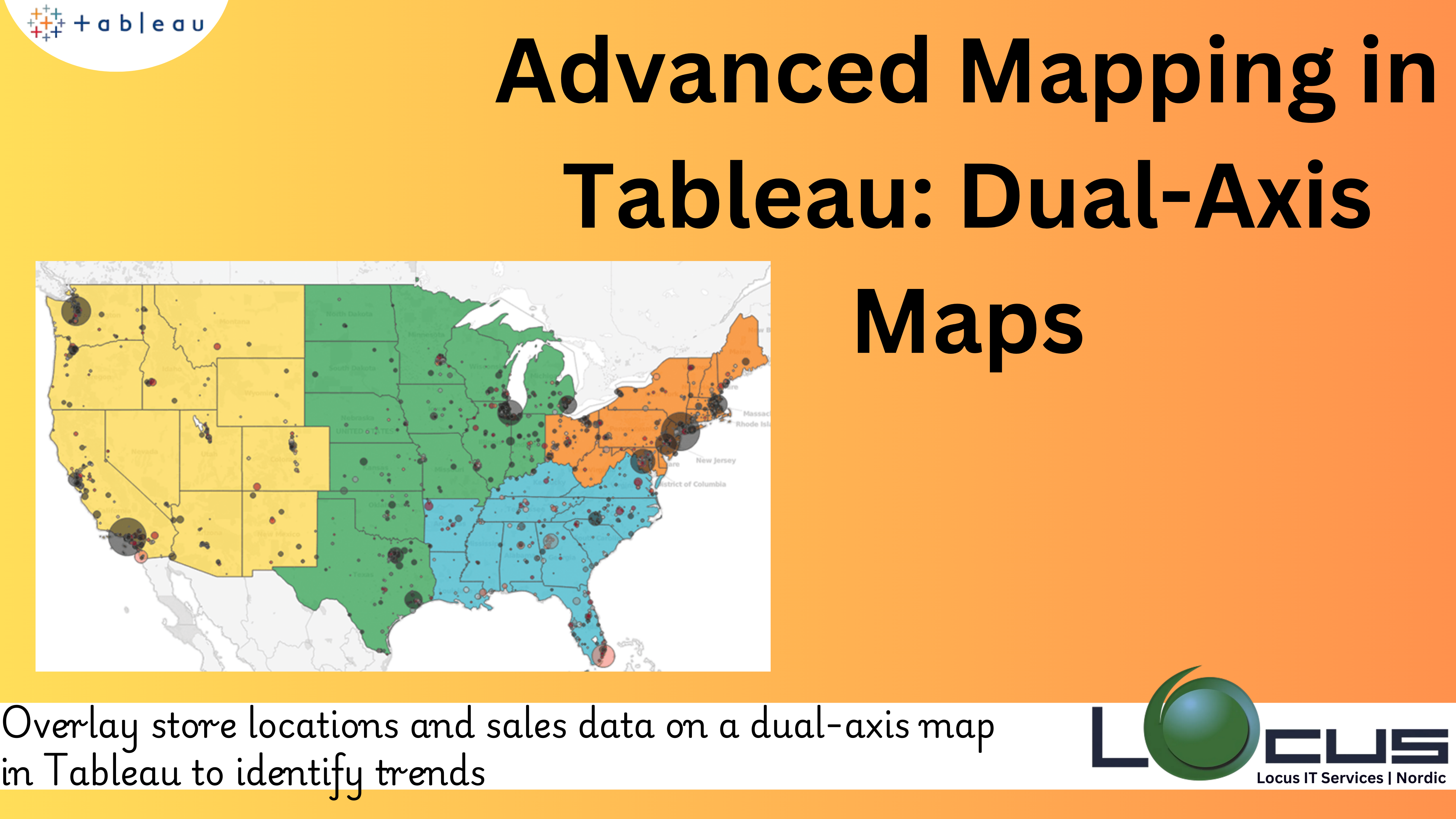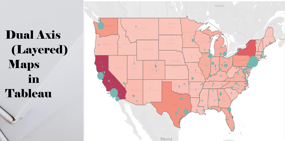
One of the best methods for any organization is to extract insights from location-based data is through the data visualization maps. Tableau is a preferred tool for geospatial analysis because of its powerful mapping features. Tableau Dual-Axis Maps capacity to merge several map layers, providing a more comprehensive context and in-depth insights, is one of its most notable advanced features.
This blog post will discuss the benefits, features of Dual-Axis Maps in Tableau, when to use them, and a step-by-step guide to create them.

Tableau Dual-Axis Maps: What Are They ?
Two separate map layers are shown in a dual-axis map in Tableau. You can use this functionality to overlay additional data, highlight linkages, and visualize several datasets. Plotting sales locations over a population density heat map is one example combining delivery routes with retail locations. Putting competing locations next to customer clusters, Dual-Axis Maps offer a thorough perspective on geospatial data. (Ref: Use Cases for Tableau API Integration : Advancing Data Visualization)
Tableau Dual-Axis Maps: Why Use Them ?
The following situations make dual-axis maps helpful :
1.Comparative Analysis: Two datasets, such as sales performance vs rival sites, must be compared.
2.Layered Insights: For example, you can overlay weather conditions on a delivery map to highlight patterns with one layer and specific information with another.
3.Enhanced Visual Impact: Use a variety of visual components to convey a story and make your visualization’s stand out.
How to Use Tableau Dual-Axis Maps
This is a thorough guide on creating a dual-axis map:
Step 1: Get Your Information Ready
Make sure that geographic fields like latitude, longitude, or geographic roles (such as city, state, or country) are included in your information. You might need to combine or merge several datasets if your data includes them.
Step 2: Construct the Initial Map Layer
Drag the country or other geographic dimension onto the Rows shelf.
On the Columns tier, put the metric you wish to see, like sales.
Tableau will make a map on its own. Change the colours, map type (such as a filled map), and other aspects of this map to make it uniquely yours.
Step 3: Add the Second Map Layer Choose Duplicate when you right-click on a blank space on the Rows shelf. This gives the map a second axis.
The second dataset you wish to present (such as Customer Locations) should be substituted for the current measure or dimension on the new axis.
Step 4: Synchronise the Axes To align both layers, right-click the secondary axis and select Synchronise Axis.
For every layer, change the mark types.
Step 5: Combine the Layers
Right-click the secondary axis and choose Dual-Axis.
Tableau will overlay the two maps into a single view.
Step 6: Customize Your Dual-Axis Map
Tooltips: Customize tooltips for each layer to provide actionable details.
Colors: Use distinct color palettes for clarity.
Interactivity: Add filters or dashboard actions to make the map dynamic.
Challenges in Tableau Dual-Axis Maps
While Dual-Axis Maps in Tableau offer powerful capabilities for geospatial analysis, they also come with their own set of challenges. These challenges can affect both the creation process and the effectiveness of the final visualization. Here are some common challenges faced when working with Tableau Dual-Axis Maps and how to overcome them:
1. Data Complexity and Integration: For Dual-Axis Maps to work effectively, you often need to combine multiple datasets that contain geospatial data. These datasets may come from different sources or have different formats, which can complicate integration.
Solution: Verify that the datasets are compatible, then correctly merge data sources using Tableau’s data blending and joining tools. In both datasets, it is important to ensure that the geographic fields (latitude, longitude, or geographic roles like nation or city) coincide. Errors can be prevented and visualisation accuracy increased by cleaning the data in Tableau Prep or another ETL tool before importing it into Tableau.
2. Performance Problems with Big Datasets: Tableau Dual-Axis Maps sometimes require rendering several data layers, and performance can lag when working with big datasets (such as millions of data points). Maps may become sluggish or load slowly as a result.
Solution: Since data extracts are more effective at managing big datasets, think about utilising them in place of live connections to maximise performance. By removing extraneous points, combining data, or lowering the level of detail, you can also make your data simpler. Map rendering can also be accelerated with Tableau’s background data caching feature.
3. Clutter and Overlapping Data Points Problem: When several maps are layered, data points from the two levels may overlap, which makes the map challenging to understand. Plotting delivery routes and client locations on the same map, for instance, can produce a cluttered appearance.
Solution: The fix for this is to change the mark types for each layer such that they distinguish between the datasets (for example, using polygons for one layer and circles for another). To prevent overpopulation, use transparency on one of the layers or change the mark size. Clutter can also be decreased by filtering or combining data points for wide regions.
4. The company syncing and scaling challenge: It can occasionally be challenging to synchronise the axes in a dual-axis map, particularly when the datasets have different scales or when the geographic data isn’t precisely aligned.
Solution: The fix is to make sure the geographic fields are the same on both axes. You may need to change one of the axes’ scaling to better match the other if the datasets have different scales. For improved visualisation, you can also normalise the data using logarithmic scales or computed fields
5. Overuse of Map Layers: One common mistake when usingTableau Dual-Axis Maps is adding too many layers, which can overwhelm the map and detract from the clarity of the story you’re trying to tell.
Solution:
Limit the number of layers to those that provide complementary insights. Every additional layer should add value to the narrative or analysis. Avoid using too many variables in one map, as it may result in a chaotic visualization. Consider alternative ways of presenting data, such as breaking down complex maps into separate visualizations or using filters to allow users to toggle between different layers.
6. Map Projections and Accuracy: Spatial relationships can be distorted by various map projections, particularly when working with big or international datasets. A Mercator projection, for example, might produce erroneous visualisations by making areas close to the poles appear far larger than they actually are.
Solution:
Choose the right map projection for Tableau Dual-Axis Maps based on the geographic area you are working with. Tableau allows you to use different map styles (like filled maps, symbol maps, or custom backgrounds), and you can use Mapbox or other map providers to fine-tune projections for more accurate depictions.
7. Lack of Interactivity or Dynamic Features: Without interactive features, Tableau Dual-Axis Maps can feel static and less engaging. For instance, users may struggle to drill down into specific areas or explore relationships between data layers in a meaningful way.
Solution:
Use dashboard actions, parameter controls, or filters to make your maps more interactive. This enables users to zoom into regions of interest, concentrate on particular data subsets, and examine the map in greater detail. Tooltips, hover effects, and map layers with drill-down capabilities can significantly improve the user experience.
While Tableau Dual-Axis Maps are a powerful tool for visualizing and comparing complex geospatial data, they do come with several challenges, including data integration, performance issues, clutter, and interpretation difficulties. By understanding these challenges and applying the appropriate strategies and best practices, you can effectively leverage Tableau Dual-Axis Maps to create insightful, interactive, and engaging visualizations.
By simplifying the data, optimizing performance, and designing clear, interactive maps, you can overcome these challenges and make the most of Tableau’s advanced mapping capabilities.
Best Practices for Tableau Dual-Axis Maps
1.Choose Complementary Datasets: Ensure the layers provide context to each other rather than overcrowding the map.
2.Optimize Performance: Large datasets can slow down rendering. Simplify your data or use extract files.
3.Use Legends Effectively: Add clear legends to help viewers interpret different map layers.
4.Avoid Clutter: Too many marks or overly complex designs can detract from insights. Keep it simple.
Real-World Applications of Tableau Dual-Axis Maps
1.Retail Location Analysis
Visualize store performance on a heat map of customer density, helping identify underserved areas.
2.Logistics and Supply Chain
Overlay delivery routes on traffic or weather data to optimize operations.
3.Public Health and Safety
Combine disease outbreak data with healthcare facility locations to identify gaps in coverage.
Final Thoughts
Tableau Dual-Axis Maps are a powerful tool for creating sophisticated, layered visualizations that offer deeper insights into geospatial data. By combining datasets effectively and following best practices, you can build compelling stories that drive decision-making.


