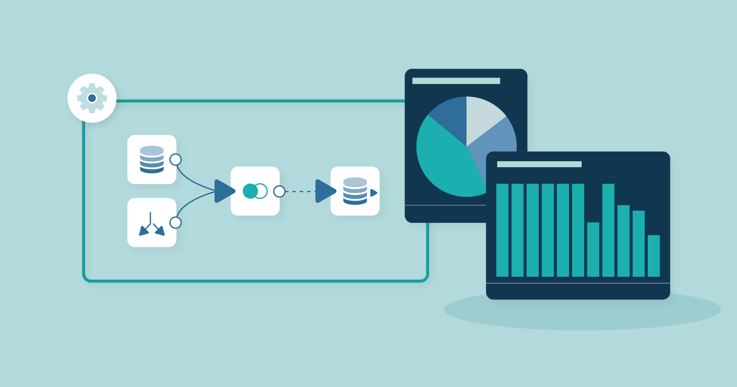
For Every Business data-driven, making sense of the mountains of data our disposal can feel overwhelming. Enter Domo—a business intelligence tool that transforms complex data sets into beautiful, interactive dashboards. Whether you’re a data analyst, a business executive, or simply someone curious about data visualization, Domo provides a user-friendly way to display insights that truly matter. This article will explore how to create stunning interactive dashboards with Domo, the benefits they offer, and some practical tips to get you started.
Why Interactive Dashboards Matter
Having access to data is just the beginning; presenting it effectively is where the real power lies. Interactive dashboards help businesses analyze data more intuitively and in real time. Here’s why they matter: (Ref: Pre-Built Data Connectors in Domo)
Visualize Complex Information
- Simplifies Interpretation: Dashboards help break down large quantities of data into visual formats like graphs, charts, and maps.
- Real-Time Updates: Domo offers real-time data integration, allowing businesses to make decisions based on the latest information.
- Customizability: Users can customise dashboards to show only the indicators that are most important, ensuring that relevant data is displayed first and foremost.
“Dashboards provide the first impression of your data. Their clarity can make or break your data-driven decision-making process.”
Getting Started with Domo
Creating an interactive dashboard in Domo is an intuitive process. Here’s a step-by-step guide to help you get started:
1. Data Connection
Before designing your dashboard, it’s crucial to connect to your data sources.
- Integrate Easily: Domo supports various data sources, including spreadsheets, cloud services, and database systems.
- Data Transformation: Use Domo’s Magic ETL feature to clean and transform your data effortlessly.
2. Choose Your Metrics Wisely
Identify which key performance indicators (KPIs) you want to highlight.
- Sales Metrics: Revenue growth, customer acquisition costs, and churn analysis.
- Marketing Metrics: ROI on campaigns, conversion rates, and social media engagement.
- Operational Metrics: Supply chain efficiency, employee performance, and project timelines.
3. Designing the Dashboard
Once the data is set, it’s time to design.
Layout and Aesthetic

- Simplicity is Key: Avoid clutter by concentrating on the most important data items.
- Color Schemes: Use color strategically to differentiate metrics and emphasize trends.
- Responsive Design: Ensure your dashboard functions well across devices, from desktops to mobiles.
Interactive Elements
Interactive elements make user engagement more profound.
- Drill-Down Features: Allow users to click on metrics for deeper insights.
- Filters and Date Ranges: Give users control to view data that meets their specific needs.
- Real-Time Alerts: Set up notifications for key thresholds or changes in data trends.
Best Practices for Effective Dashboards
Creating interactive dashboards that resonate and drive action involves a few tricks of the trade.
Stay User-Focused
- Understand Your Audience: What insights do they need? What decisions are they trying to influence?
- Gather Feedback: Regularly solicit user feedback for continuous improvement.
Keep It Dynamic
- Regular Updates: Make sure your data is routinely refreshed, reflecting the latest business conditions.
- A/B Testing Dashboards: Test different designs to see which garners more engagement.
Training and Documentation
- Educate Users: Provide training on how to interpret the dashboard.
- Documentation: Include a guide or a help section within the dashboard for quick reference.
Final Thoughts
Creating stunning interactive dashboards with Domo can dramatically enhance your organization’s ability to make informed decisions based on real-time data. By focusing on user experience, leveraging Domo’s robust features, and adhering to best practices, you can empower your team to dive deep into data insights.
So, why wait? Dive into Domo today and start turning your data into actionable insights. Whether you’re exploring the platform for the first time or looking to sharpen your interactive dashboards skills, the opportunities for enhancing your business intelligence are limitless.

