Analysing intricate datasets and displaying patterns across several dimensions are essential for making well-informed decisions in today’s data-driven society. Tableau radar charts are unique among Tableau’s many visualisation tools since they offer a condensed and perceptive representation of multi-dimensional data. Although radar charts are not the default visualisation type in Tableau, they can be created with a few clever steps, opening up a potent way to efficiently compare several variables.
We will go into great detail in this blog post on radar charts, their uses, and how to make and utilise them in Tableau for multi-dimensional analysis. You will have a firm grasp on the benefits of radar charts and how to take advantage of them by the end.

Radar charts: what are they ?
A Tableau radar chart is a visual representation of data that plots values for multiple variables on axes arranged in a circular layout, radiating from a central point. It resembles a spider web and is used to display multivariate data, making it easier to compare multiple dimensions or metrics simultaneously.
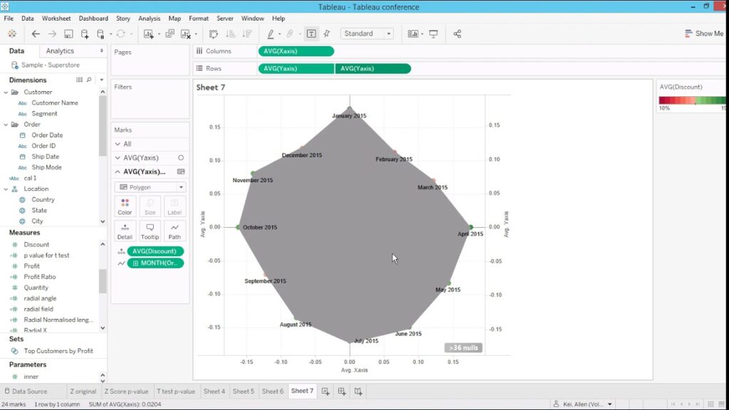
Although Tableau does not provide a built-in Tableau radar charts, you can create one using some workarounds, typically involving trigonometric functions and calculated fields. (Ref: Tableau Predictive Tools: Clustering, Forecasting, and R)
Key Features of Tableau Radar Charts
1.Circular Layout for Multidimensional Data: Tableau radar charts display data on axes radiating out from a central point, with each axis representing a different variable.
The radial design allows users to easily spot trends, patterns, or outliers across multiple dimensions at once.
2.Comparative Visualization: When multiple entities (e.g., products, teams, or individuals) are plotted, radar charts enable direct comparisons between them.
Overlapping polygons reveal areas of strength and weakness, making it easy to compare performance or attributes.
3.Proportional Representation: Data is scaled relative to the central point, visually indicating how each metric performs proportionally to others.
Ideal for identifying whether one dimension is significantly outperforming or underperforming relative to the rest.
4.Symmetry Detection: Symmetry (or lack of it) in the shape of the chart can indicate balanced or unbalanced performance across metrics.
For example, a balanced radar chart with a regular polygon might indicate consistent performance, while irregular shapes highlight disparities in Tableau radar charts.
5.Highlighting Extremes: Peaks and troughs in the radar chart are visually striking, drawing immediate attention to the highest and lowest values.
Useful for prioritizing areas needing improvement or areas of excellence.
6.Layered Data Representation: Multiple layers or series can be plotted on the same radar chart.
For instance, you can compare current performance (one layer) versus target performance (another layer).
7.Customizable Axes: Each axis can have its own scale, allowing for the comparison of variables with different units or ranges.
Alternatively, variables can be normalized to fit within a standard scale for uniformity.
8.Ease of Pattern Recognition: The overall shape formed by the data points makes patterns intuitive and easier to interpret compared to raw data tables.
For example, a star-shaped pattern could indicate balanced contributions from all metrics.
9.Compact Overview: Tableau radar charts condense complex multivariate data into a single, visually appealing chart.
This makes them an excellent choice for dashboards or summary reports where space is limited.
10.Custom Applications:
Tableau radar charts are particularly effective for:
-Skills Assessment: Comparing individual or team capabilities across various skill sets.
-Market Analysis: Analyzing product attributes versus competitors.
-Survey Results: Visualizing responses across multiple categories (e.g., customer satisfaction).
-Balanced Scorecards: Tracking organizational performance across strategic goals.
Common Use Cases
-Performance comparison across different departments or regions.
-Visualization of survey data with multiple categories (e.g., customer satisfaction).
-Analyzing balanced scorecards or skill assessments.
The Benefits of Tableau Radar Charts

For multi-dimensional analysis, Tableau radar charts provide a number of advantages:
Compact Representation: They make it simpler to understand relationships and patterns by combining multiple variables into a single perspective. Radar charts facilitate rapid comparisons across entities in a variety of dimensions, including departments, regions, and competitors.
Emphasising Extremes: They are great in pointing out anomalies as well as advantages and disadvantages.
Intuitive Visualisation: Tableau radar charts are visually appealing and simple for non-technical audiences to understand since they display data in a circular format.
When Tableau Radar Charts Should Be Used
Tableau radar charts are useful, but not all situations call for them. They perform well in the following situations:
-Comparing a team’s, individual’s, or product’s performance using a variety of measures is known as performance analysis.
-Visualising survey data or feedback scores across several attributes is an example of customer feedback.
-Assessing how your company or product compares to rivals is known as competitor benchmarking.
-Assessing and contrasting the skill sets of people or groups is known as skill assessment in Tableau radar charts.
-Radar charts are most effective when you have fewer variables (typically 3 to 10) to compare. With too many dimensions, the chart becomes cluttered and difficult to interpret.
Challenges with Radar Charts in Tableau
One of the primary challenges with radar charts in Tableau is that they are not available as a built-in chart type. However, Tableau’s flexibility allows you to construct radar charts using calculated fields, custom polygons, and careful design techniques.
Interpreting Radar Charts: Radar charts are effective for identifying patterns, outliers, and trends.
Here are a few tips for interpretation:
Shape Analysis: Look at the overall shape of the polygons. An evenly spread shape indicates balanced performance, while an irregular shape highlights areas of strength and weakness.
Area Comparison: Compare the size of the polygons to identify entities with higher overall scores.
Axis-Specific Insights: Analyze each axis to pinpoint dimensions where entities excel or lag.
Best Practices for Using Radar Charts
To make the most of radar charts, follow these best practices:
Limit Dimensions: Avoid clutter by restricting the number of axes to a manageable number (typically less than 10).
Use Consistent Scales: Normalize data to ensure fair comparisons across dimensions.
Provide Context: Label axes clearly and include tooltips or legends for additional context.
Combine with Other Visualizations: Pair radar charts with bar charts or heatmaps for a comprehensive analysis.
Engage Stakeholders: Use radar charts in presentations or dashboards to communicate insights effectively.
Applications of Radar Charts in Real-World Scenarios
1.Business Performance Dashboards
Businesses can use radar charts to compare performance across regions, departments, or product lines. For instance, a company might plot sales, customer satisfaction, and operational efficiency metrics for each region.
2.Employee Skill Assessments
HR teams can assess employee skill levels in various domains, enabling targeted training and development initiatives.
3.Marketing Campaign Analysis
Radar charts are useful for visualizing campaign effectiveness across metrics like reach, engagement, conversion rate, and ROI.
4.Competitive Analysis
Organizations can benchmark their performance against competitors across multiple attributes, such as price, quality, and brand recognition.
5.Customer Feedback Surveys
Radar charts can aggregate and display survey results, highlighting areas where customer experience excels or needs improvement.
Limitations of Radar Charts
Despite their advantages, radar charts have limitations:
1.Clutter with Many Variables: Too many axes make the chart difficult to read.
2.Comparative Challenges: Comparing overlapping polygons can be challenging when there are many entities.
3.Scaling Issues: Variability in axis scaling can distort interpretations.
4.Subjectivity: Interpretation of shapes and patterns can be subjective, requiring additional context for accuracy.
Final Thoughts
Radar charts are a versatile and visually compelling tool for multi-dimensional analysis. Although not a default option in Tableau, they can be created with calculated fields and custom design techniques. By using radar charts effectively, organizations can gain valuable insights into performance, identify trends, and communicate findings in a clear and engaging manner.
When used appropriately, radar charts empower decision-makers to navigate complex datasets and uncover actionable insights. Whether you’re analyzing employee skills, customer feedback, or business performance, mastering radar charts in Tableau is a valuable addition to your data visualization toolkit.


