Tableau, one of the leading data visualization tools, offers various chart types that help users uncover patterns, trends, and insights within their data. Among these visualizations, Tableau tree and heat maps are two powerful options that provide unique ways of interpreting large datasets. These charts are particularly effective when it comes to analyzing relationships between multiple variables or visualizing complex data in an easily digestible format.
In this blog, we will explore Tableau tree and heat maps, discussing their purpose, how to create them, and when to use each type of visualization. By the end, you’ll have a solid understanding of how to leverage these charts to transform your data into actionable insights.

What are Heat Maps?
A heat map is a data visualization technique that uses color to represent the values in a matrix or grid. The darker or more intense the color, the higher or lower the value, depending on the color scale. This makes heat maps an excellent way to display the intensity of data across different dimensions, showing patterns and relationships clearly on Tableau tree and heat maps.
Heat maps are ideal for comparing large volumes of data across two dimensions, where the values can be represented by color to highlight areas of interest. They are often used to track performance over time, compare categorical data, or even visualize correlations between variables. (Ref: Tableau Date Fields with Time-Based Insights)
What are Tree Maps?
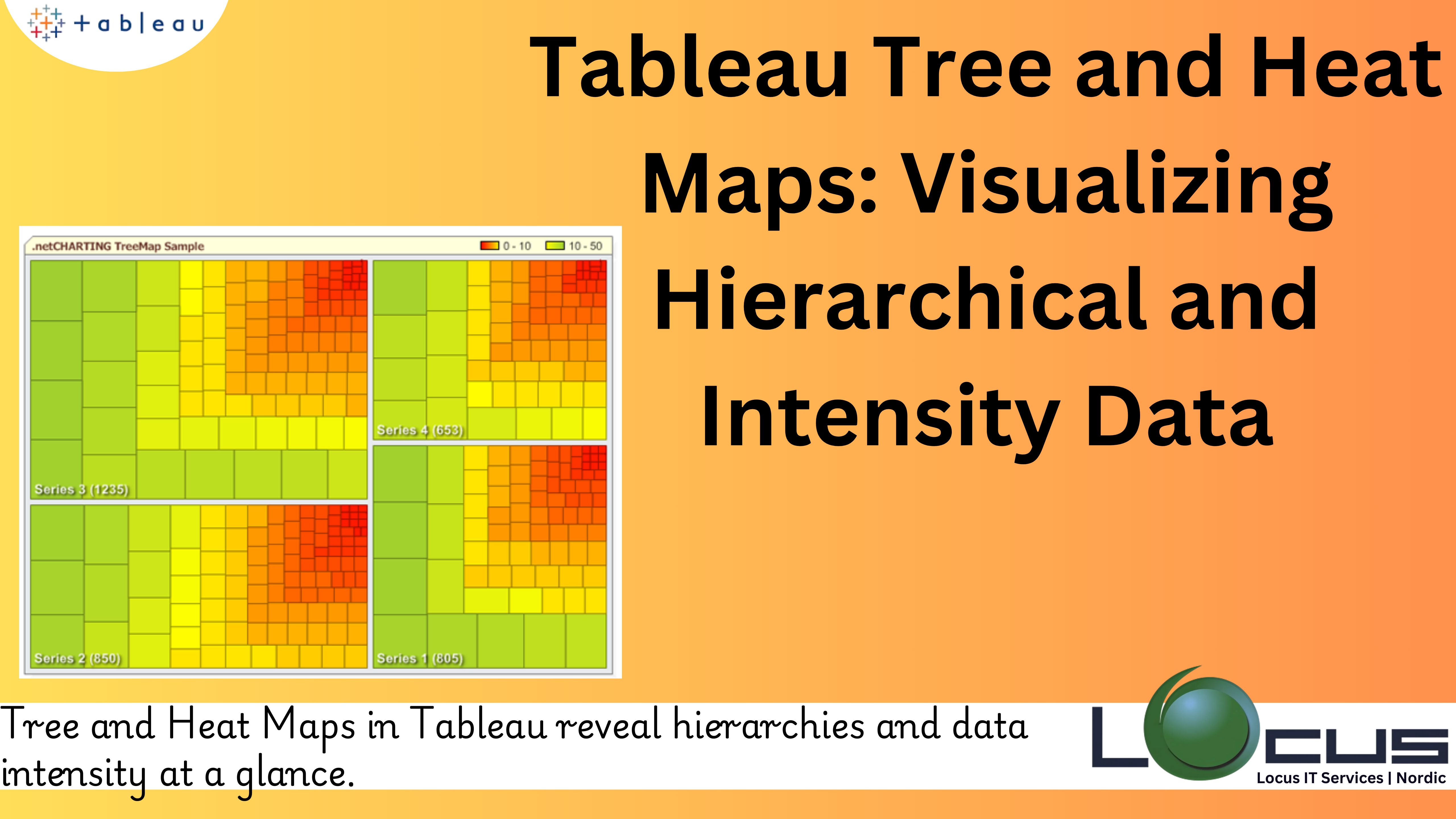
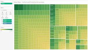
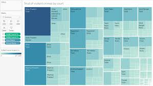
A tree map is a hierarchical data visualization that uses nested rectangles to represent data. Each rectangle’s size corresponds to a specific quantitative measure, while the color of the rectangle reflects another dimension or measure. This visualization method is especially useful for comparing proportions and understanding hierarchical relationships within a dataset.
Tree maps are ideal for displaying proportions among categories and subcategories. They are often used to present complex data with many layers, making it easier to see how smaller elements fit into the larger context.

Tableau Tree and Heat Maps: A Comparative Overview
Before diving into the process of creating these visualizations, it’s essential to understand the key differences between heat maps and tree maps:
1.Heat Maps: Primarily used for visualizing data intensity across two dimensions, heat maps rely on color gradients to represent data values. They are best suited for datasets where you need to compare the values across rows and columns, such as sales performance over time or customer satisfaction levels across regions.
2.Tree Maps: These are better suited for hierarchical datasets. Tree maps can visually represent proportions, allowing users to compare categories and subcategories at a glance. They are effective for showing how smaller parts contribute to the whole, such as revenue breakdown by product categories or market share by company.
While both visualizations use color as a means of conveying information, the structure of the data in question typically dictates which one is the best choice.
When to Use Heat Maps?
Heat maps are best used when you want to quickly identify trends, patterns, or outliers in your data. They are particularly useful when:
1.You have a two-dimensional dataset: Heat maps work well when your data consists of rows and columns. They can show how values change across two variables, which is ideal for analyzing performance over time, such as monthly sales by region.
2.You want to emphasize intensity or variation: Heat maps use color to highlight areas of interest. This makes them excellent for showing concentrations of values or spotting deviations from the norm.
3.You need to compare a large volume of data: When you need to analyze a large dataset with many values, heat maps condense that information into an easily digestible format. By color-coding values, you can quickly identify where certain trends are more pronounced or where issues need attention.
4.You are looking for correlations: Heat maps can reveal correlations between multiple dimensions. For example, you can visualize how different factors interact with each other, such as the relationship between customer satisfaction scores and product features across different regions.
When to Use Tree Maps?
Tree maps are most effective when you want to visualize hierarchical relationships or show proportions in a clear and intuitive way. You should consider using tree maps in Tableau when:
1.You have hierarchical data: Tree maps excel when your data is structured in a hierarchy, such as products within categories or regions within countries. The size and color of the rectangles help represent both the value of each category and its relationship to the overall dataset.
2.You need to compare parts to the whole: Tree maps are ideal for showing how individual elements contribute to a larger total. For instance, they are excellent for showing the breakdown of revenue by product category or expenses by department within a company.
3.You have many categories or subcategories: When your data has multiple levels of classification (e.g., regions, subregions, and cities), tree maps allow you to explore these different levels of hierarchy in a compact, easy-to-understand format. The nested rectangles give you a sense of the relative importance or size of each category and subcategory.
4.You need a visually engaging way to present proportions: The use of size and color in tree maps ensures that they are highly engaging and can help present complex data in a way that is both informative and visually appealing.
Creating Heat Maps in Tableau
Creating a heat map in Tableau is straightforward. Below is a step-by-step guide to help you build your own heat map:
1.Prepare your data: Ensure your data is organized so that it can be analyzed across two dimensions. For example, you may want to compare sales over months and regions or performance scores across different departments.
2.Connect to your data: Open Tableau and connect to your data source. Once connected, navigate to the worksheet area where you will begin creating the heat map.
3.Place your dimensions on the Rows and Columns shelves: For a heat map, you typically need two dimensions to represent the data. Place one dimension (e.g., “Month”) on the Columns shelf and the other dimension (e.g., “Region”) on the Rows shelf.
4.Drag a measure to the Color shelf: The measure you select will determine the values represented by color. For example, you can choose “Sales” or “Performance” as your measure. Tableau will automatically assign a color gradient to these values.
5.Adjust the color scale: You can customize the color gradient to better match the intensity of the values. To do this, click on the color legend and select “Edit Colors.” You can choose from several color palettes or define a custom range.
6.Fine-tune the view: You can adjust the size of the cells or add labels to provide more context. Use the “Size” shelf to modify cell sizes and the “Label” shelf to show values within each cell.
7.Refine the formatting: Once you’re satisfied with the general layout, refine the formatting by adjusting fonts, borders, and gridlines to ensure your heat map is both clear and visually appealing.
Creating Tree Maps in Tableau
The process of creating a tree map in Tableau is equally simple. Follow these steps:
1.Prepare your data: Like heat maps, tree maps require hierarchical data. For example, you may want to display the proportion of sales by category and subcategory, or revenue by department and region.
2.Connect to your data: Open Tableau and connect to your data source. Once connected, go to a new worksheet to begin creating the tree map.
3.Drag a dimension to the Rows shelf: To create a tree map, you first need to drag a dimension that will represent the highest level of hierarchy (e.g., “Category”) to the Rows shelf.
4.Drag a measure to the Size shelf: Next, drag a measure (e.g., “Revenue” or “Sales”) to the Size shelf. Tableau will adjust the size of the rectangles based on the values in this measure.
5.Add additional dimensions to the Color and Detail shelves: You can add other dimensions (e.g., “Subcategory” or “Region”) to the Color shelf to differentiate between categories or to the Detail shelf for more granular information.
6.Customize the color scale: Just like with heat maps, you can modify the color scale to reflect different ranges or thresholds. Right-click the color legend and select “Edit Colors” to make adjustments.
7.Fine-tune the appearance: Once the tree map is created, you can adjust the size, colors, and labels to ensure that the information is easy to understand and visually appealing. Use the “Label” shelf to add data labels, and adjust the color palette to fit your needs.
Best Practices for Tableau Tree and Heat Maps
While heat maps and tree maps are powerful tools in Tableau, it’s important to follow certain best practices to ensure the clarity and effectiveness of your visualizations:
1.Choose the right color palette: For Tableau tree and heat maps, selecting the right color palette is essential. Ensure that your color choices make it easy to distinguish between different values and categories. Use color gradients for heat maps and contrasting colors for tree maps to highlight differences clearly.
2.Label clearly: Make sure to include clear labels on Tableau tree and heat maps. This helps your audience understand the data represented by each color or rectangle. Labels should include the measure (e.g., sales or revenue) and, if applicable, the dimension (e.g., category or subcategory).
3.Avoid clutter: Tableau tree and heat maps can become cluttered if there are too many dimensions or if the data is too complex. Limit the number of categories or subcategories shown and focus on the most relevant data.
4.Consider interactivity: Tableau tree and heat maps interactive by adding filters or tooltips. Use these features to allow users to drill down into the data and gain more detailed insights.
5.Test with different datasets: Experiment with different data sources to understand how these visualizations work best with your specific data. Try using Tableau tree and heat maps to display hierarchical financial data.
Final Thoughts
Tableau tree and heat maps are incredibly valuable tools in Tableau for visualizing complex data. Heat maps allow you to represent intensity and compare values across two dimensions, while tree maps provide a clear way to display hierarchical relationships and proportions. By following best practices and leveraging Tableau’s powerful features, you can create dynamic and informative Tableau tree and heat maps visualizations that transform your data into meaningful insights. Whether you’re analyzing trends, tracking performance, or understanding proportions, Tableau tree and heat maps visualizations will help you communicate your findings with clarity and impact.


